

While working at Kompleks Creative, this hypothetical re-brand project was assigned. I tackled this brand redesign for a local historic Durham Restaurant, The Chicken Hut.
Firm: Kompleks Creative Art Director: Tobias Rose

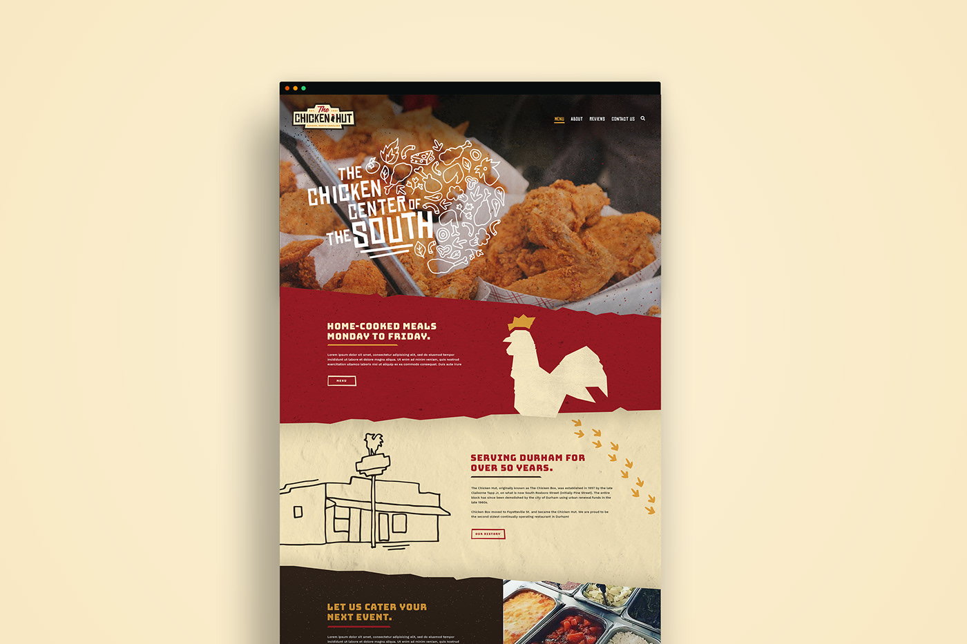
The Chicken Hut is the second oldest continually operating restaurant in Durham, supporting their community for over 60 years. They serve delicious home-cooked meals with a menu that changes daily. Durham is changing and growing every day and their current branding was ready to be refreshed in a way that still honors their history.

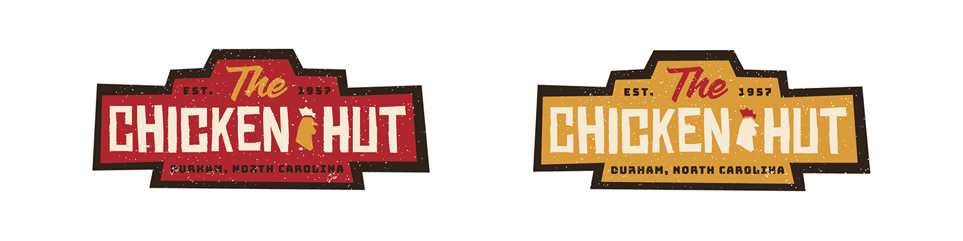
The Chicken Hut, originally known as The Chicken Box, was established in 1957 by the late Claiborne Tapp Jr, on what is now South Roxboro Street (initially Pine Street). During my research, I found an old photo of the original location. I was instantly inspired by the shape of the original neon light pole sign they had in the front of the restaurant. This retro shape was what led me to the final logo.


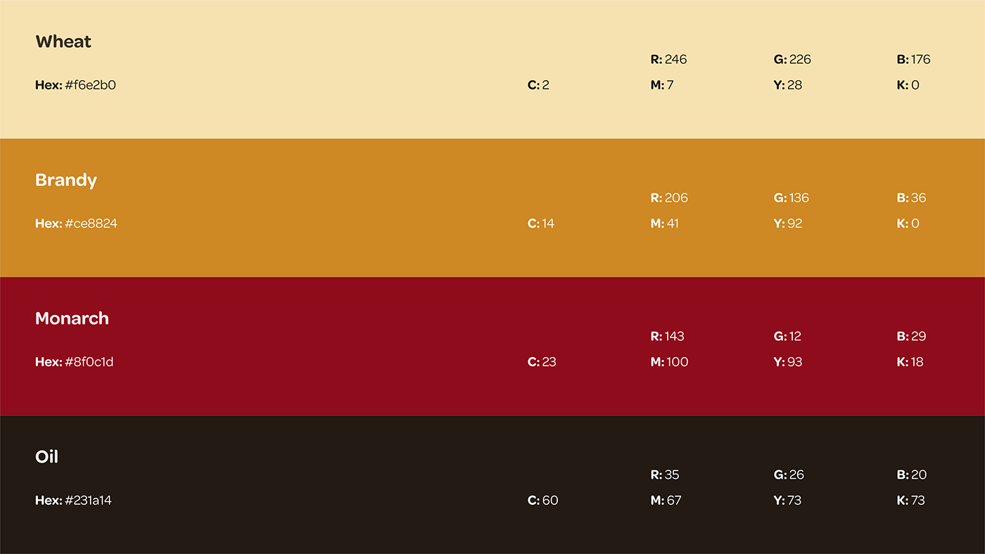
The color scheme had to feel similar to their current look and be genuine with their restaurant. Warm colors like beiges, browns, and reds are most commonly correlated to chickens, pulling from their beautiful feathers. This combination sparks a feeling a homeyness and heritage that we wanted to be associated with The Chicken Hut. Distressed textures and edges added to that goal.

The website along with the refreshed logo creates a seamless branded experience that feels fresh and works well with the surrounding growing community in Durham.


