

Complete branding and identity package
Renaissance is led by Jeff Watts, a recent client of mine, with a really cool concept behind their work. They are an artistic outreach ministry in downtown Decatur, IL with a mission to create a church for people who don't like church. On top of that, the coordinators and the church itself focus on glorifying the arts in everything they do where even sermon themes will redesign the atmosphere of the building from month to month Basically, they've not only taken on the name of the renaissance but also the spirit of it with everything from the professional contemporary band they have lead worship, to the historic, gothic building they just moved to as their headquarters. I've been commissioned to serve as a creative associate on their team and will design every piece of printed media, digital media, and online presence that they plan to develop in the next couple years. They're literally starting from the ground up and building the identity of this ministry around the way everything is designed. It's been great so far working with people who are so on fire about what they do that you can't help but throw yourself into the mix with them.
I'll try to keep up with posting cool pictures and material for this as it's produced!
I'll try to keep up with posting cool pictures and material for this as it's produced!

The inspiration for this mark came from a concept that we would design around the reoccurring theme of using the 're' and words that start with that (for example, restroom). It was tricky creating a brand that would push them forward into a modern age but still adhere to influences of the renaissance. Using the typography and the three marks on the left I focused the black to reflect period correct architecture, and stumbled across that quatrefoil shape in stained windows (that renaissance actually has in their building).
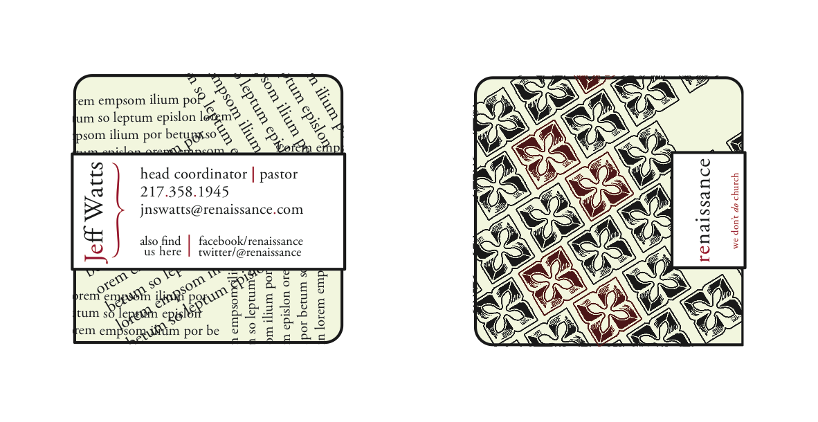
Business Card -- In final production the back of the card (left) will be collaged with french book pages and the front of the card (right) will be letterpressed and embossed. The slip piece of starch white paper will wrap around the card and cut flush on the backside.
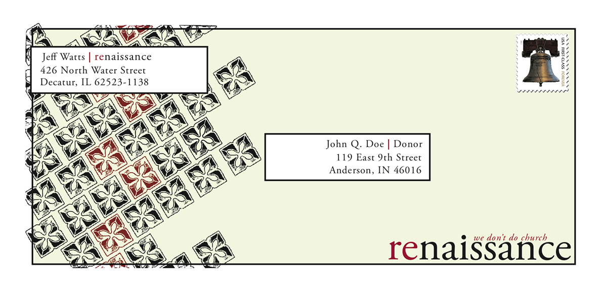
Envelope -- In final production the front pattern will be letterpressed on handmade paper and the slip pieces of stark white will be adhered to and around the envelope. The opening flap will be on the right side.
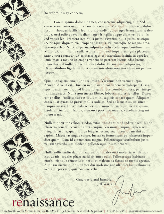
Letterhead -- In final production a small number of these will be letterpressed and embossed to be inserted in a marketing strategy package and supporter package. For the most part this page will be seen in digital print for a majority of the time.

Additional Media Proposal for Sermon Cards -- This a format design for Sermon program based off of the theme, re duce, re use, re cycle. Final production will include front side screenprinted on burlap sack and mounted to recycled cardboard that the sermon content page will slip into.


