A Fresh Food Network
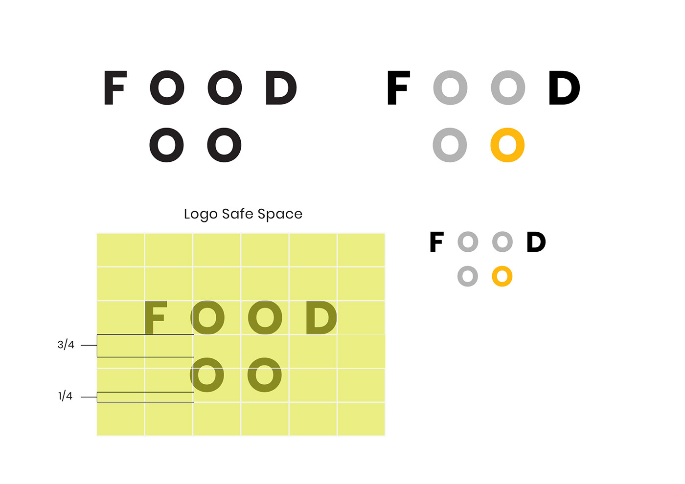
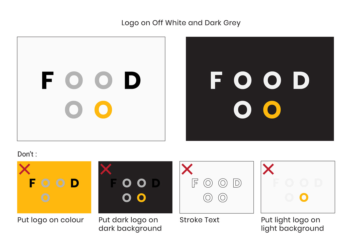
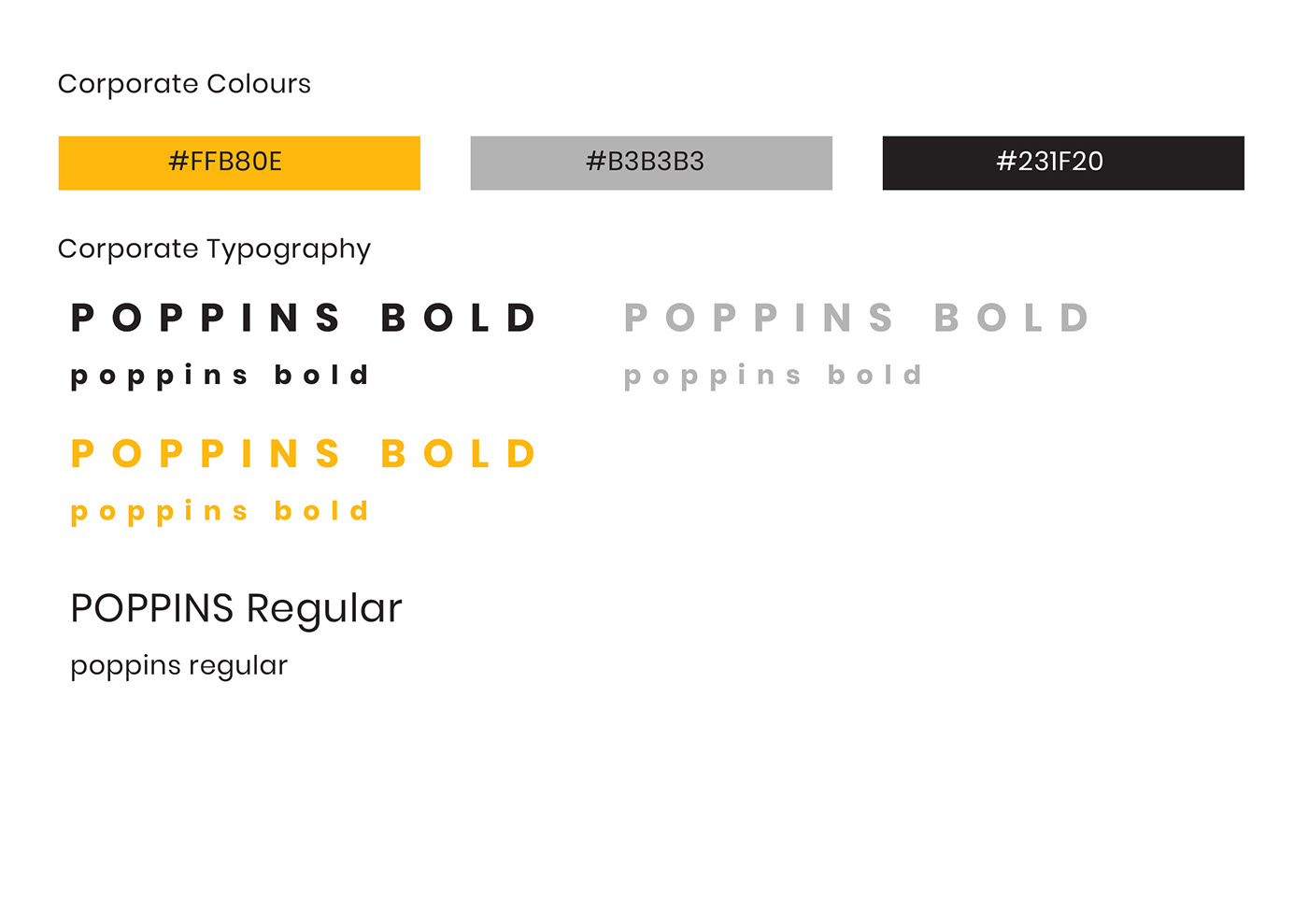
For this project we were required to take an existing TV channel and rebrand it. The rebrand had to be far removed from the original and accentuate a old and new aspects to appeal to a target demographic. I found through user testing and surveys, Food network is commonly viewed as old fashioned, house-wife-y, too American, Inaccessible, Friendly and Competitive. Taking into account their perceived image the new logo focuses on creating a more contemporary logo. The logo is meant to depict a hotplate with its multicolored “O’s”, using typography instead of iconography to create a timeless logo that would last longer and appeal to larger audiences. The orange color was used not only to create the hot plate heating effect but also to incite hunger, fun and energy when contrasting with the rest of the design. The original red was a heavy color that though eye-catching was overused by food network and didn’t stimulate appetites. The lighter orange creates a fun and energetic image for the company similar to the brand statement they support and their this project tries to reinvigorate. The sleek new design is meant appear mature and modern while its animations create a quirky and fun image for the brand. The circular motif is repeated throughout the designs crafted and is a major part of the visual system. Poppins was used because its sans serif and scales well while also creating interesting negative space. The bold letterforms with copious tracking help make the typeface stand out visually from the previous logo while also creating its own bold visual statement.
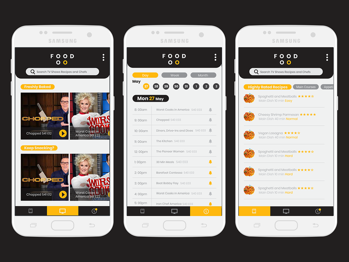
The videos are meant to show a human side to the network, in stark contrast to the competitive and aggressive cooking competitions they’ve become known for. They mark a return to form of the days when the network focused on the joys of cooking and eating. So the videos depict how people interact with and enjoy food. Primarily how food brings out their smile. Each short features a different food item thats being consumed from popcorn to peanut butter, that’s also a conscious choice as food doesn’t need to be extravagant to be enjoyed just good enough to make you smile. The schedule filler similarly focuses on the joys of eating and the joys of cooking through “The Best thing I ever ate” and “Kid’s Baking Championship.” The app interface is simple and is primarily a way to show how the branding and logo apply in different situations. Using friendly vernacular instead of common names for features and using light backgrounds with dark greys and spot colours of the brand’s orange. The rebrand is successful in creating a new and fresh visual for food network that could bring back the heart that the network lost when it became more obssessed with ratings than their audience and food.