

There is a familiar farm in a small town of Catalonia (La Moixa) that has been making dairy products for 3 generations. The packaging this family used, didn't represent their ecological values and origins, so we propose them a packaging and logotype redesign.

Illustration by Carla Gallén.
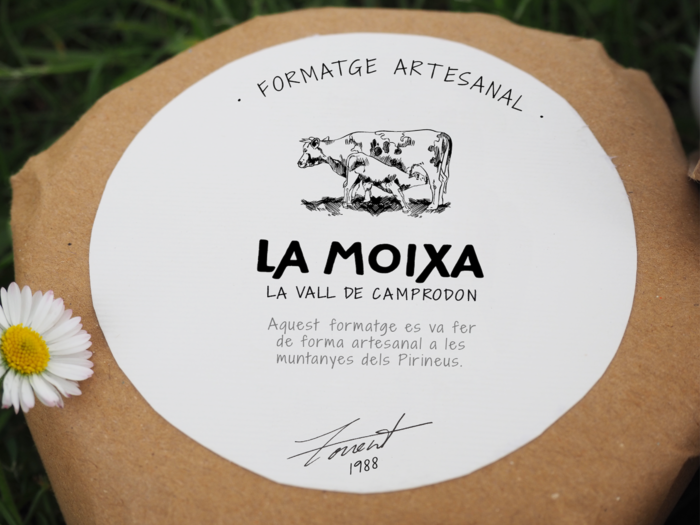
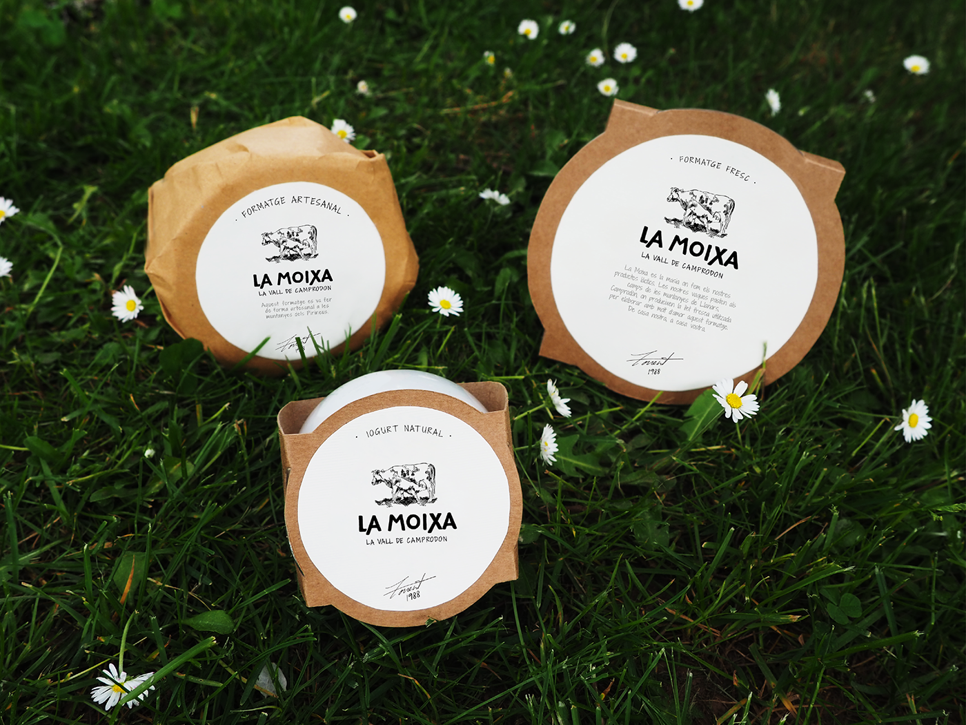
With regard to the logotype, a lettering was made to give the brand more presence. And a new illustration, in combination with the glass pot and the craft and textured papers, is given to the product the handmade aesthetics needed.
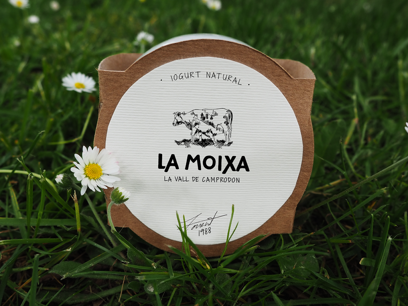

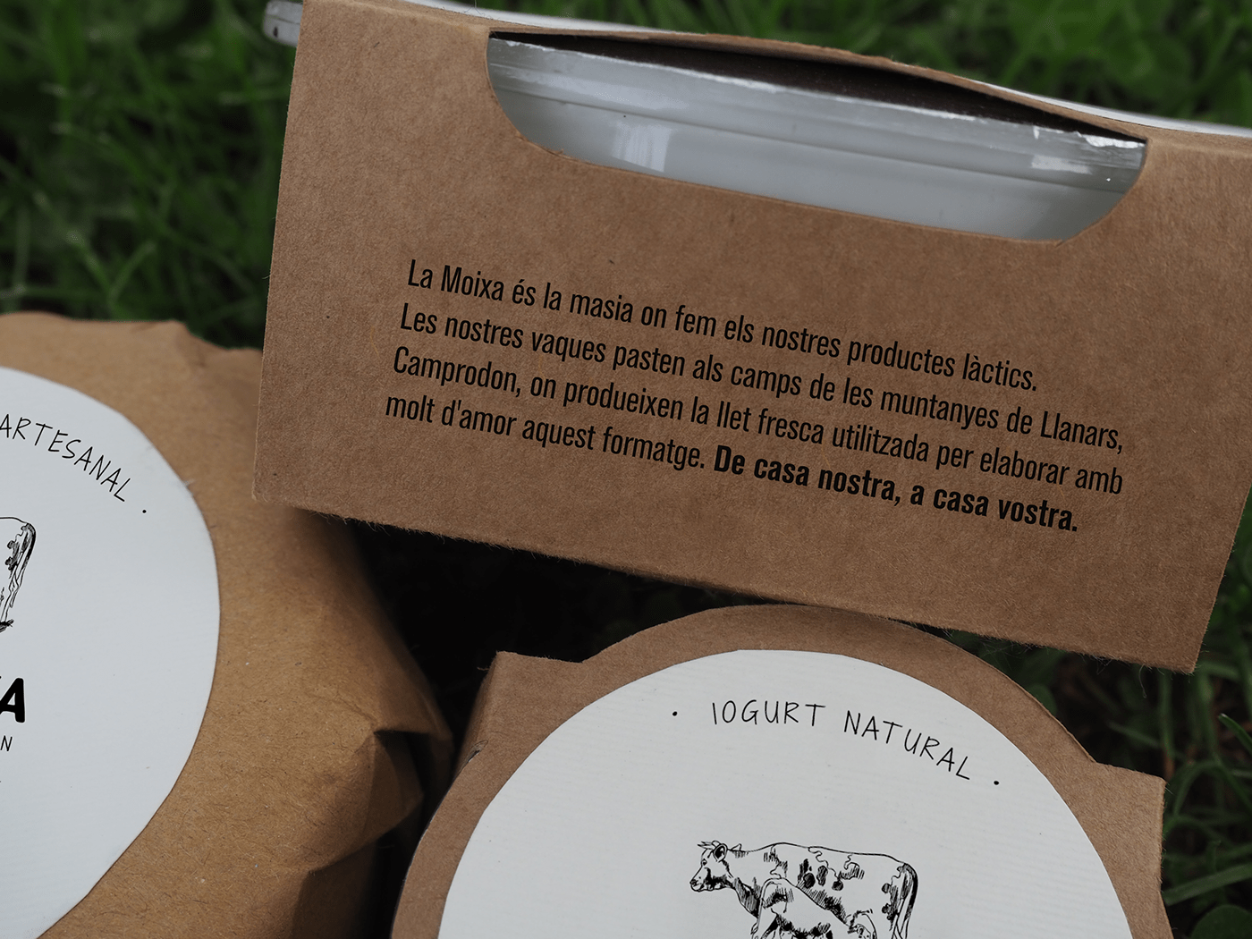
The origin of the product makes it pretty valuable, but it was treated just like another yogurt. The love and care should be evident in its design. With texts for each product, as "La Moixa is the farm where we produce our dairy products. Our cows graze in the mountain fields of Llanars, Camprodon, where they make the milk used to elaborate with love this yogurt. From our home to yours" the consumer will feel closer and know the valuable origin of the product.


Master in Packaging Design | ELISAVA | Barcelona, Spain | 2019
Tutored by Eva Minguella
Tutored by Eva Minguella
Featured on: Packaging Of The World


