

Kurs typeface is the thesis project of the type design master "Type Design Expanded Program" that I attended last year at CFP Bauer in Milan.
This display typeface is inspired by the New Renaissance. It is a concept that rethinks the Renaissance as a moment of transition between the Medieval and Modernity, when paradigm shifts – without new models to stand with – insecurity grows with anxiety, bringing consequence in society that we can clearly see then, as well as today.
This display typeface is inspired by the New Renaissance. It is a concept that rethinks the Renaissance as a moment of transition between the Medieval and Modernity, when paradigm shifts – without new models to stand with – insecurity grows with anxiety, bringing consequence in society that we can clearly see then, as well as today.
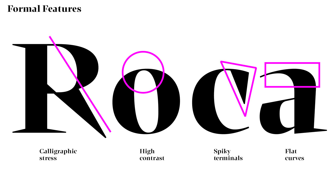
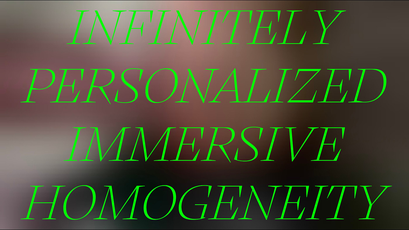
These concepts translates into shapes with stark contrasts between thick and thin lines, soft and flat curves with spiky serifs and terminals. Harshness and opposition of shapes were the core of an attempt to depict a small part of what it means to live today.
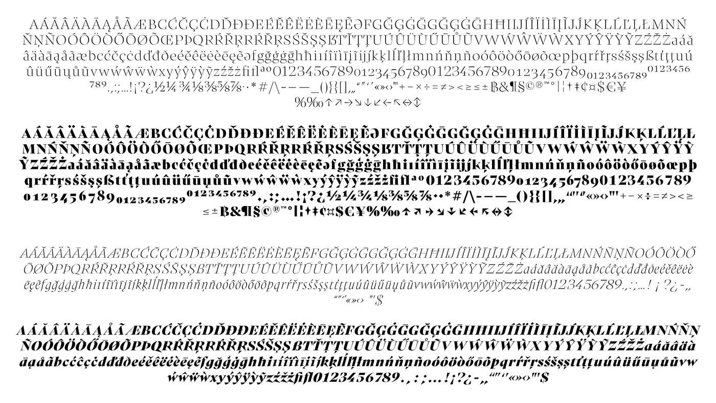
Designed in 6 weights, 12 styles with 496 glyphs and Latin Extended A Language support.


Above Kurs ExtraBold squeezed by 20%, might be a good start to think about a condensed/compressed version!

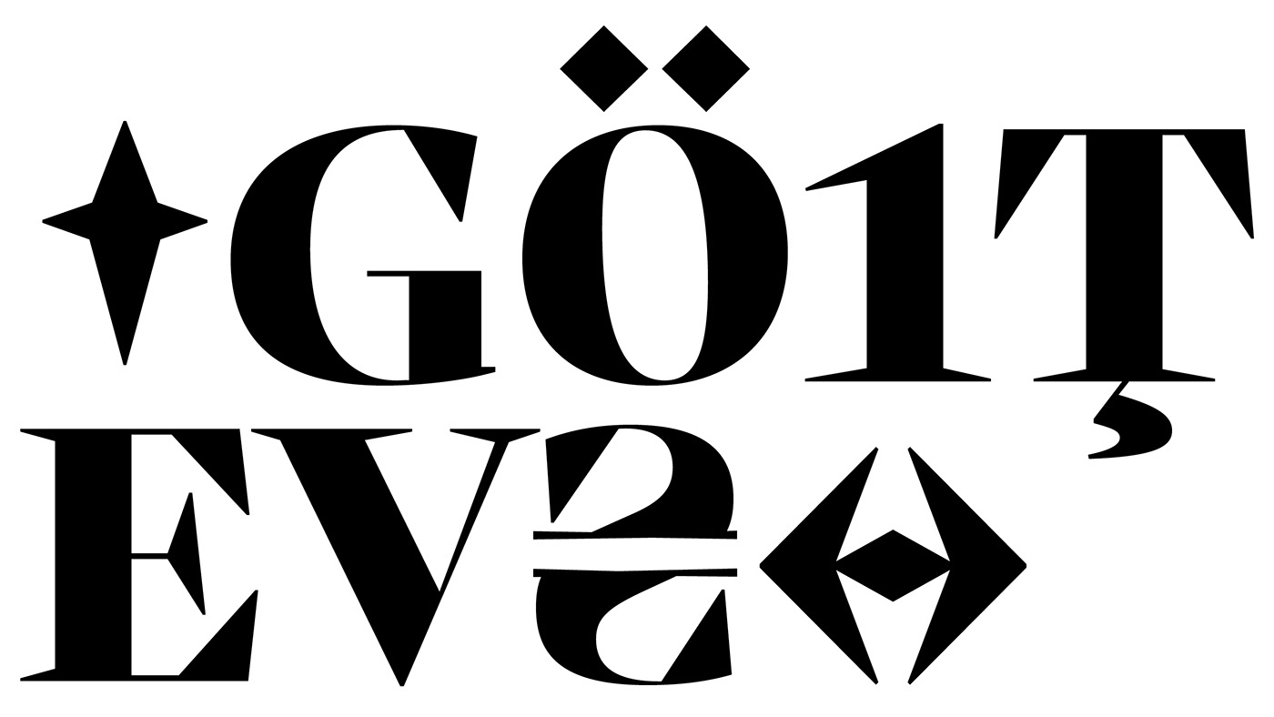
Lots of EVA references for you anime nerds out there!;)
Thanx for watching!


