
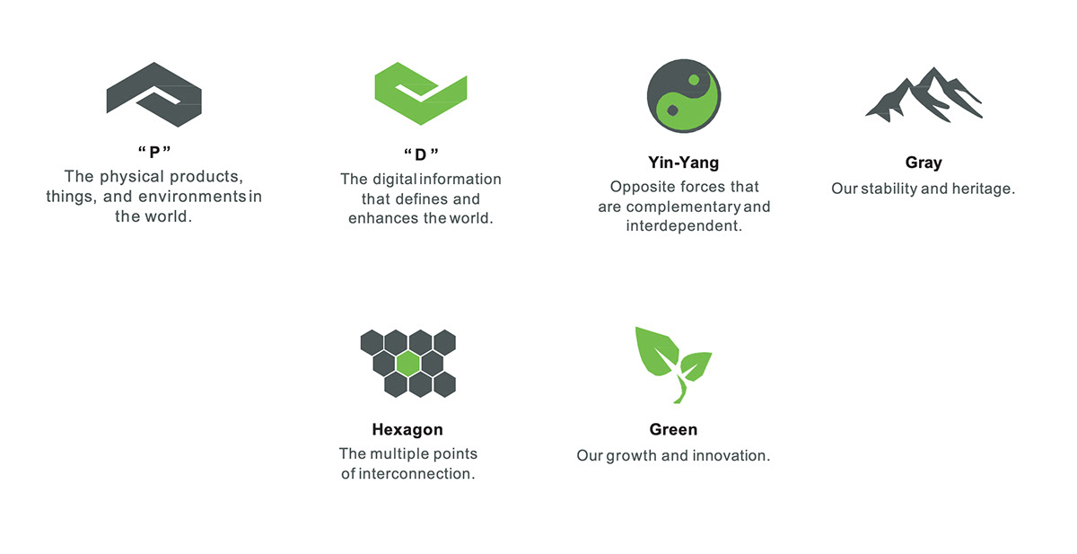
The PTC corporate logo comprises two elements, the symbol and the logo type. Our logo is the key building block to our identity, the primary visual element that defines PTC. The logo is a combination of the “p” for physical and the “d” for digital that come together to tell our story while revealing the brand symbol. These are a fixed relationship and should never be changed.
The “P” and “D” shapes in the PTC logo are aligned to create a hexagon shape. This shape is a play on the traditional Yin/Yang symbol and represents the convergence of the physical and digital worlds.
The color palette of green and gray has been chosen to convey new technology, standing out from the traditional blues that are so prevalent in the brands of competitors.


Overlays
Our design overlays or “digital overlays” are core visual compliments that help PTC achieve it’s tech aesthetic. Overlay accents should feel current and not “retro-futuristic.” An important characteristic of the overlays is their accent use as they should never be used as primary design elements.
These overlay accents convey a modern presence for the PTC brand and may exist in print, web, or virtual forms.


Copyright - 2019 PTC, Inc. All rights reserved.


