The client: Spike N Fortune is a proprietary trading company with vast experience and expertise in Indian stock markets and International Forex market.
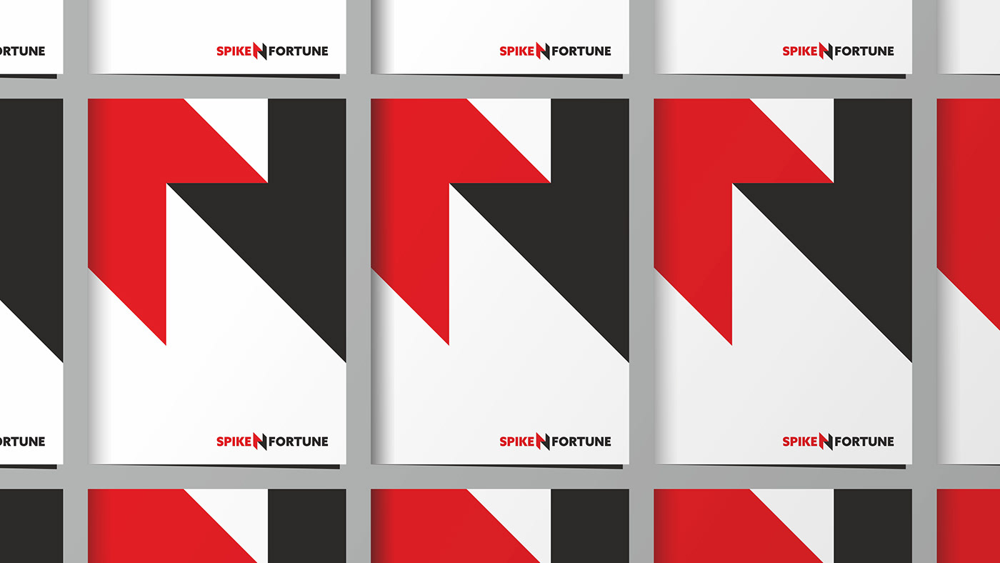
The challenge: The client wanted to update the logo without loosing its upward and downward arrows integrated in the N, It has symbolism to the market volatility and has been in use for a long time.
The solution: As you can see below we tried to recreate the N in such a way that it does not loose its shape and structure at the same time solving the purpose and aligning with the brief. We adopted Azo Sans Bold font to go with symbol in sync.
We loved how this brandmark turned out into an amazing graphic system for the brand that can be used across various consumer touch-points creating strong brand recall and uniformity. Tell us what you think in the comments below.


THANK YOU FOR YOUR FEEDBACK & APPRECIATION!


