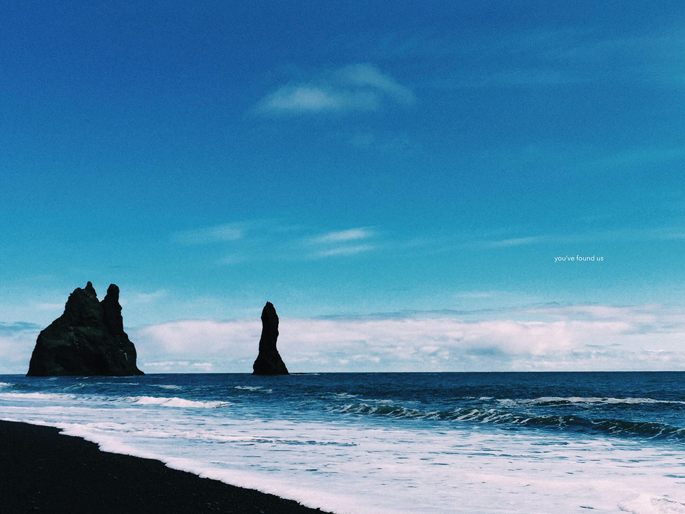
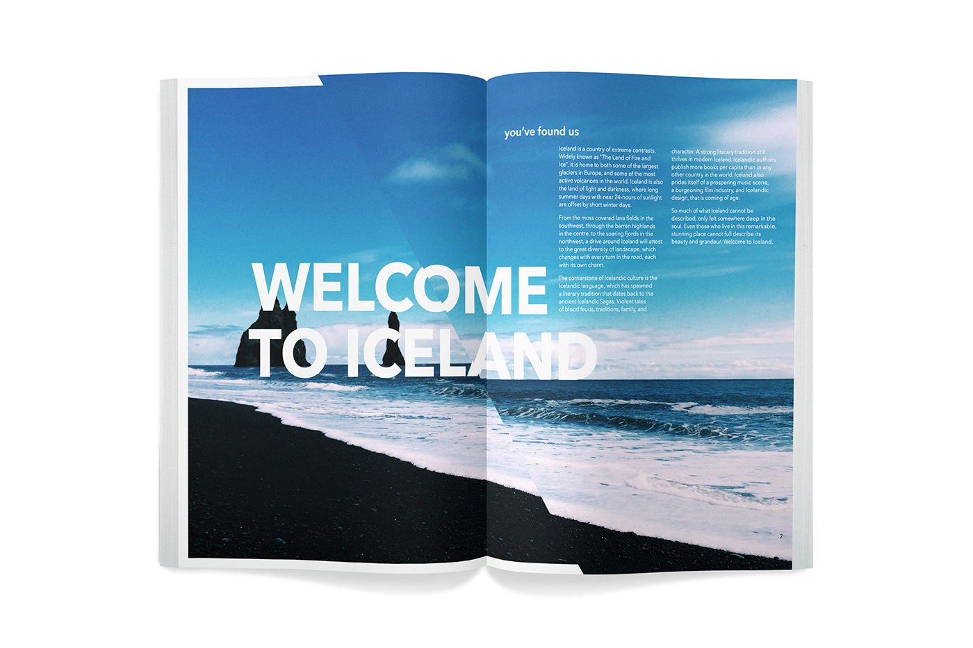
The goal for the Icelandic brand was to display the beauty and epicness of Iceland while staying uniquely Icelandic. The result is a brand that displays the grandeur of Iceland without distracting or becoming about itself.
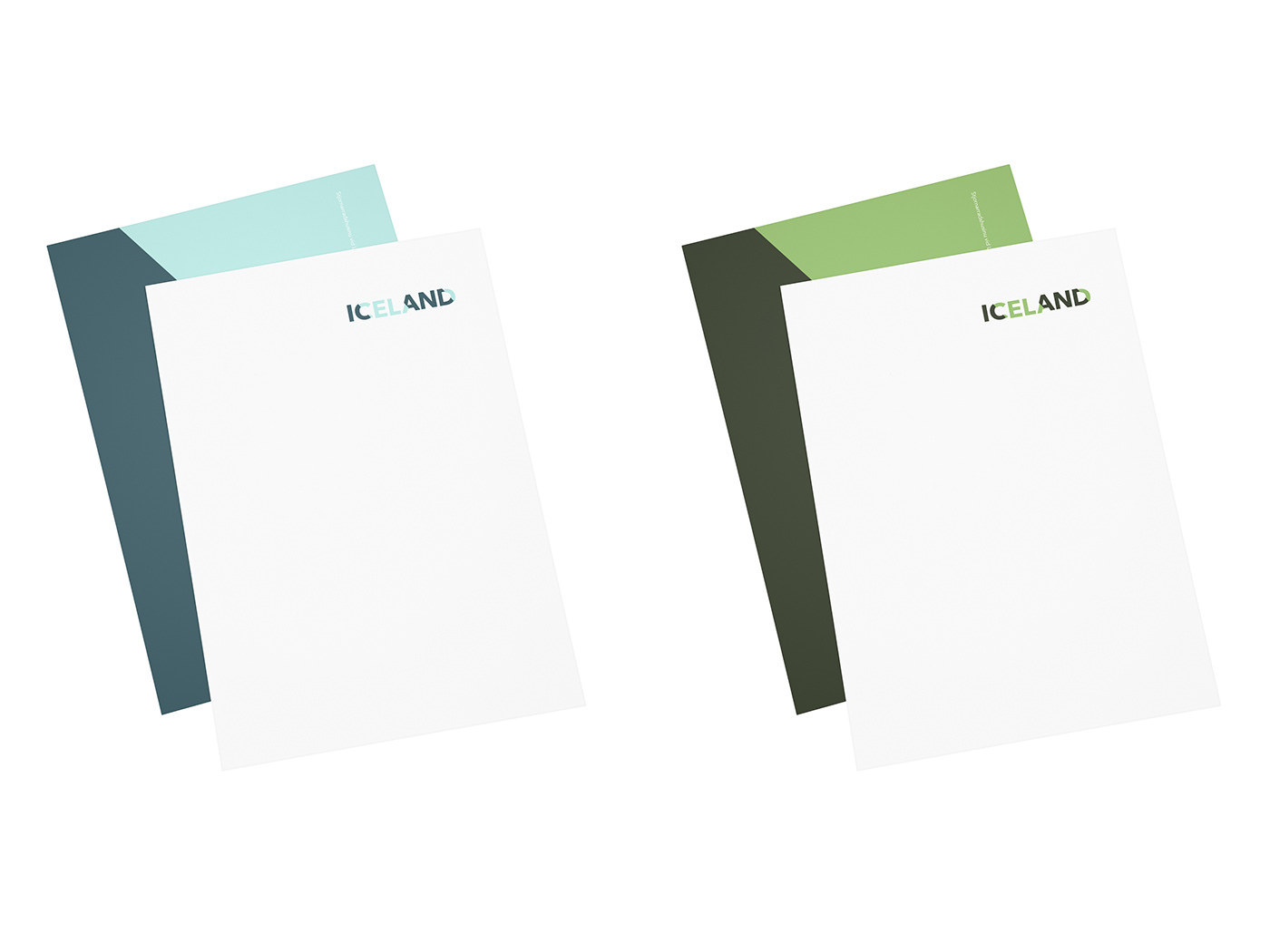
Iceland's topography ranges from stark ice wastelands to red-hot erupting volcanoes. Because of this dramatic shift, each region of Iceland was given a unique color palette.
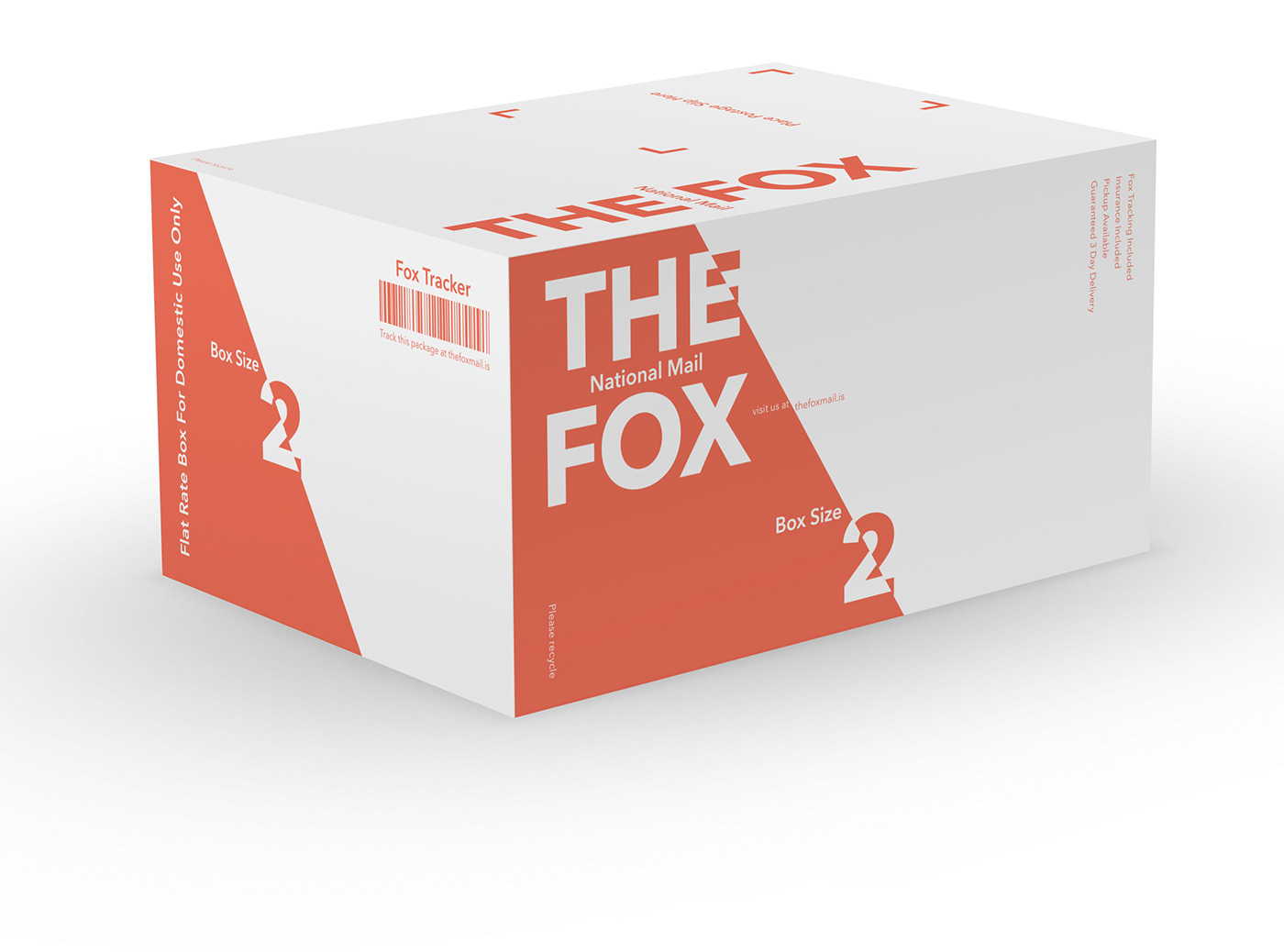
Included is a sample identity for the Iceland National Mail (The Fox). The Fox National Mail is an example of a possible application of the Icelandic brand using the brand attributes outlined in this book.
The Fox utilizes the primary color palette, color fields, and type cut by the angle as well as the same typography rules as the main Icelandic brand. These attributes give this sub-brand its own feel, while still remaining confidently under the umbrella of the primary Icelandic brand.