Since 2015 we've worked with Rhythm & Vines to reposition
the brand and reclaim their position as New Zealand's
premier music festival & NYE event.
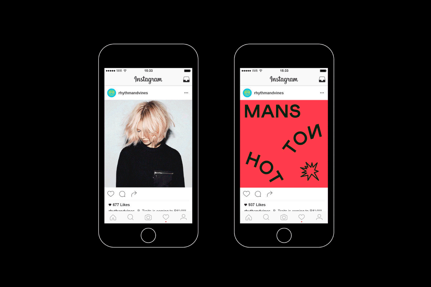
Each year the R&V logo has been reimagined
as a container logo that could adapt to tell different stories and
convey different emotions by using an emoji in place of the ampersand.
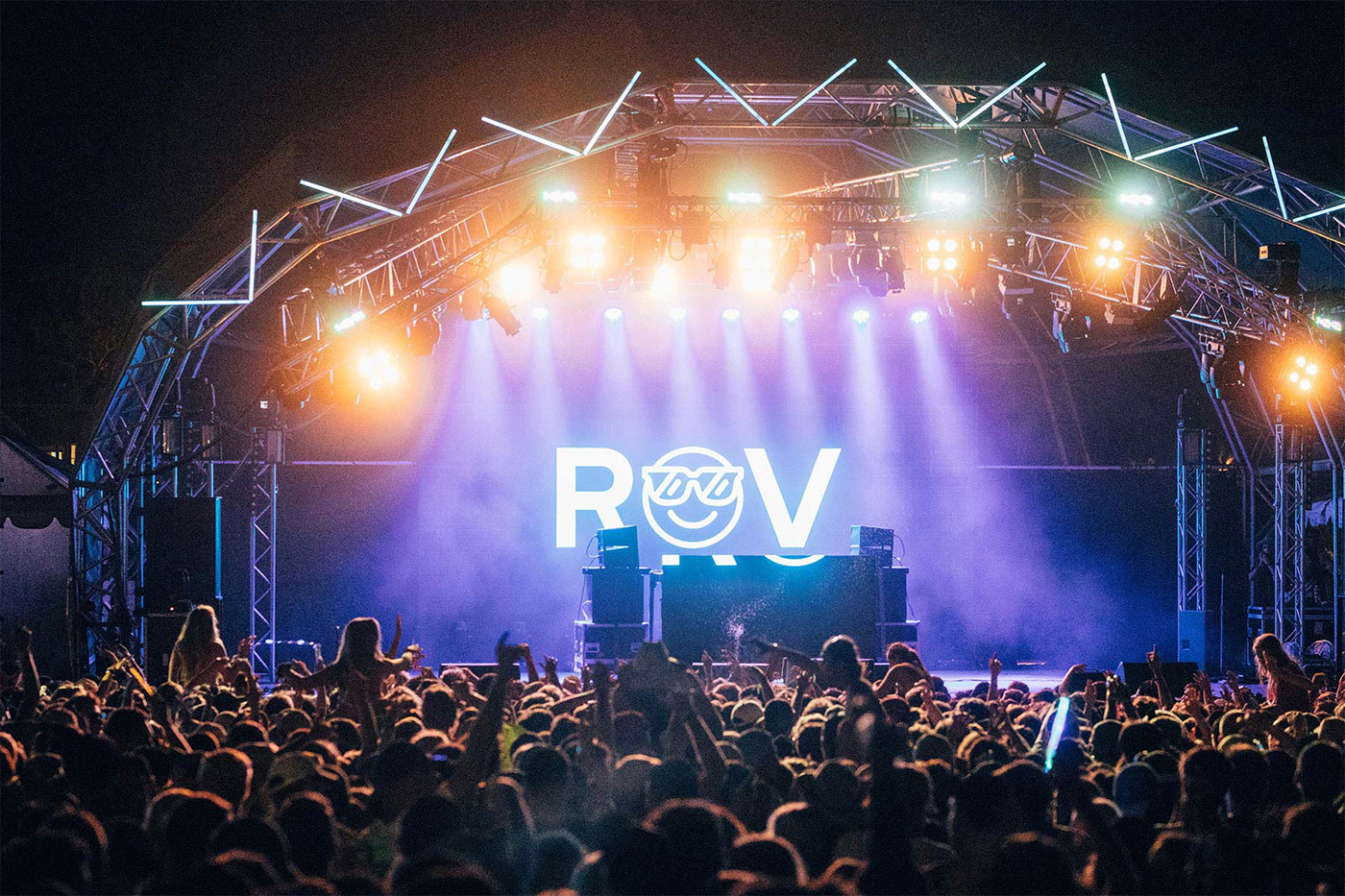
2017 marked the 15th anniversary of the festival and a retrospective
exhibition for the event. This was communicated visually using
reflected typography and the sunglasses emoji.


Our goal was to build a brand that would capture the range of emotions
and experiences of the festival and engage with their core
audience in a meaningful way to build brand loyalty.


In 2016 the identity featured the sun emoji, hot colours and cascading
typography as Gisborne in New Zealand is the first place
in the world to see the sun rise in the New Year.


Each year the identity has been updated with a new emoji logo, new
colours and new layouts to strike the balance in maintaining
brand awareness while staying fresh and relevant.


Today tickets are selling out faster than ever before with strong
brand awareness and loyalty. Rhythm & Vines continues to
push the boundaries in creating a world class festival
showcasing top international and local talent.


