
/packaging /branding
Sammontana UAU!
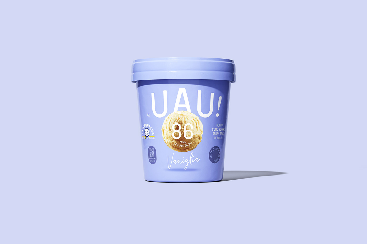
From Sammontana, an ice-cream with a high-protein and low-calories recipe. Once you taste it, it’s nothing but UAU!
CLIENT
With over 70 years of history in ice cream making, Sammontana is the Italians’ favorite industrial ice cream and frozen goods brand. The Group operates in 5 production sites around the country and counts over 1000 employees. Sammontana indubitably means Italian Summer.
ASSIGNMENT
Give birth to a whole identity to a new product: an ice-cream with a high-protein and low-calories recipe, tasty as always but lighter than ever. This new product should transmit lightness and taste through the packaging’s look.
SOLUTION
Design of an enlarged imaginary through the creation of naming, the logo design, the shooting art direction, the identity definition and finally the packaging design of the product.
A levitating ice-cream ball visual narrates the lightness of the product in a self-explaining manner, while a white and pure typography plays around the packaging, contrasting with the pastel colors of the backgrounds.
A levitating ice-cream ball visual narrates the lightness of the product in a self-explaining manner, while a white and pure typography plays around the packaging, contrasting with the pastel colors of the backgrounds.
PROCESS
Creation of naming, logo and brand identity of the product, following art direction of the photographic shooting of the still. Definition of a color palette for the two packaging references.