As part of my Interface design course, I was asked to redesign an existing website for better user experience.
Website chosen:
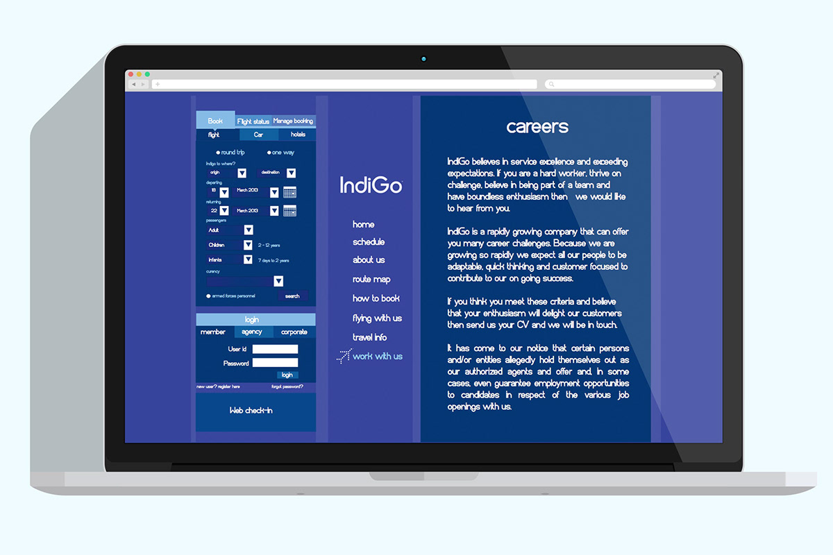
IndiGo airlines

The existing website had problems with the hierarchy of information, navigation and it didn't convey the entire fun and casual feel of the brand itself.

I identified the four main purposes users visit the website and designed it as part the opening page. Pop ups open up on the same page which decreases the need for the users to get linked to another page. Scrolling down will lead to the pages below.

As booking flights is the primary purpose of the website, I decided to keep that constant on the left along with the main headings.


Images are sourced from the internet for reference purposes only.

