
Hi folks! I want to show you my personal experiment work for new logo of the One best and big Fashion company ZARA. This company already exist in many country and one of them is in my country, Indonesia. You can visit their website here https://www.zara.com/id/
From the past year I have seen many good progresses and expansions from this company, but on my opinion, their current logo cannot represent that progress and expansion. So, I decided to re-design it.
DISCLAIMER :
This personal project may not reflect the views or plans of ZARA.


i Think and in my opinion as a logo maker, this logo is too monoton and lose their element of luxurious and symbollic. We know ZARA is Fashion Company with style and luxury. So, i try to make a new one with that all element.
Now I present you the new ZARA LOGO

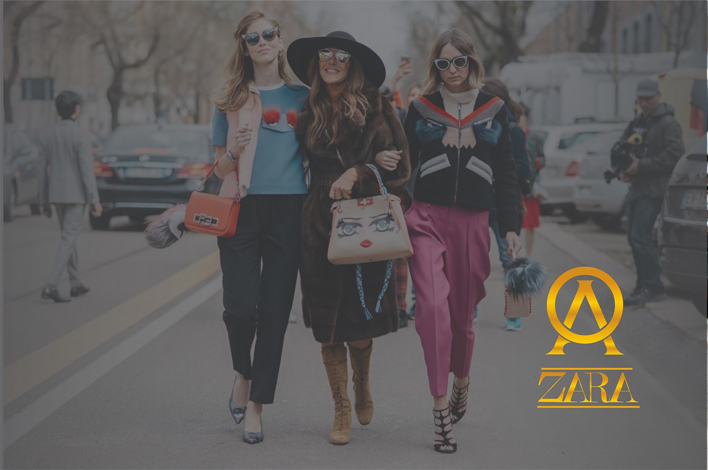


i Give a symbolic element for this Zara Logo. Thats a monogram style combinaation of "A" and "O", thats two capital is inisial from the founder of Zara. AMANCIO ORTEGA.
The reason why i give a monogram symbol between the Zara wordmark is because in my vision, one of the biggest company like Zara need more element just then a wordmark like before. Then the symbol logo can be following the trend as a shapeshifting type. that can be applicate to a little product as a symbols.


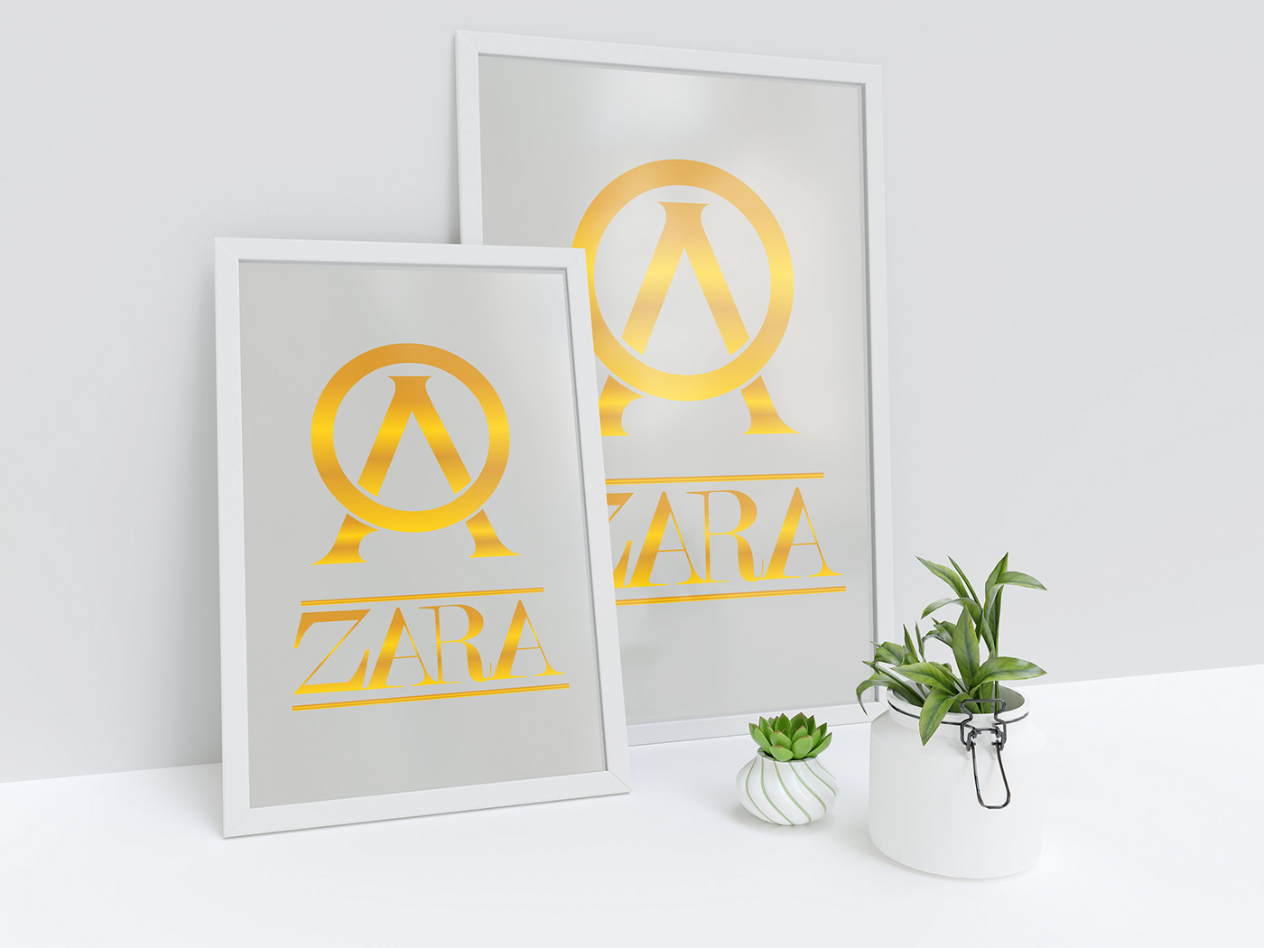
The Second Change i make it is a new style of custom typography from wordmark logo name "Zara". the old one give a element of unity from one letter to another. thats give a meaning a "Sturdy" as big company. But, i think that not enough. Thats why, i give a line in the upper and bottom of typgraphy, then make a new custom typography wordmark logo.
A line to give more "Sturdy" and i still make a unity concept at new typography. A letter still connecting eaach other.

The third change is the color of the logo. I give a gradient logo to make a gold color. I give gold color because GOlD has a meaning of luxury. the old color of logo is black.i know black give elegant meaning, but, black also one of a basic color for a have logo. I think "ZARA" need something more luxury, more looks than just elegant to give a symbolic everyone thats a luxurious Fashion.


That's all guys!
Well! Actually it's only an idea which aim to make a better design experience for ZARA. ZARA Company can see this post.
These all are designed by ME. I want to say thank you to all of you that have already supported this project.
Hope you enjoy this work! :)
--------------------------------------------------------------------------------------------------------------------------------------------
PS. If you have something to say about this project, please kindly contact me dennisrainsingh@gmail.com
--------------------------------------------------------------------------------------------------------------------------------------------
If you do love my work, please hit Appreciate button below. Thank you :)


