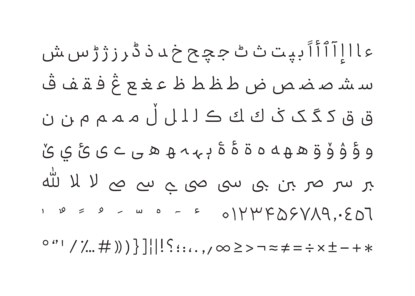
The Titr font is still one of the first options for designers to use in serious titles, and this is the main reason why Ray typeface family was created. We created Ray to cover the needs of having a serious and heavy typeface to use in marketing and advertising content. A strong and unified typeface with little ascenders and descenders, with smooth and angled surfaces that attracts the audience’s attention.
Not to mention that Ray can also be very useful in the press.
Ray is inspired by the familiar forms of Naskh Script in a modern way, with new proportions. We designed the regular weight of the typeface to be used in advertising content and letter writing. That is why it is less exaggerated, curvier, and somehow kinder.
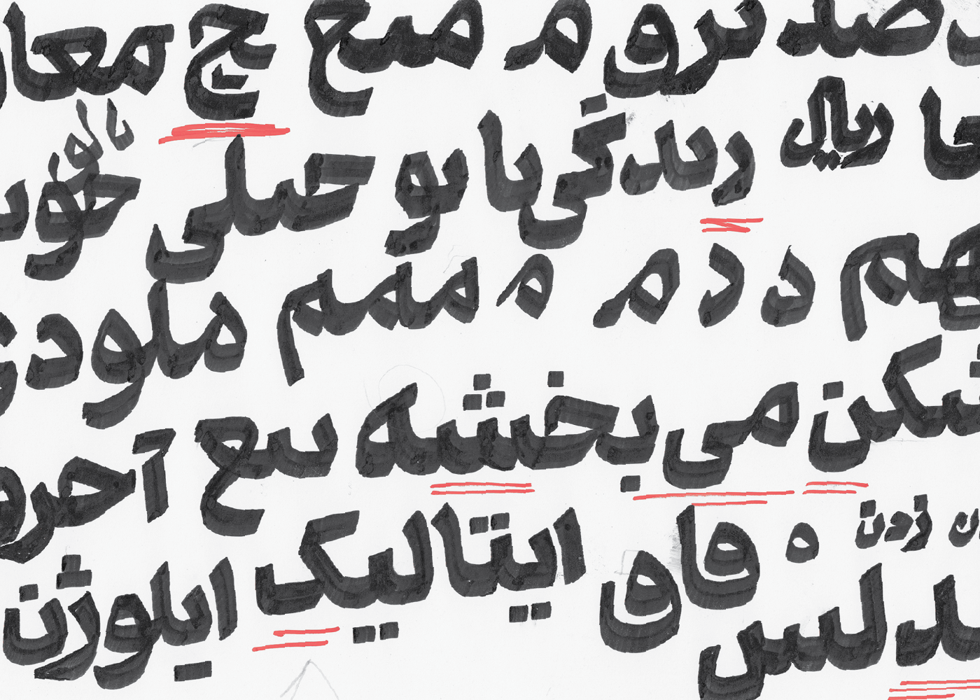
Unlike other typefaces, the design process of Ray started with Black weight and then we created the regular weight based on the Black proportions. This approach leads us to explore new ways and ideas throughout the process. Not to mention this font supports Farsi, Arabic, Urdu, Kurdish, and Jawi languages.
We started Ray typeface design in 2015 and completed its seven weights by 2019. Ray typeface was co-designed by Reza Bakhtiarifard and Omid Emamian, and was released on Maryamsoft’s font shop.
*Ray is a city's name in Iran
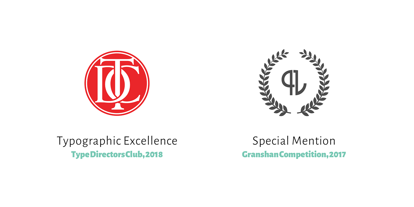
So far, Ray has been received two international honors:
• Special mention from Granshan international type design competition in 2017.
• Certificate of Typographic Excellence from Type Directors Club (TDC), which is the most valid international typeface certificate, in 2018.
You can buy Ray from Maryamsoft.com
*if you haven't Iranian bank account, contact Maryamsoft
*if you haven't Iranian bank account, contact Maryamsoft
هنوز هم فونت «تیتر» جزو اولین انتخابهای طراحان برای استفاده در عنوانهای جدی است؛ و این مسئله ایدهی اصلی شکلگیری تایپفیس «ری» بود. این فونت را با هدف پوشش نیاز به فونتی جدی و سنگینوزن برای استفاده در حوزهی تجاری و تبلیغاتی خلق کردیم. تایپفیسی با استخوانبندی محکم و منسجم، فراز و فرودهای کوتاه، دارای سطوح صاف و زاویههای فراوان که نگاه مخاطب را میرباید.
گفتنی است که ری میتواند در حوزهی مطبوعات هم بسیار کارا و توانا باشد.
ری برداشتی امروزی از فرمهای آشنای خط نسخ است با تناسباتی نو. وزن رگولار این فونت را برای استفاده در بدنهی متنهای تبلیغاتی و نامهنگاریها طراحی کردیم و به همین دلیل اغراق و تنش کمتری دارد، منحنیتر است و مهربانتر. این فونت از زبانهای فارسی، عربی، اردو، کوردی و جاوی پشتیبانی میکند.
مسیر طراحی ری برعکس روش متداول بود؛ وزن رگولار را پس از وزن بلک، و با توجه به تناسبات آن طراحی کردیم. این روش باعث شد تا در طول کار نکات جدیدی کشف کنیم. طراحی تایپفیس ری را در سال ۹۴ آغاز نمودیم و تکمیل ۷ وزن آن تا سال ۹۷ طول کشید. تایپفیس ری با همکاری رضا بختیاری فرد و امید امامیان طراحی شد و در فروشگاه قلم نرمافزاری مریم عرضه شده است.
تا امروز، تایپفیس ری ۲ افتخار بینالمللی کسب کرده است
در سال ۲۰۱۷ دیپلم افتخار مسابقهی بینالمللی و معتبر گرانشان را کسب کرد
در سال ۲۰۱۸ موفق به دریافت نشان تایپوگرافی ممتاز از باشگاه طراحان تایپ امریکا شد که میتوان گفت معتبرترین گواهی بینالمللی طراحی تایپفیس است
Motion by Abbas Jahani