

A company which values employees, community, and the environment. Nucor, a North American steel manufacturer with mills across the nation. This was a practice in rebranding a company who was communicating well as a steel manufacturer while missing the emphasis on community and being environmental stewards.
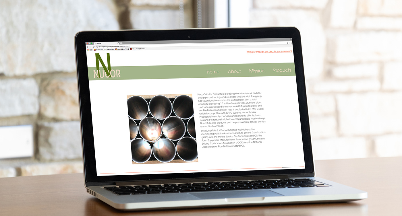
The alternate brand features a logo with a san serif typeface, representing the strength of steel, while having a neutral color palette, representing the importance of being environmental and allowing for a more approachable appearance for the community.
To interact with the website featured in the video above click here.

Nucor creates its high quality products with scrap steel, some they collect from the surrounding community. The app was created to assist in these efforts, to allow Nucor better communication with the community. Features such as receiving monthly reports and goals helps people to stay involved and feel they are truly helping save the environment.

To interact with the app featured in the video above click here.
*This was created for the purpose of practice. The copywriting and imagery can primarily be located on the companies official website.*