Formara Brand refresh... sneak peek
Overhaul of the Formara brand. The aim is to market ourselves as a 'luxury' brand that isn't just a 'printer'. I have avoid the typical cliches used by many printer brands, such as CMYK colours, paint splashes, halftones etc, and instead concentrated on beautiful colours and implementing our rabbit icon as a design device.
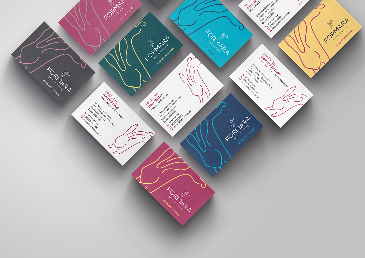
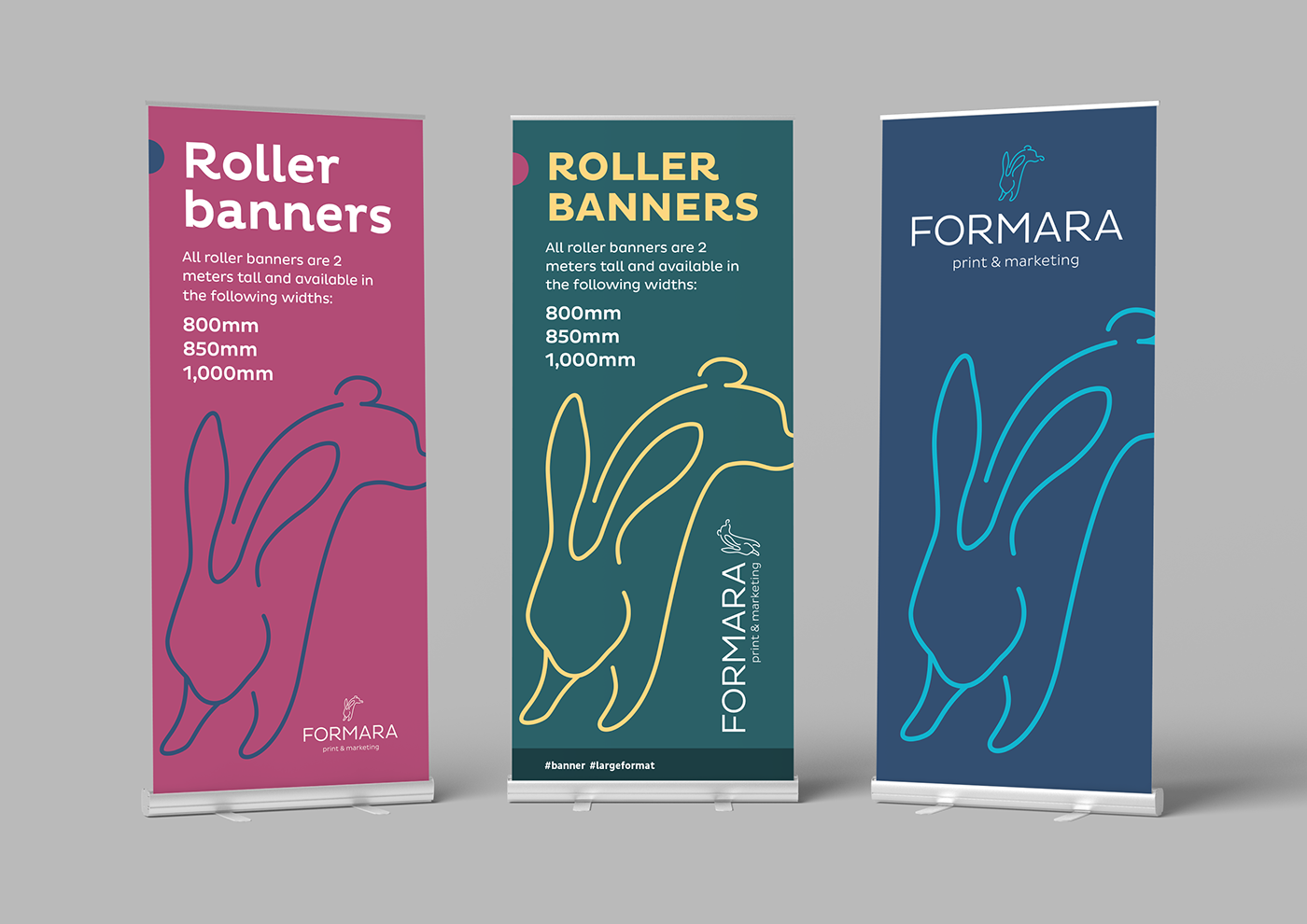
Colour: PMS 220U 'pink' is still our primary colour, but so far is has only been used with black, white and grey. I felt that as a print, design and multi-channel marketing company we should appear to be more colourful. As such, I developed a suite of colours that complement the pink with similar classy dark shades and a couple of light highlight colours inspired by Farrow & Ball's luxury interior paint range.
Rabbit: The rabbit has long been part of Formara's history and has seen a few iterations over the years. However, it has only ever been used as our logo. I felt it was time to make a bigger deal out of our heritage and shout about the rabbit! The device works in conjunction with the new colour palette and allows us to use a wide array of colour combinations as demonstrated with the business cards below - rather than every card in a set looking the same, we have a variety of backs so they all look different. I propose to take this forward and implement it onto our other stationery items such as headed paper, compslips and coasters.
Work in progress and will update as it is developed through other print and digital media.