In the brand story, square is not just a shape, in fact, it is the symbolization of home. It is similar to how a circle symbolizes the people you interact with. Potato square is home to potatoes, where all friend and family are welcome. It is starting as a small home, with a few friends and family but will eventually grow to a much bigger home with many other members.
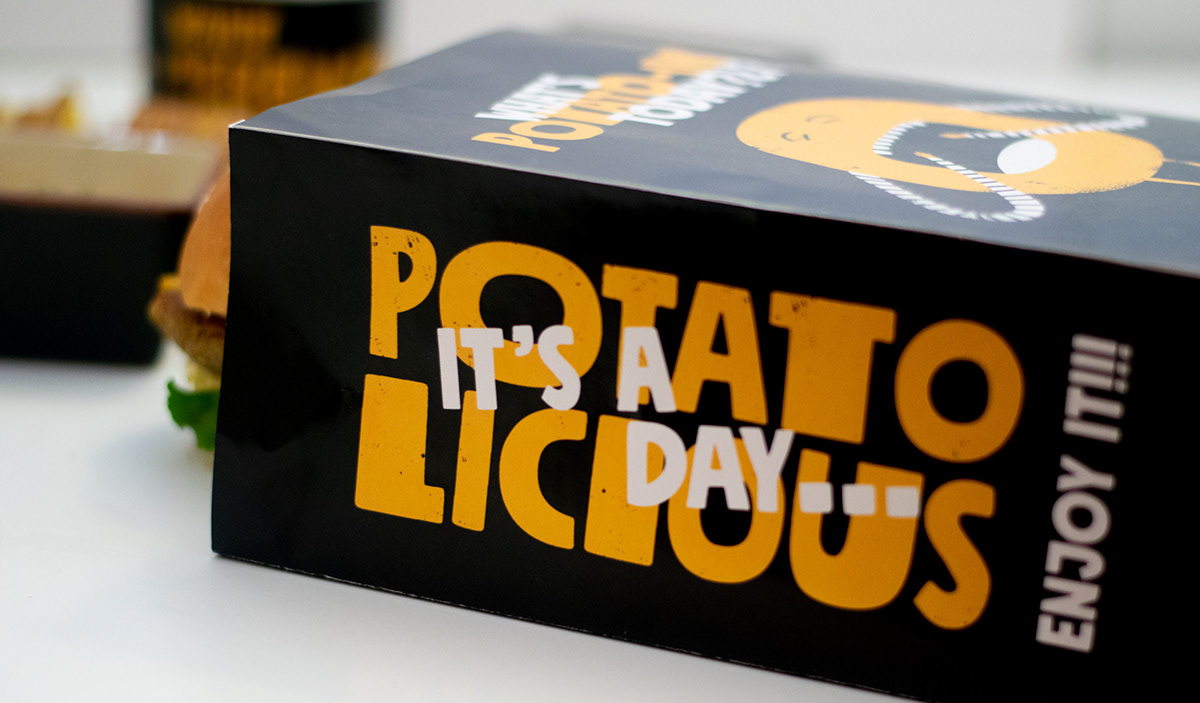
The packaging of potato square is inspired by the stamping method, a very basic and simple technique from which you can create millions of possibilities. Simple, yet fun with an informal typeface paired with potato stamp reflects the nature and usage of the potato itself. Potato Square is not just a logotype or mark, we have also designed a series of illustrations and characters with their background stories. The brand language is also developed by using a friendly wordplay on phrases we use every day.

— Overall identity look


— Paper wrap

— The potato family


—Who doesn't want a french hug?


— Potato Square

— Let's dig in!!!


— It's a potatolicious day...

— What's potato-in' today?


Potato square


