

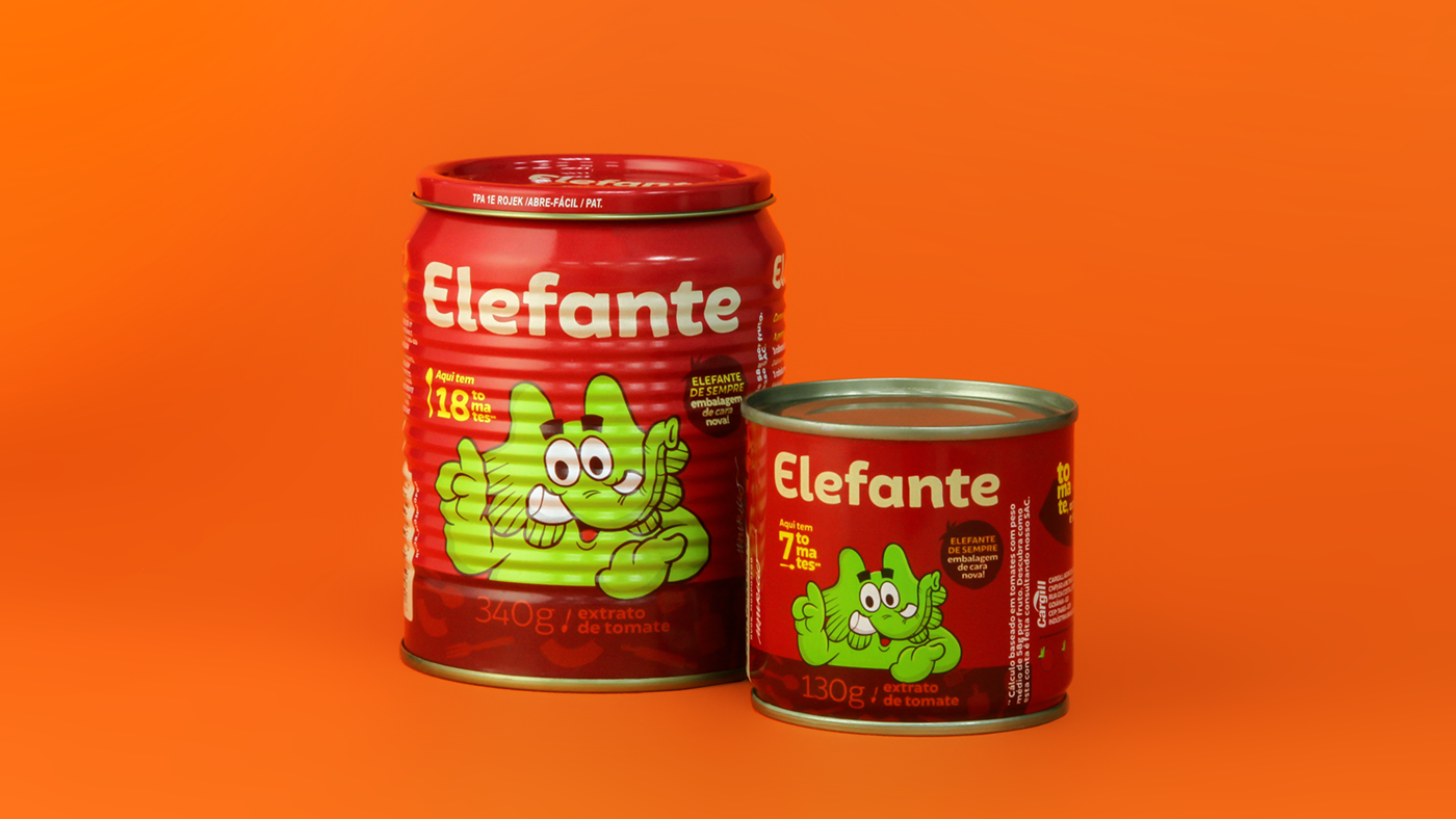
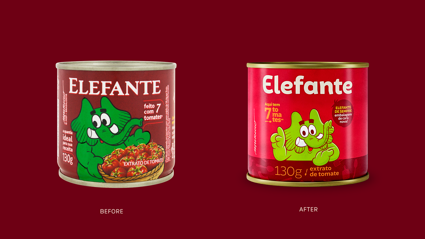
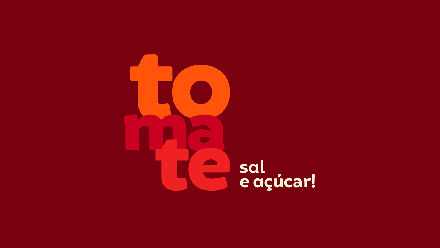
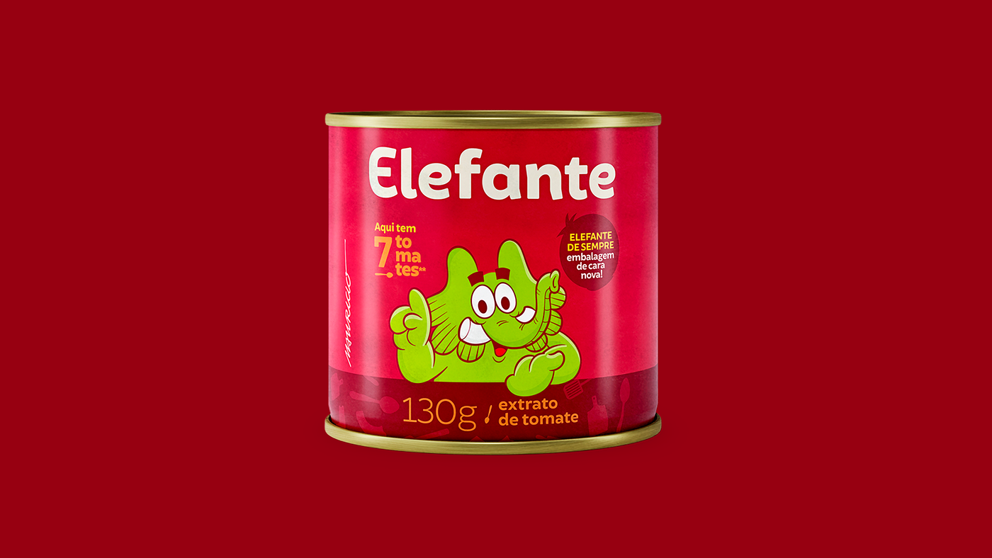
Elefante is a brand present in Brazilian homes and it needed updating. Our challenge was to show to new generations (that are now interested in cooking) how tomato sauce is a practical product, made with only three known ingredients: tomato, sugar and salt.
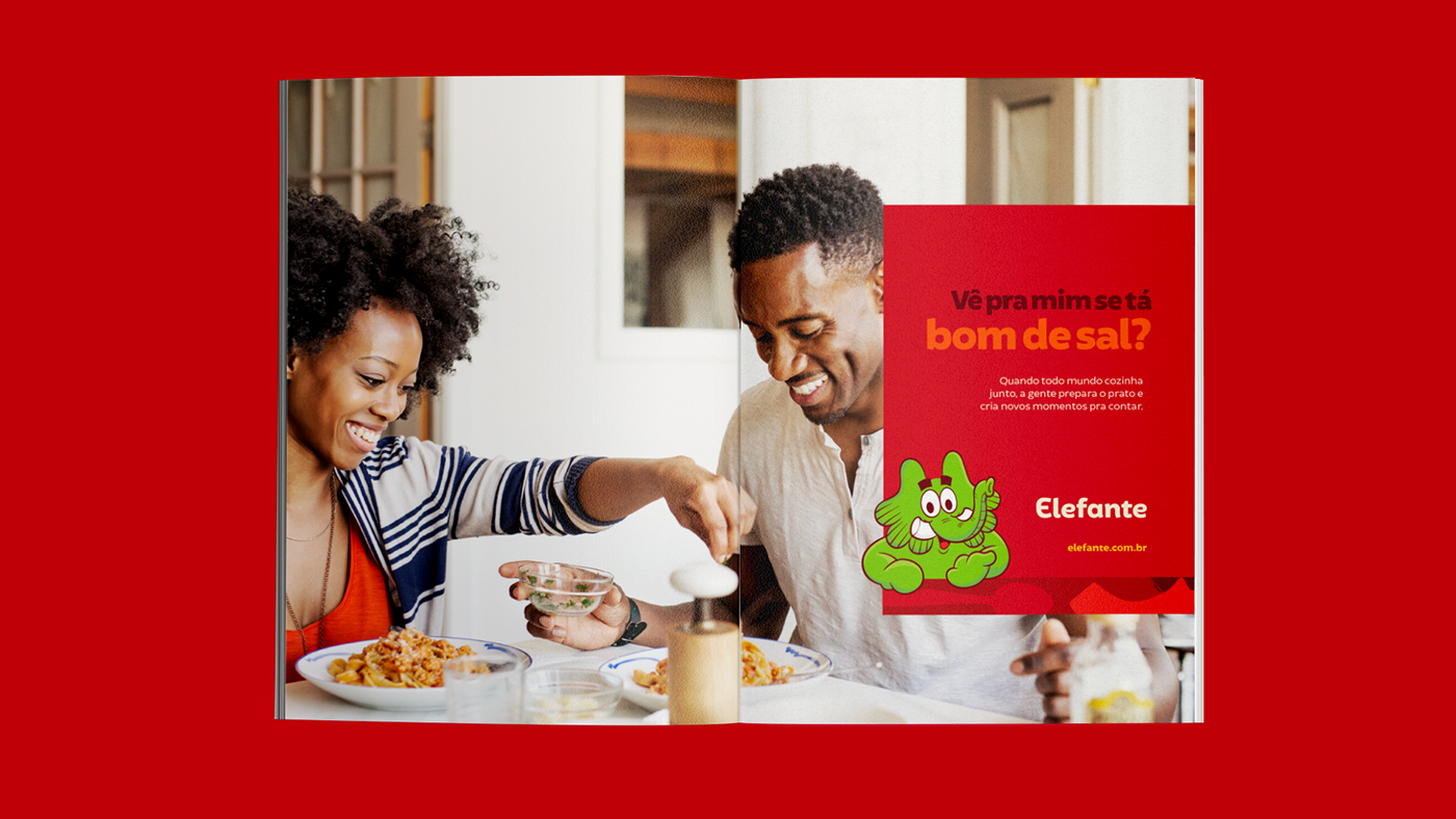
We understood that people lost connection with family and close friends. So we created Elefante as a brand that gather people around the table. The brand repositioned itself to make people more involved with food and we updated its identity and started to talk right to the customer, like equals.
We have brought a new way to talk about all that Elefante believes. Now, Elefante tells and participates of the stories that gather people together.
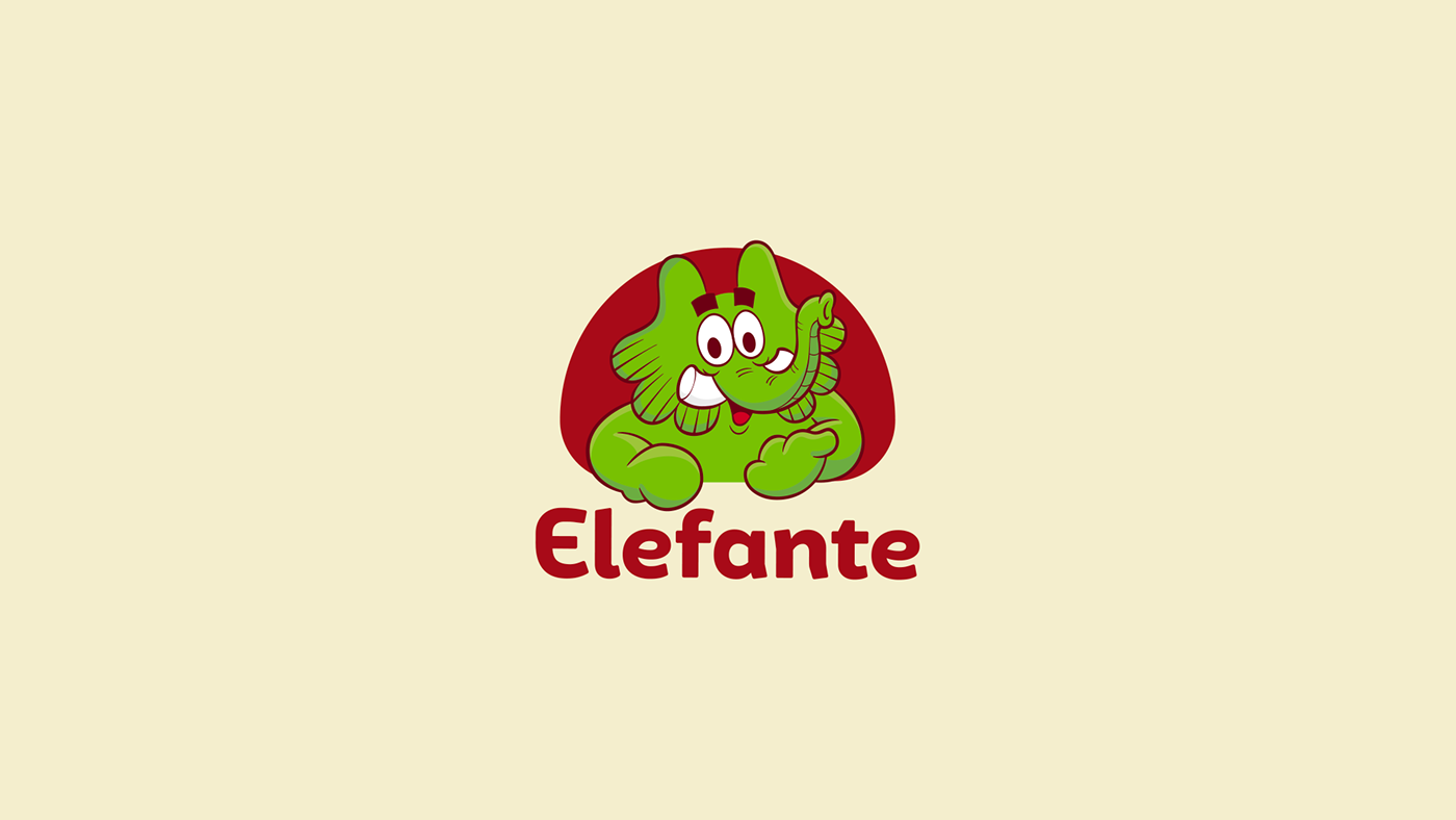
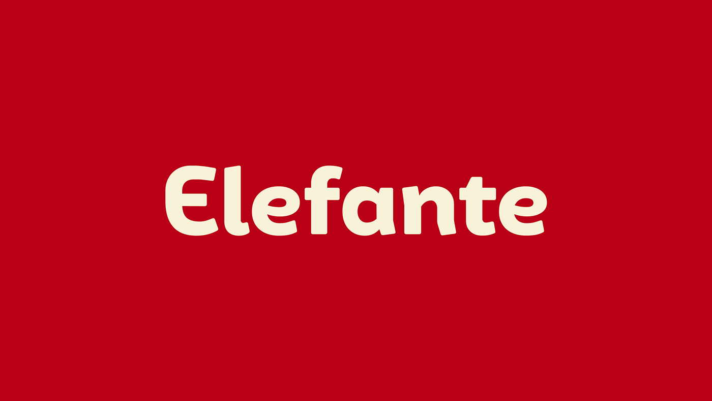
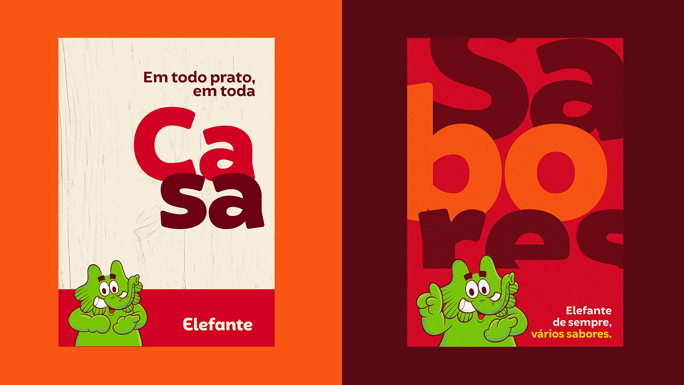
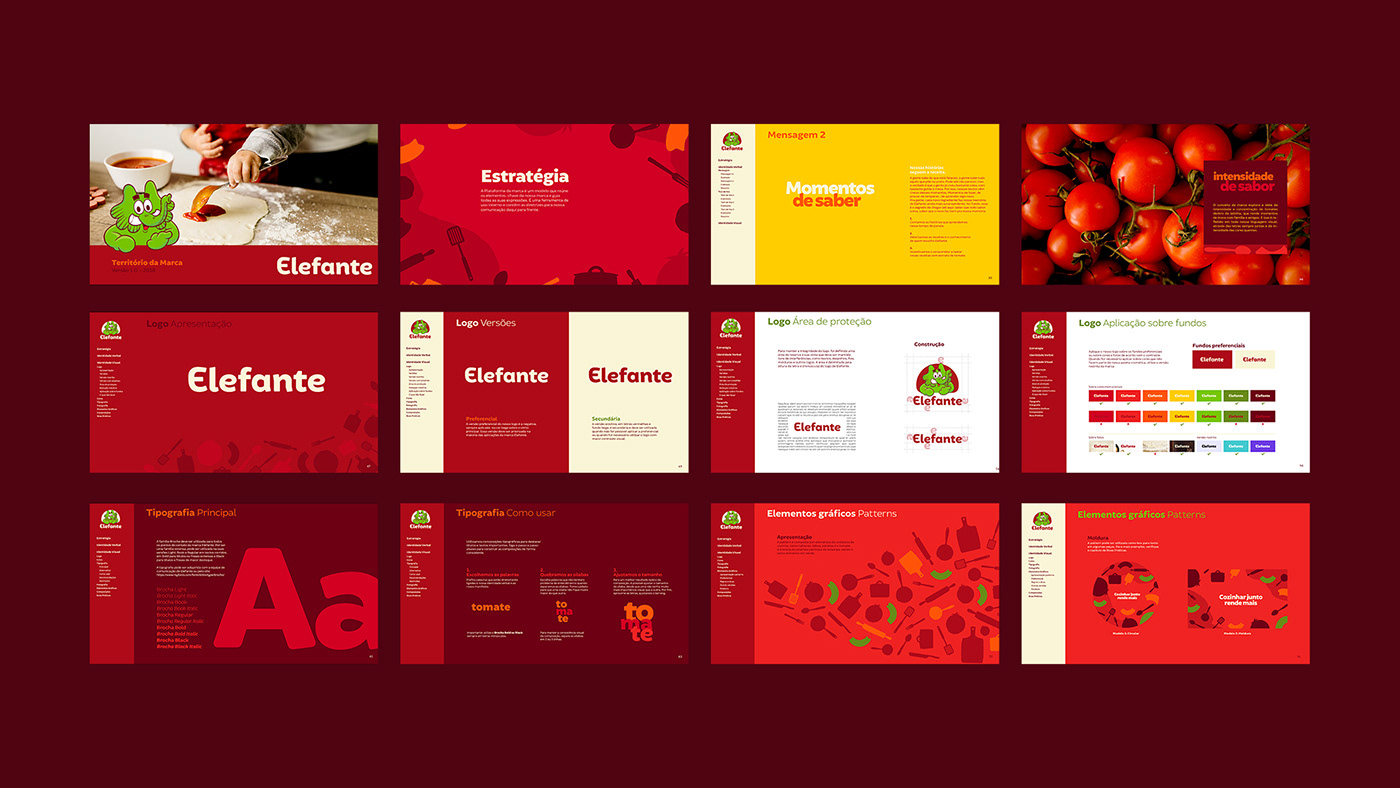
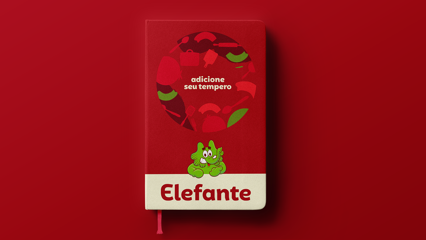
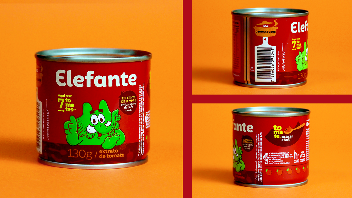
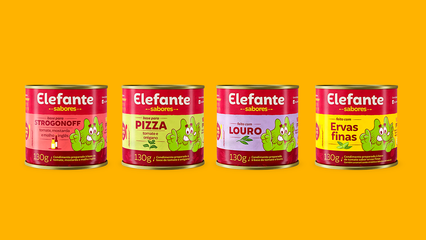
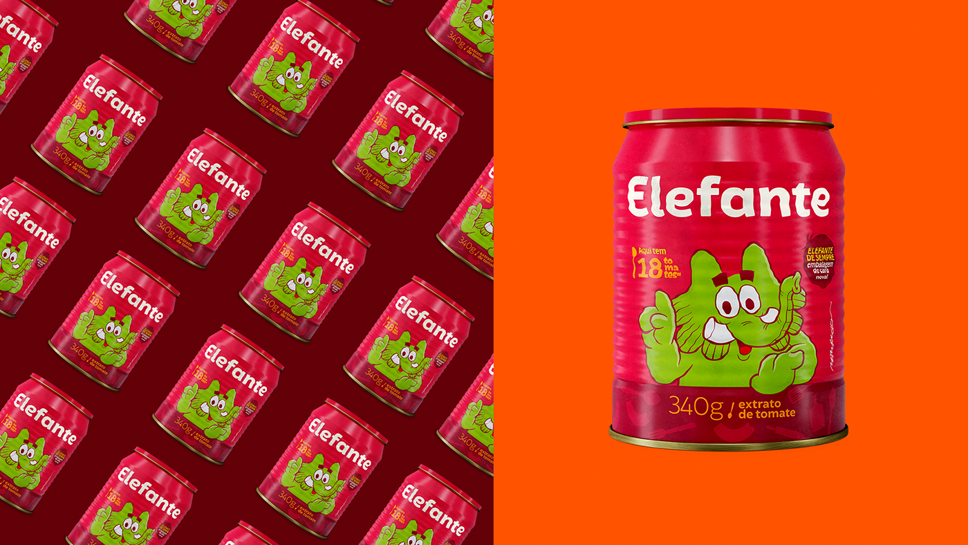
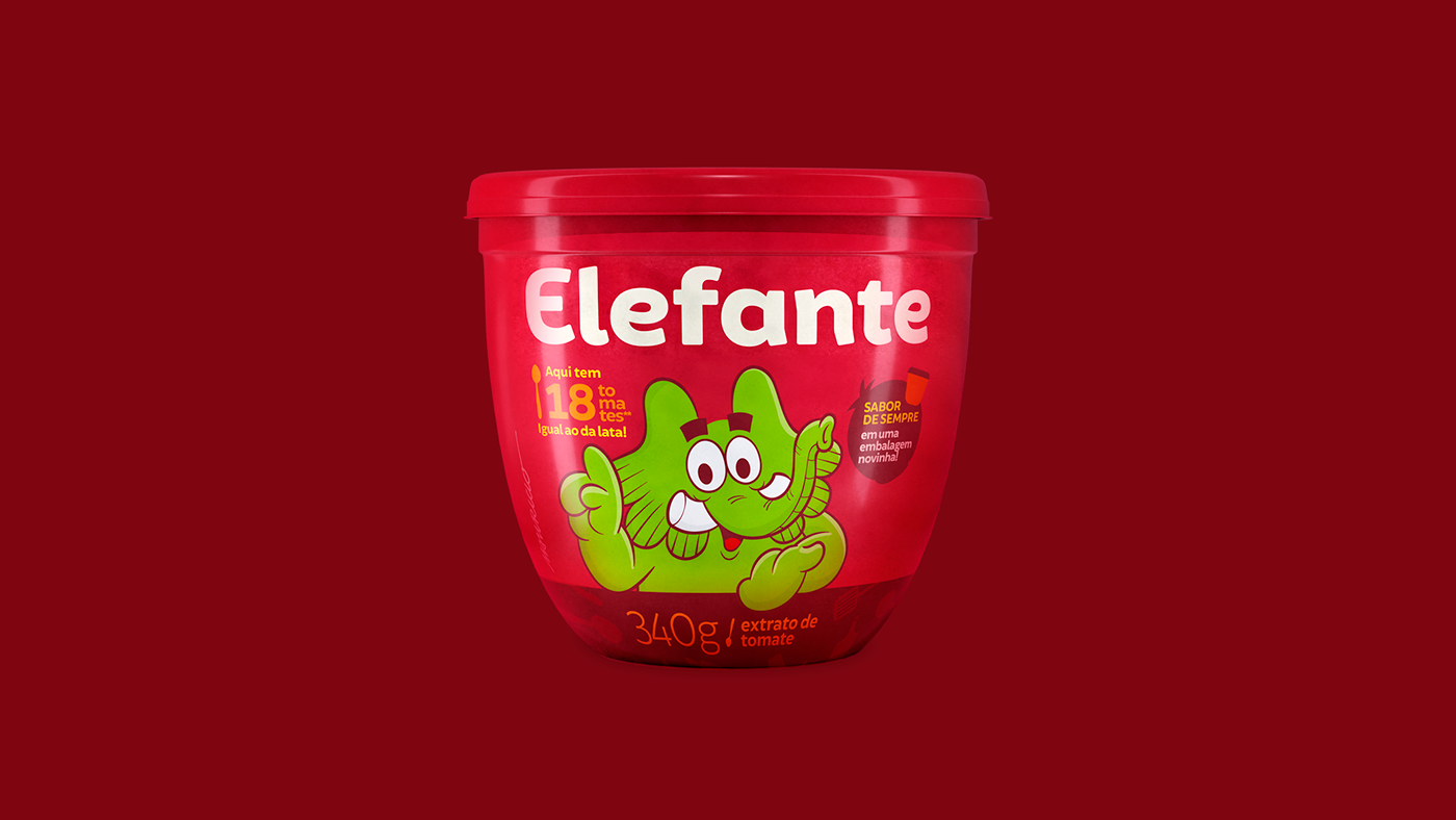
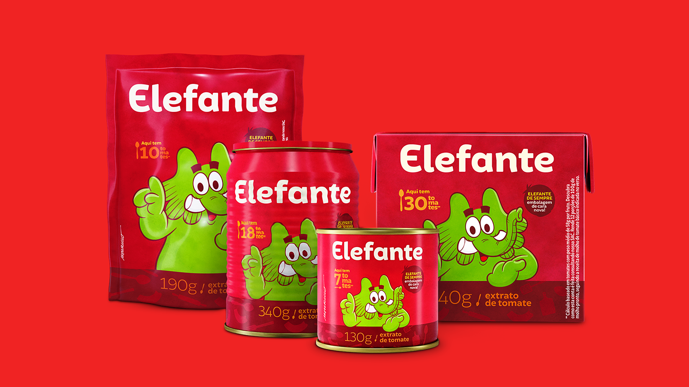
The new logotype is modern and clean, besides that it was designed to remind an elephant body, with clumsy terminals and bold structure. By the way, we updated Jotalhão, character created by Maurício de Souza, and adopted by Elefante brand since 1979. Finally, the visual identity explores the idea of the intensity and concentration of tomatoes inside the package, and this is reflected in all its visual language, with the letters always together and the warm colors.


Project by Interbrand São Paulo
Creative Director: Sergio Cury
Design manager: Leandro Strobel
Visual Identity and Packaging: Carlos Teles, Camila Kodaira
Verbal Identity: Giovanna Marques, Pedro Kastelic
Brand Strategy: Ivo Costa, Daniela Klepacz
Brand vídeo: Estudio Histeria!
Typography consulting: Fabio Haag
Packaging rollout: José Rago
Packaging photos: Luana Motta
Packaging mockups: Mazola Rímoli
Character Design (Jotalhão): Maurício de Souza Produções


