Only
-
Because in cosmetics, less is more:
Fewer and carefully selected ingredients obtain the highest benefits from them.
Fewer and carefully selected ingredients obtain the highest benefits from them.
This identity explains this concept with a minimalist language.
“Only” fulfills this attitude.
-
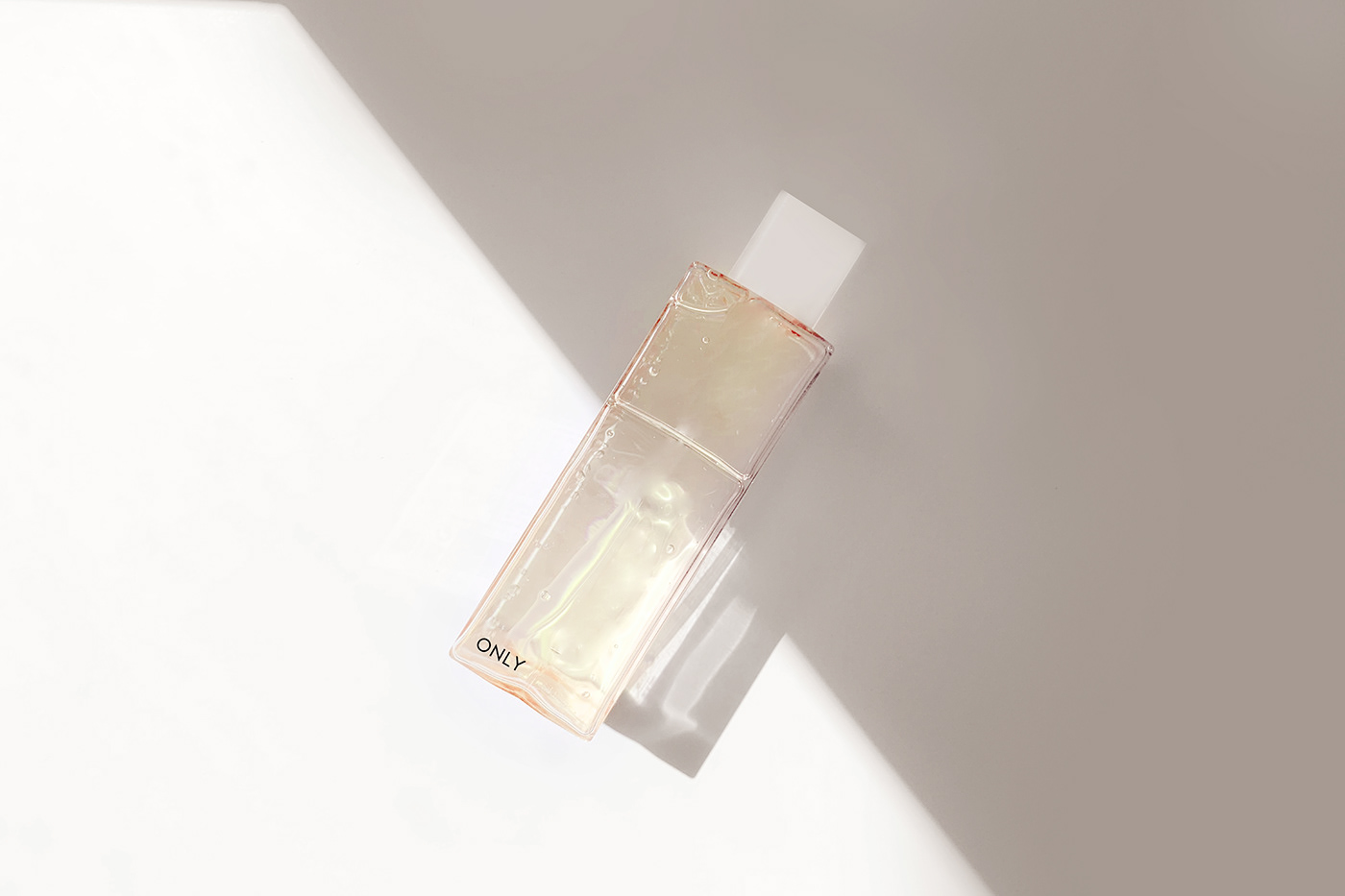
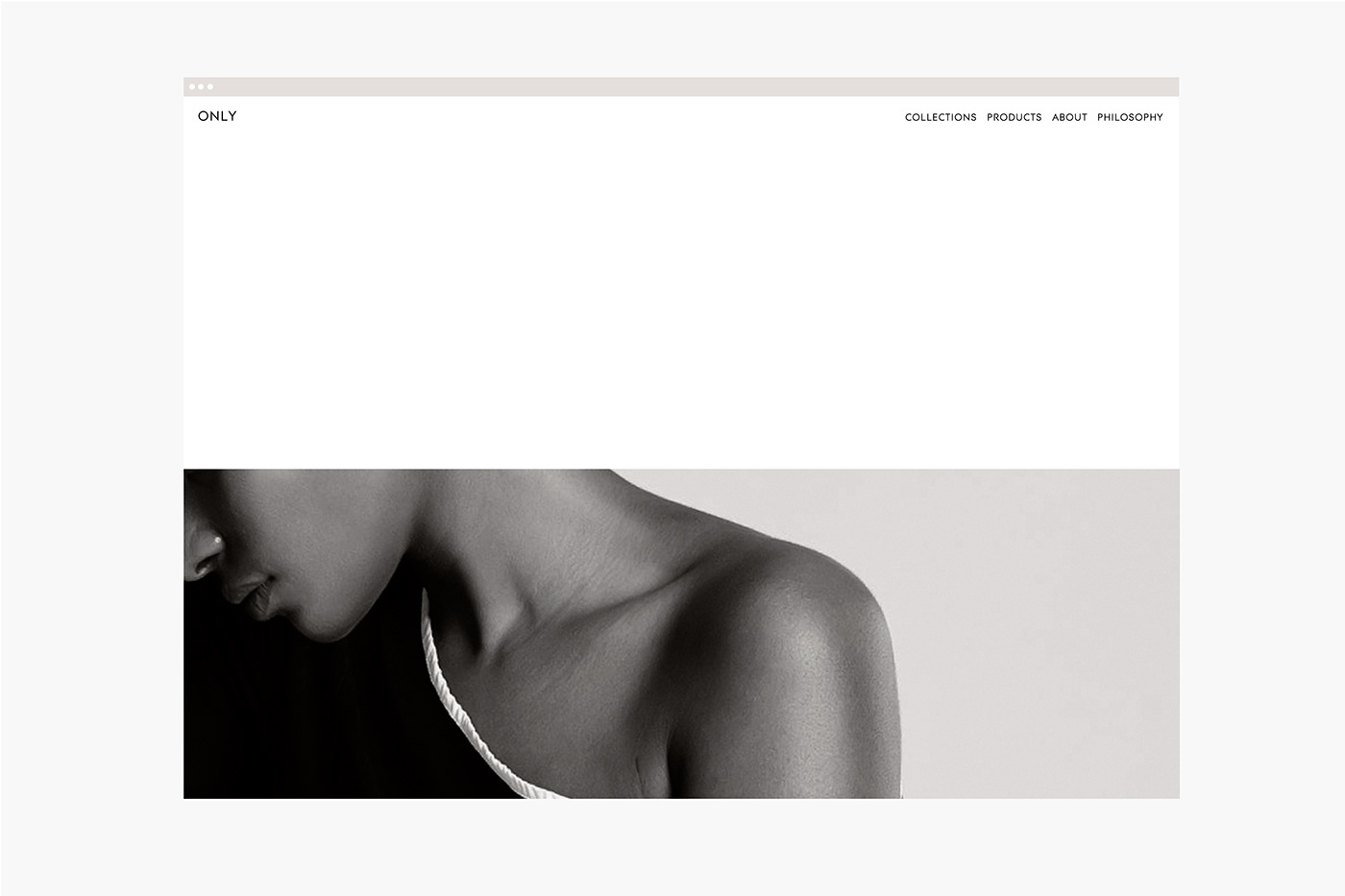
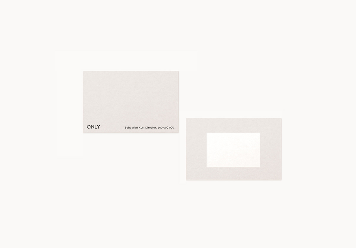
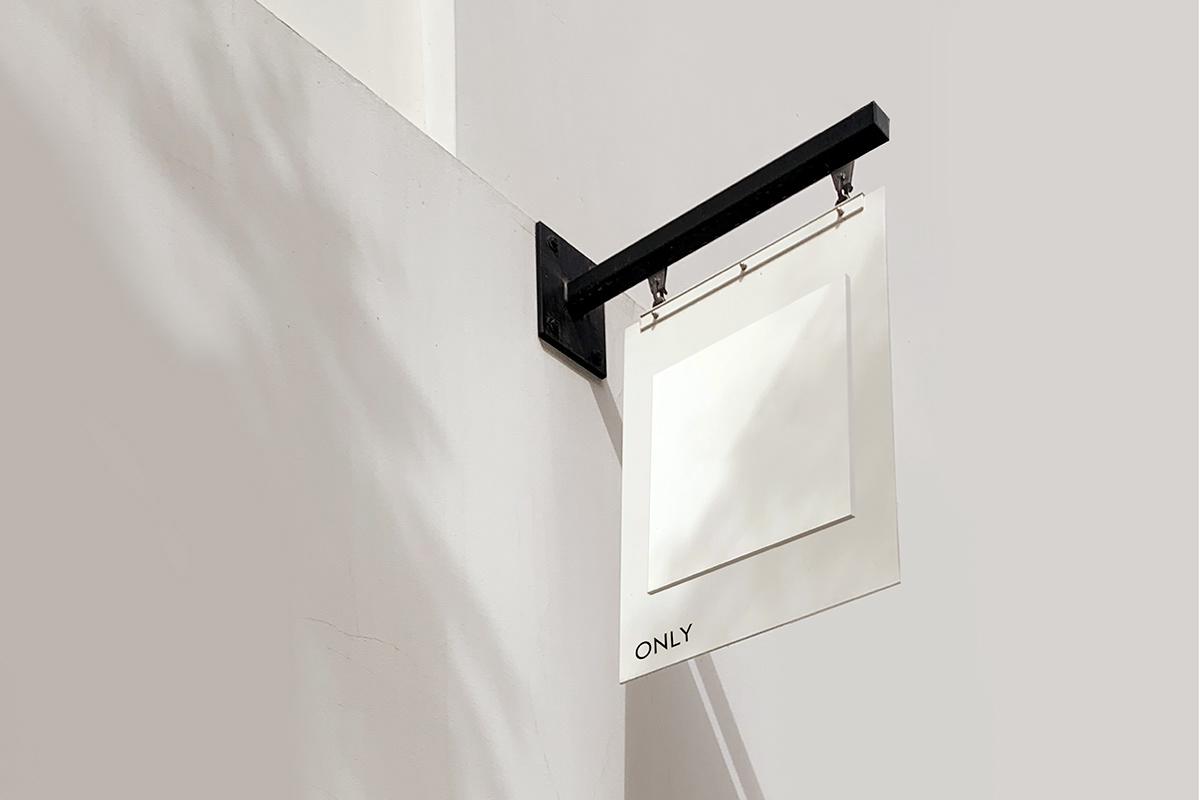
I developed a sleek, geometric identity for "Only", a small cosmetic brand.
The project included a complete conceptual development, visual identity and web design.
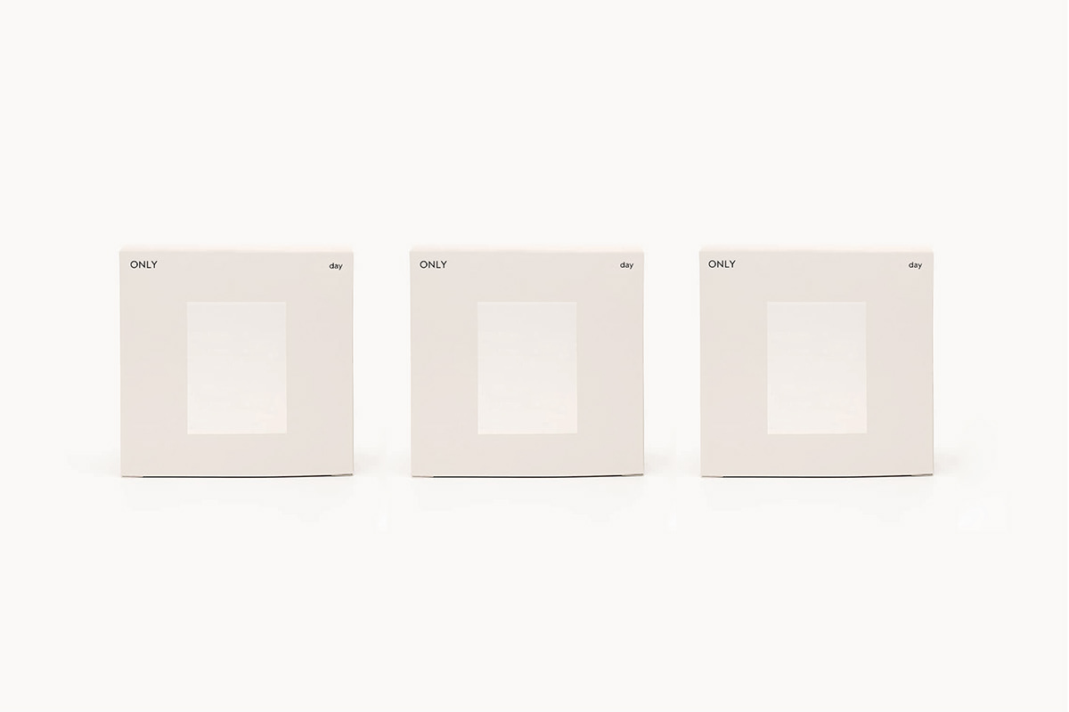
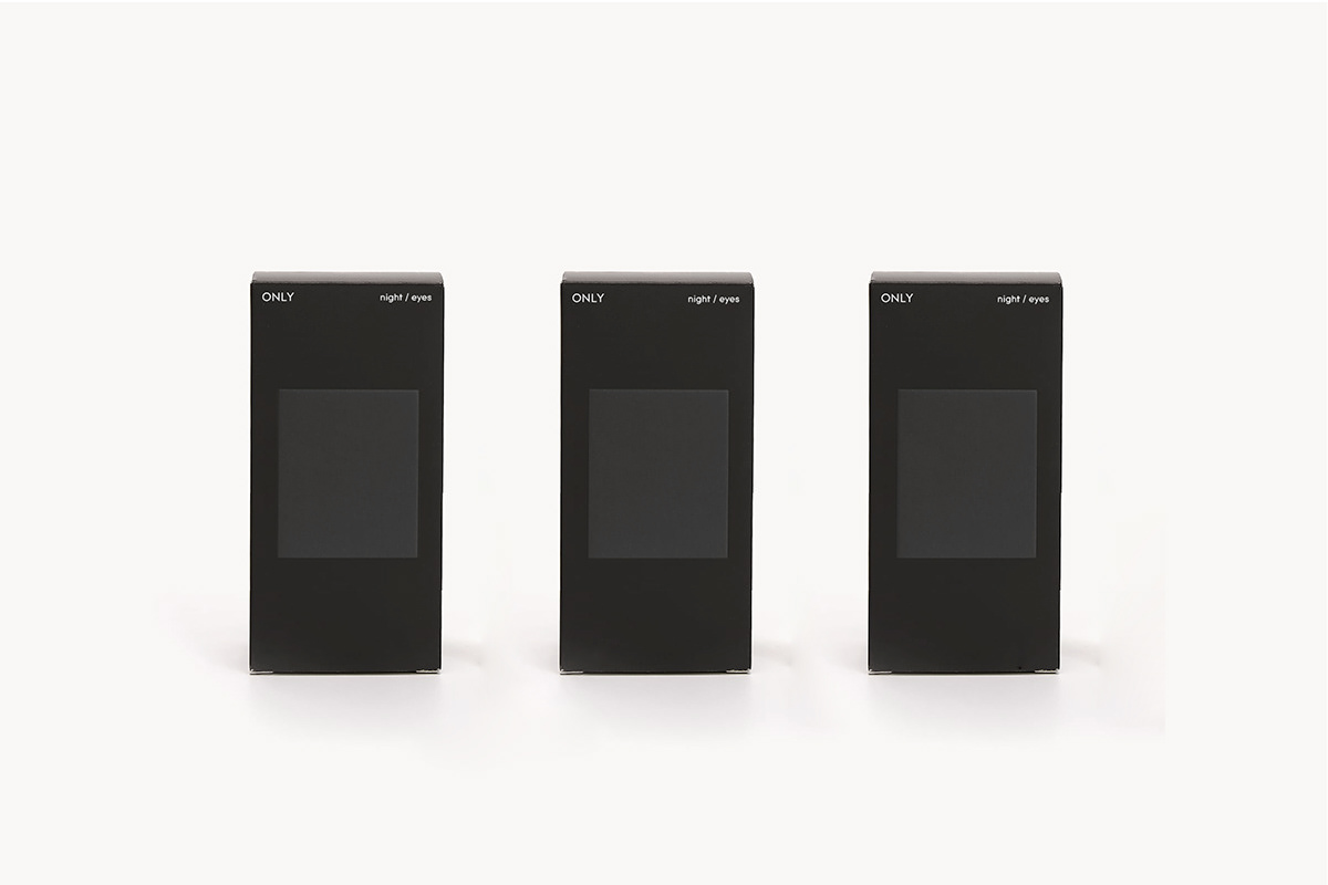
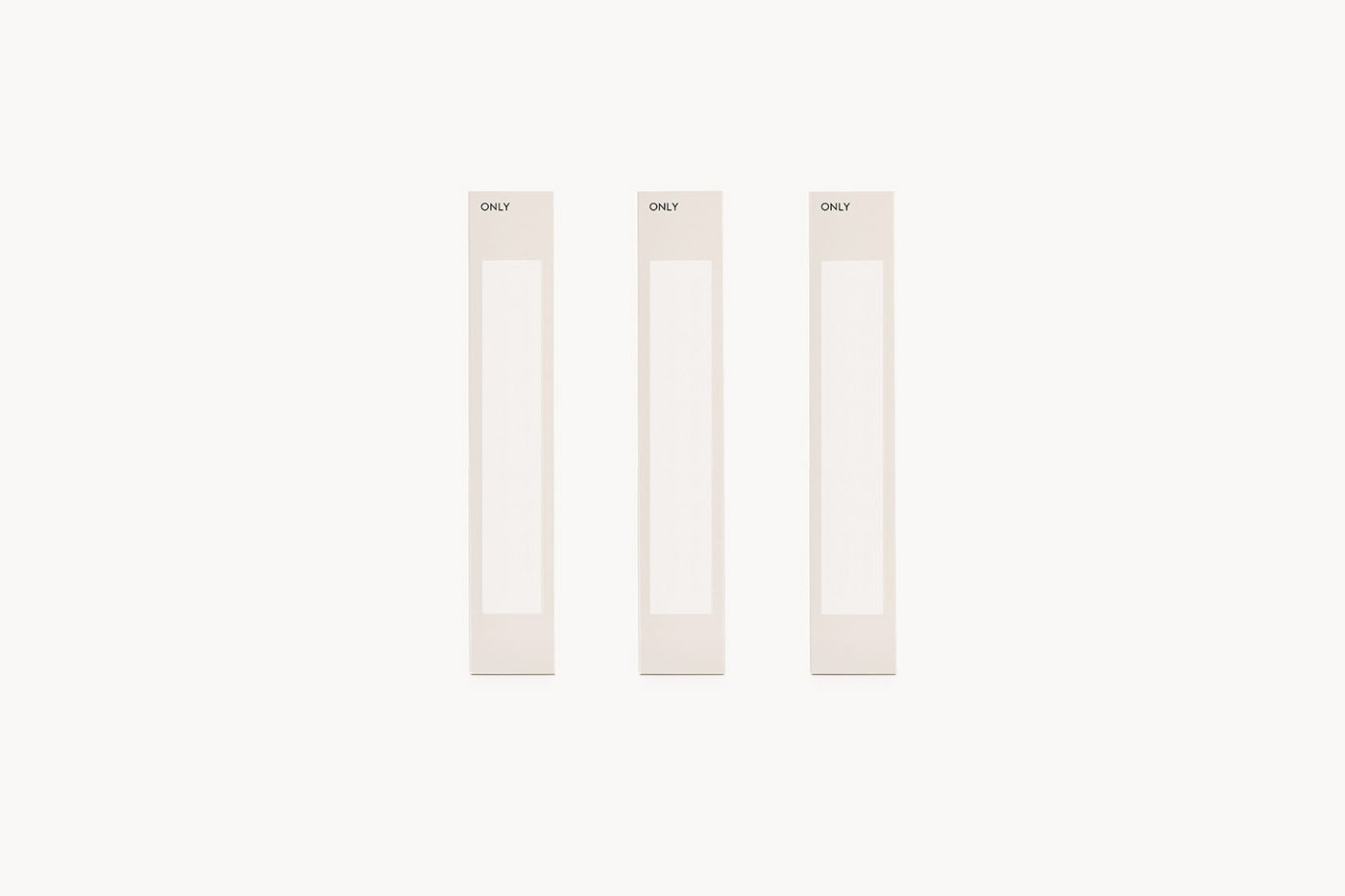
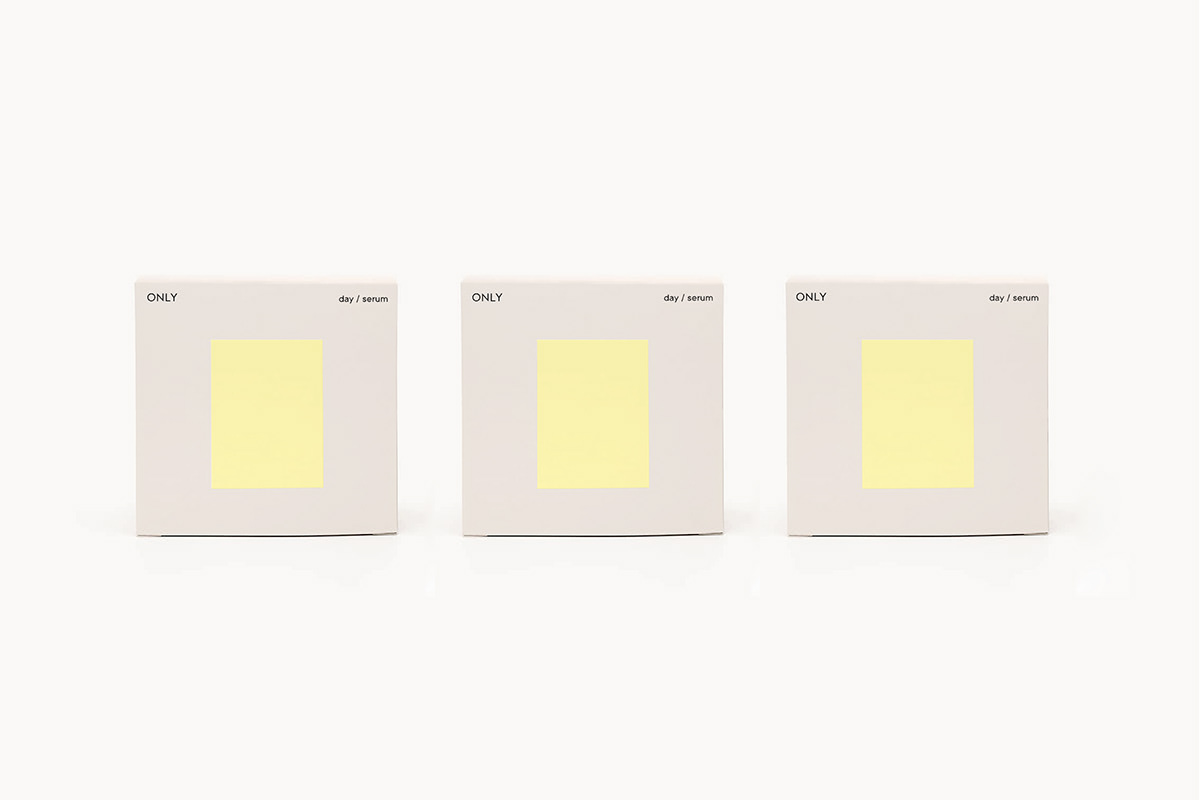
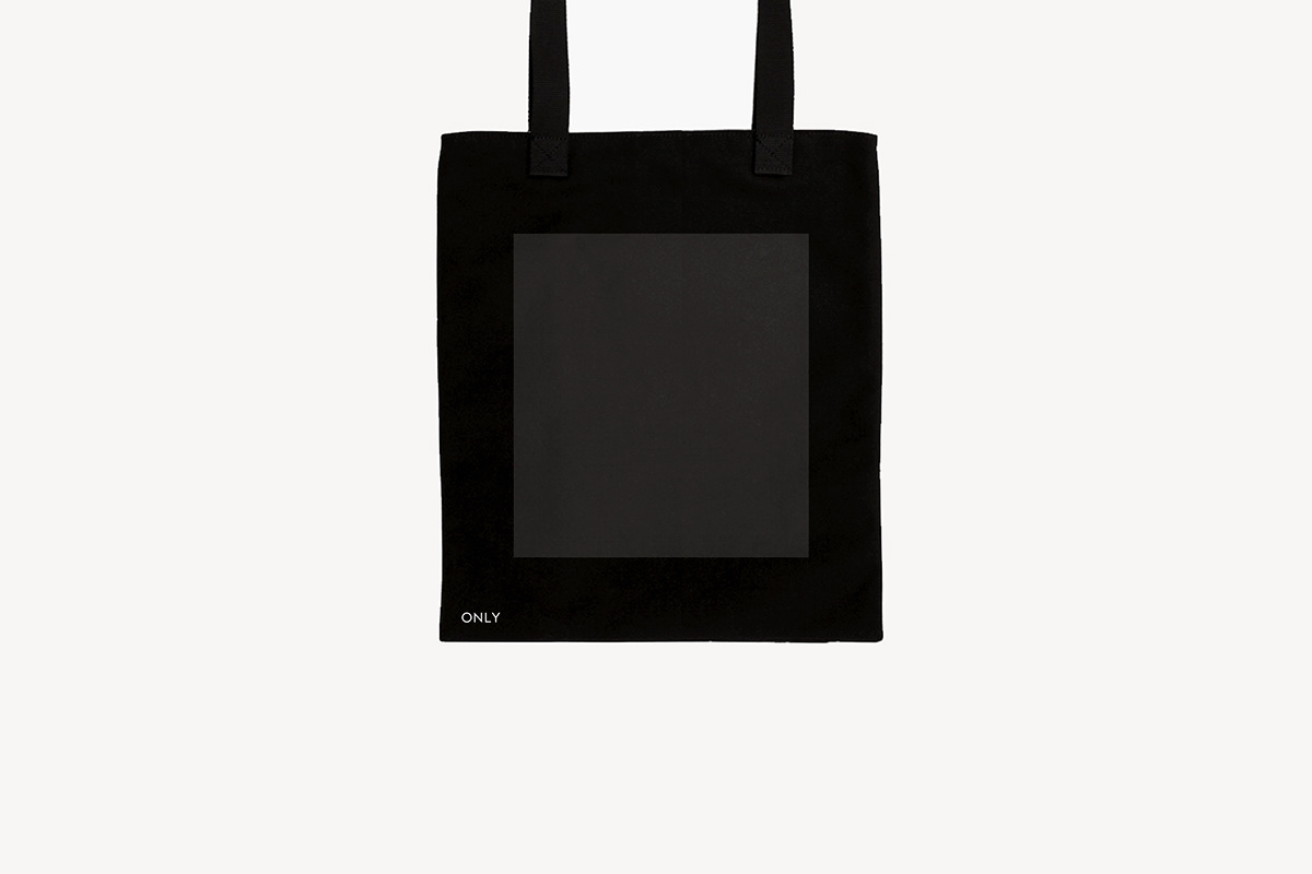
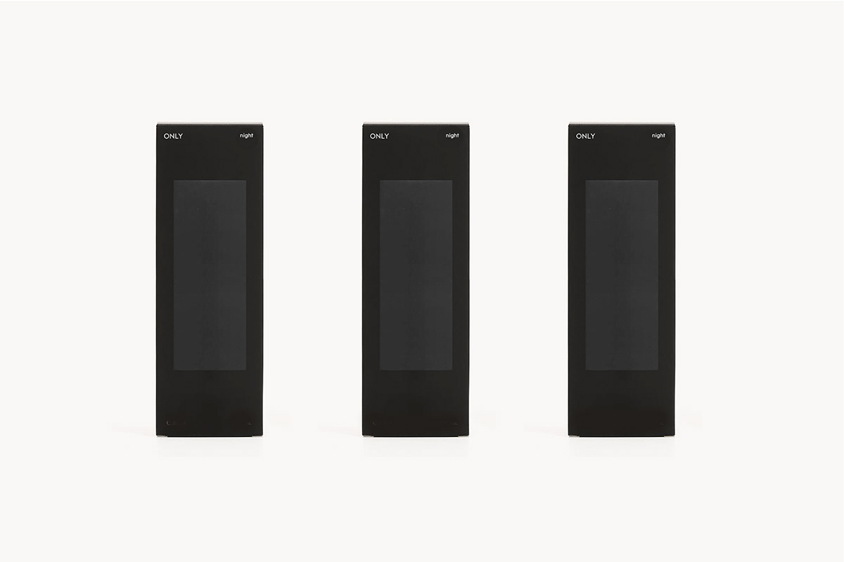
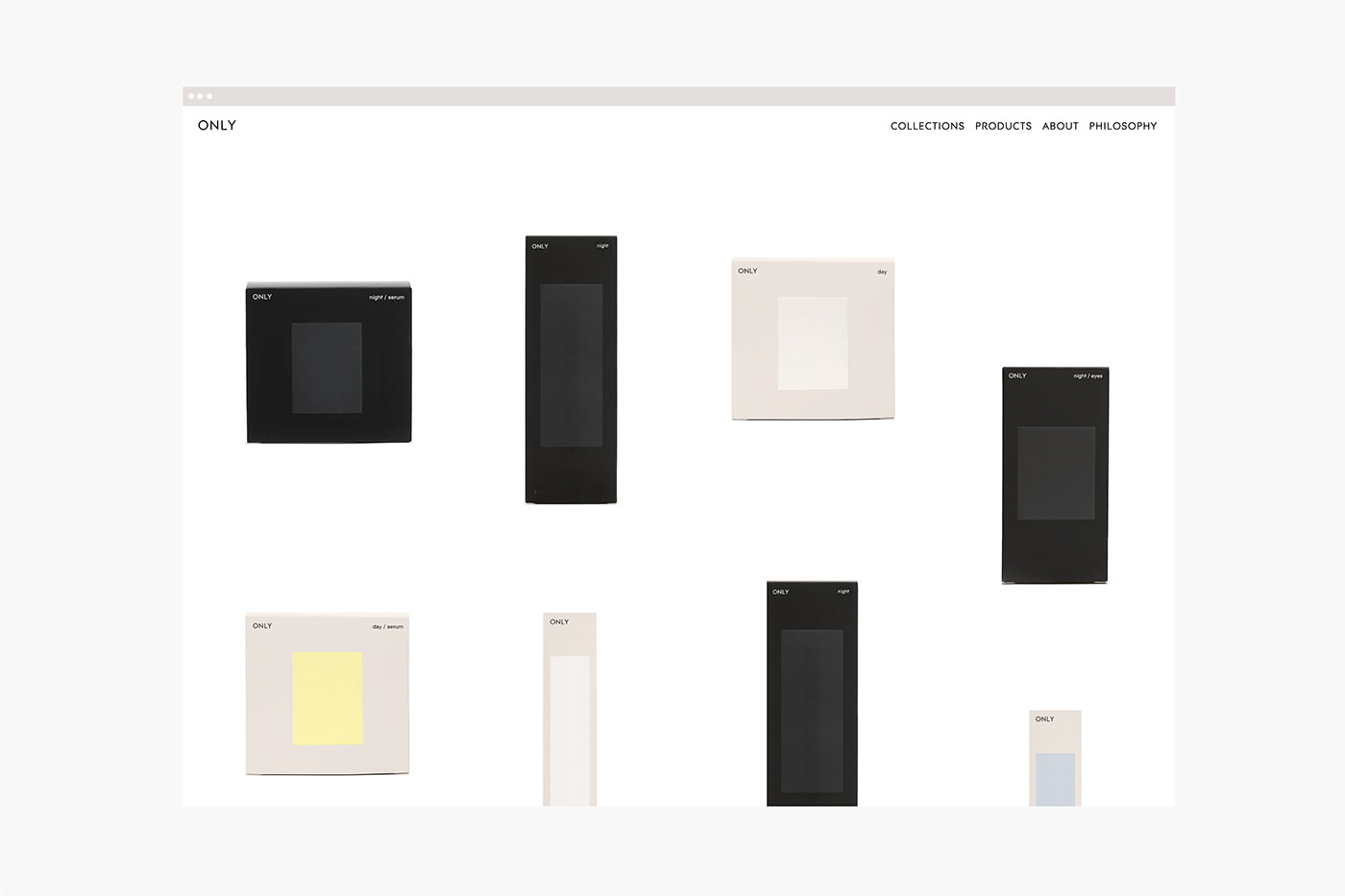
The brand it was designed on black and white with occasional support on yellow and blue and with a very special attention to each detail that perfectly reflects the brand’s main values. My focus on this design is consumers can easily know the ingredients and information of the products. The minimal branding and packaging of these packaging aids reinforcing the brand’s clarity.
The logo is simple, strong and clean and extends to the labelling on the packaging.
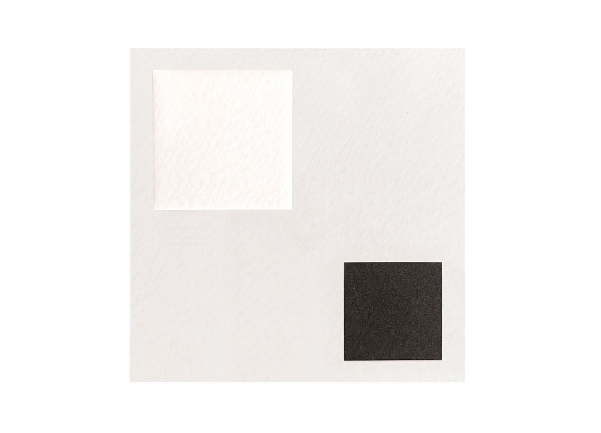
The primary corporative colors represent the day creams (white) and the night creams (black).
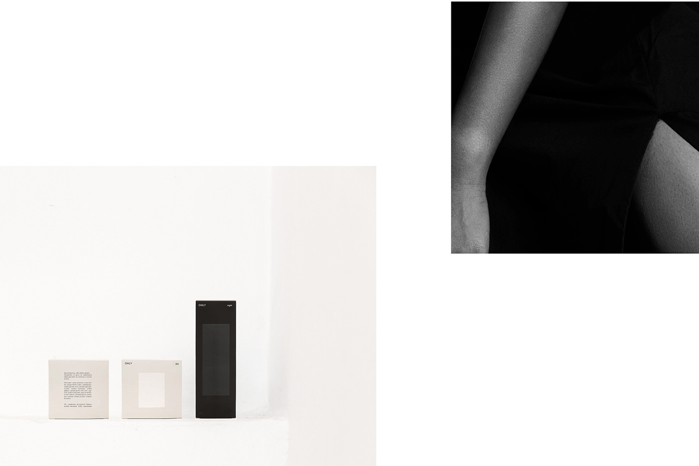
The visual identity is modern, geometric and functional. I have been inspired by suprematism and how they sought sensitivity through geometric abstraction.