


what:
VASA CERAMICS - redefining essential dinnerware
Germany, Munich ( 04.05.2019.- 10.05.2019. ) -logo design
-identity
-brand assets
-packaging
-web design
-marketing collateral
Info:
To serve people when they perform the essential activity of their lives. Vasa Munich Ceramics aims to redefine tableware essentials to give people a feeling of premium essential dinnerware at an affordable price range.They create the ideal post-IKEA tableware for the grown-up but not sophisticated urban generation: Classic white porcelain tableware and elegant design meets premium quality at an economical price point.
Mission:
In order to start designing a brand identity, a thorough understanding of the reason it exists is an essential part. Together with the client it was established that the underlying philosophy of Vasa is to: Give people an easy and straightforward way to buy the essentials components for serving dinner, all the while keeping a feeling of catered service towards them. It had to be clear that Vasa is here for the people, not the other way around.
objective:
MAKE A PRACTICAL BRAND IDENTITY THAT ALLOWS CLIENTS TO HAVE SIMPLE AND ACCESSIBLE EXPERIENCES ALL WHILE KEEPING A FEELING OF PREMIUM.

the logic behind it:
Inspired by the german anti-ornament minimalistic design philosophy.
Bauhaus was an art school in Germany that combined craftsmanship, fine arts, and design with geometric characteristics (important influence on Bauhaus was modernism), minimalism, respect for materials, hand-crafted. It was invented to serve the user practically. The most basic tenet of the Bauhaus was
form follows function.
Vasa takes the unnecessary distractions away from shopping. And doubles down on the important aspects.
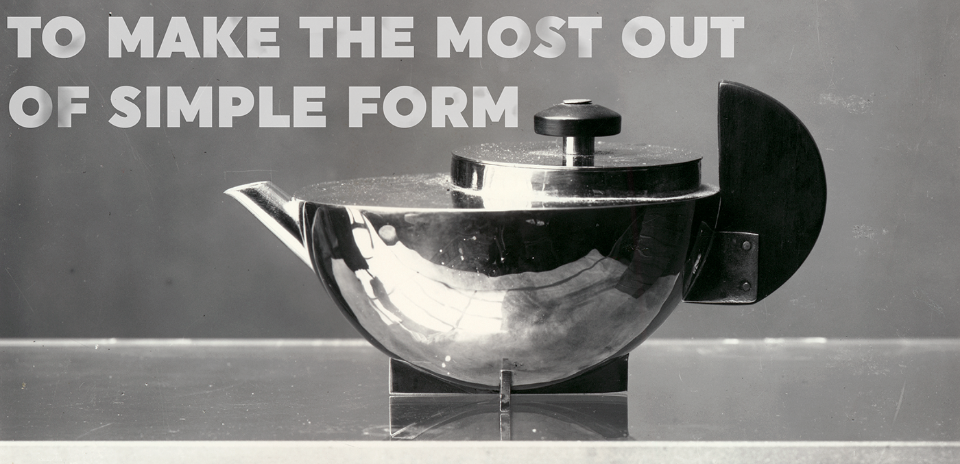
Capturing the essence of the business in one form with the "less equals more" philosophy.
In an effort to capture the essence of the brand I went into the very foundation of what constitutes dinnerware - a container which holds something (food and drink in this case). I deconstructed the plate into its most basic forms. This allows the consumers to understand what Vasa offers immediately.
An essential dinnerware buying experience.


Palette:
Keeping the colors at a minimum for clarity.
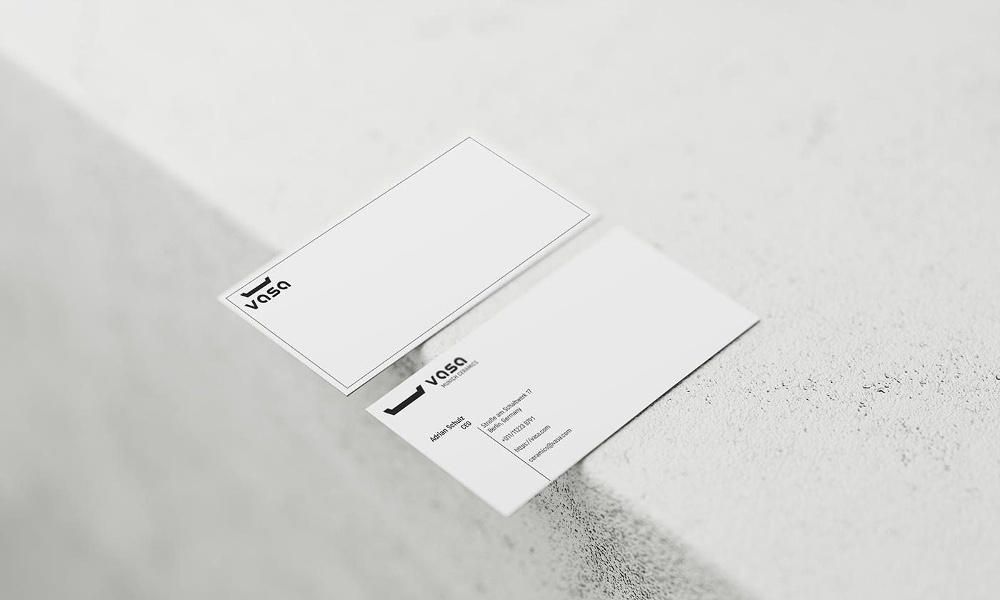
We associate white as something that is stress free. Something that is practical. It enables us to focus on the important parts in this identity. On the other side is black - letting us know what to focus on. Using different levels of black on the brand elements such as titles, body texts and numbers we can guide the user in the right direction more precisely and in consequence realize more sales.


Typography:
Uniform font for directness.
The Bauhaus School taught typography, and they were strong advocates of sans-serif type, as they believed that its simplified geometric form was more appealing and useful than the ornate German standard of blackletter typography. Balanced layout, harmonious geometric shapes, and sans-serif letters in upper case or lower case fonts are simple but strong and leave a feeling of order.
I choose Uniform because it is a multi-width geometric type family designed around the circle. Remarkably fresh type family that bridges the gap between circular geometric typefaces and condensed straight-sided typefaces. Uniform also includes many opentype features like Old Style Figures, Tabular Lining Figures, Alternate characters, Ligatures and more.


Application:
Serving the buyers.
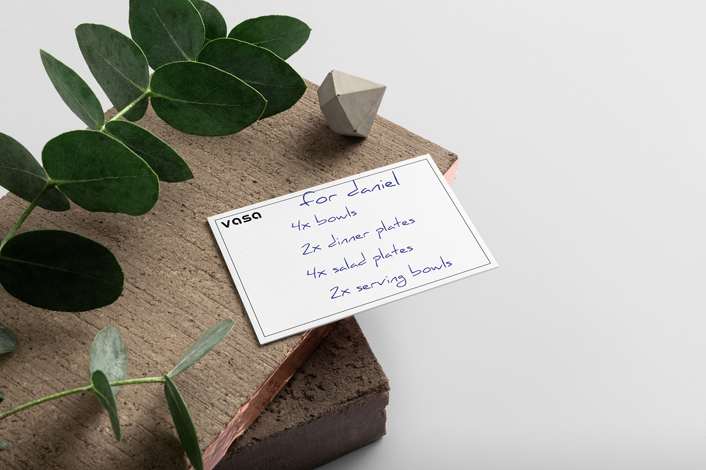
This entire time I talked how Vasa is here to make peoples lives easier, here is the part where this virtue shows the most. I employed the collateral materials in such way that they can be used practically. Allowing the buyer to take notes and reminders. The business card was given a big amount of empty space for this purpose.


Conclusion:
Make it simple, but significant.
Good design should always be upfront on the visual part, and deep on the thought part. What people feel is far more important than what they think. In the end it is always the underlying intuition that tells us if we like something or not. So be sure that when you're starting any new design venture you know what the end user needs to feel when interacting with your product.

VASA MUNICH CERAMICS
Graphic design
Ivan Kukovec
Identity design
Ivan Kukovec
-logo design
-identity
-brand assets
-packaging
-web design
-marketing collateral
Client
Vasa Munich Ceramics Co.
Thank you for watching!
▼


