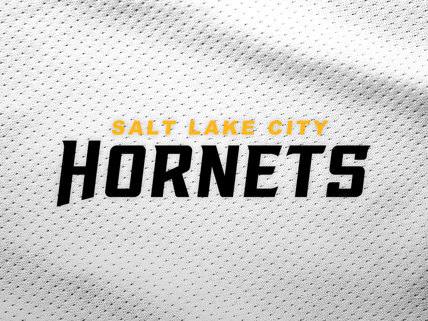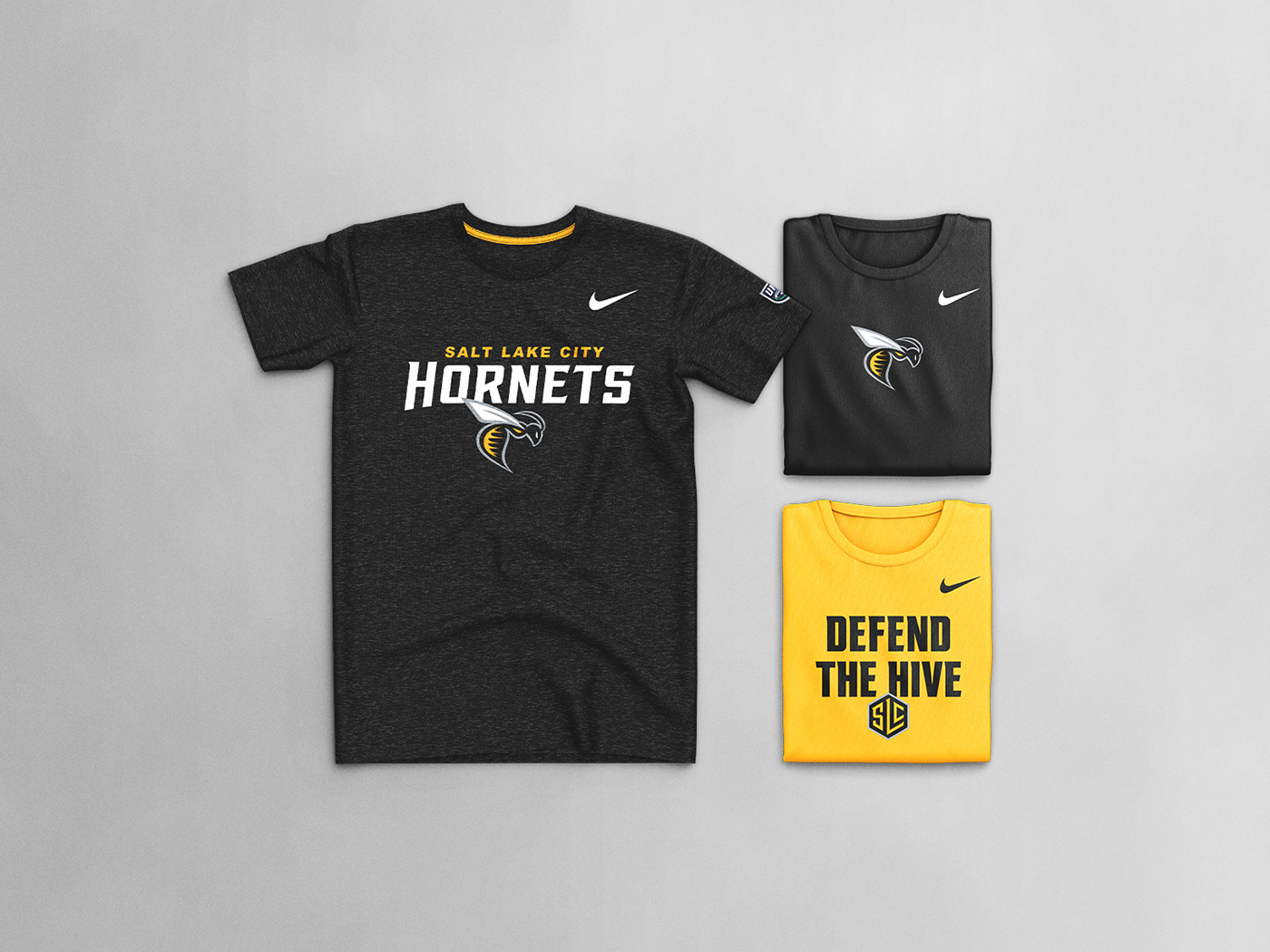
SALT LAKE CITY HORNETS
OVERVIEW
The goal: develop a logo system and visual identity for the Salt Lake City Hornets – a fictional football franchise that plays in the Canyon Division of the Great West Conference of the Ultimate Football League – that is appropriate for its location, sophisticated and versatile, and effectively executes a professional sports aesthetic. The final design should attempt to blur the line between real and fiction and should make it hard to determine whether or not the team is real.
RATIONALE
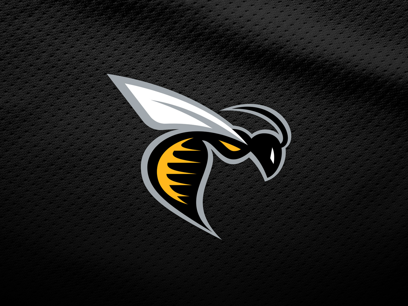
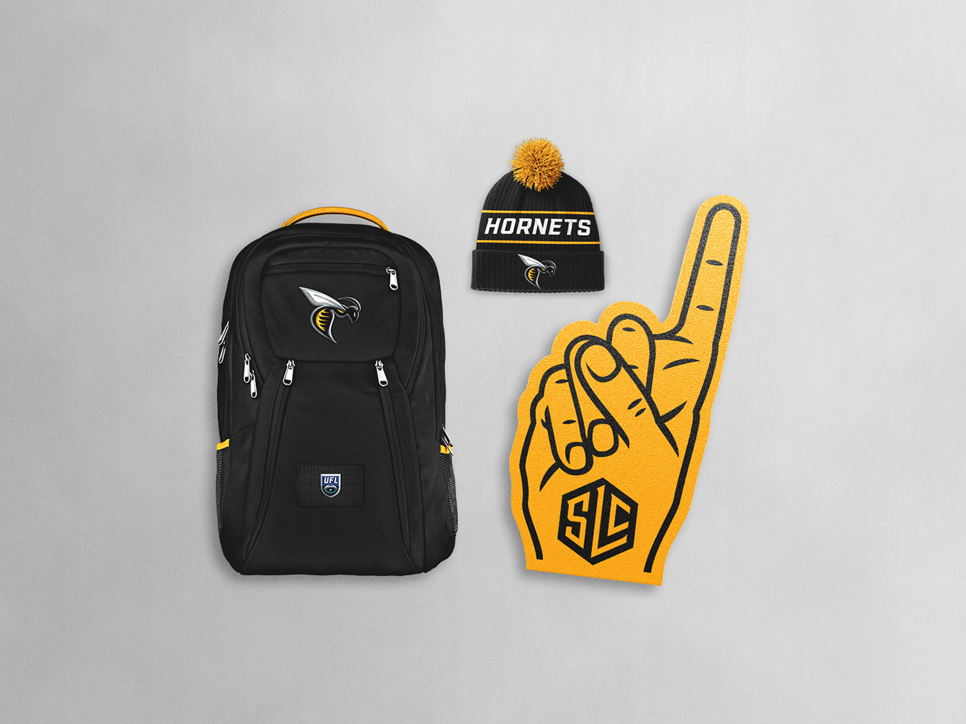
The nickname “Hornets” is stemmed directly from Utah being officially known as “The Beehive State”. Utah’s official coat of arms features a beehive that symbolizes hard work and industry, indicative of the attributes a hornet wasp may have within its nest. They’re also notoriously known for aggressively defending their hives, akin to the battles on the gridiron.
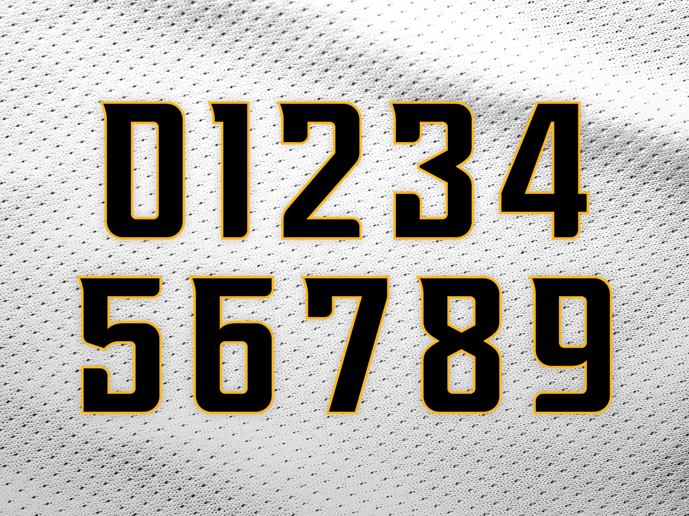
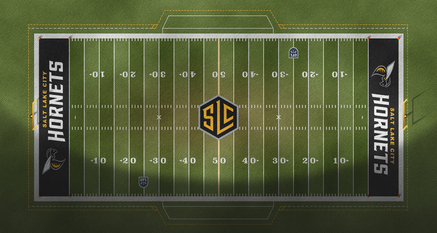
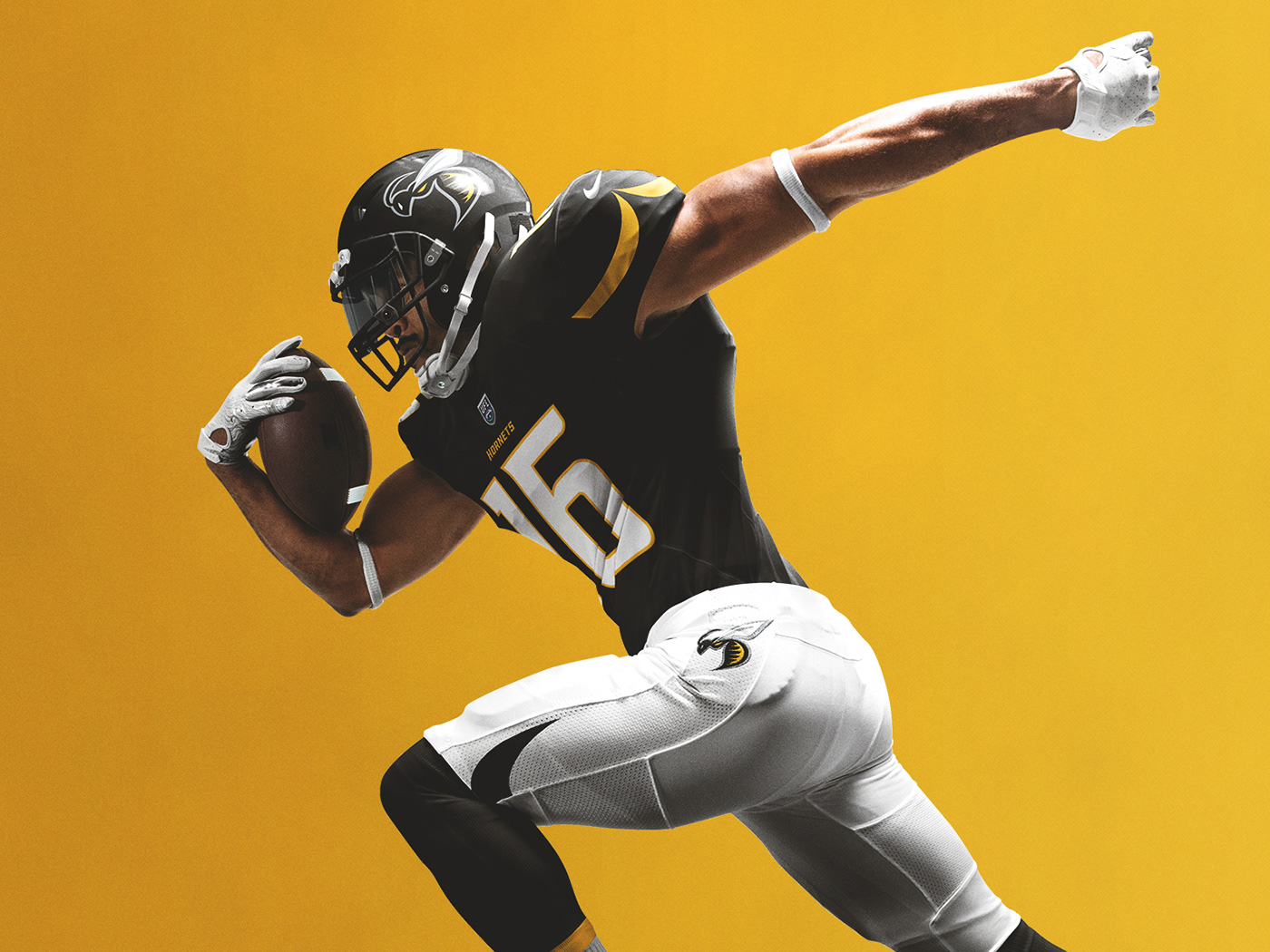
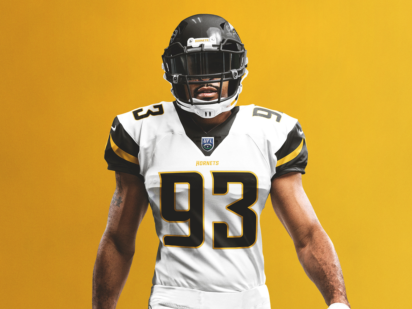
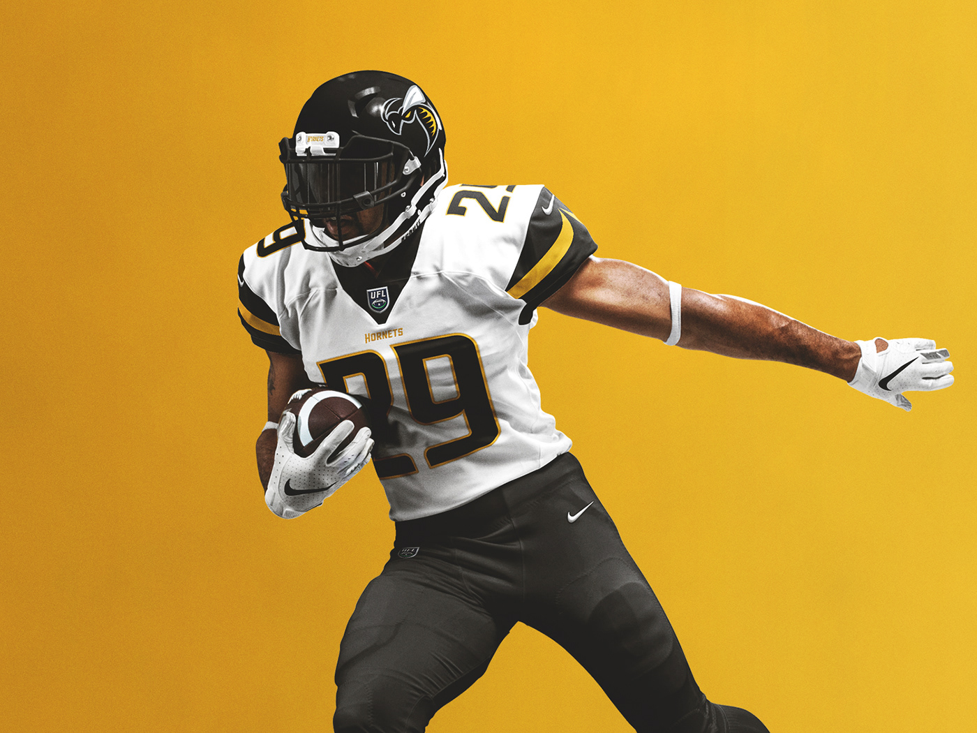
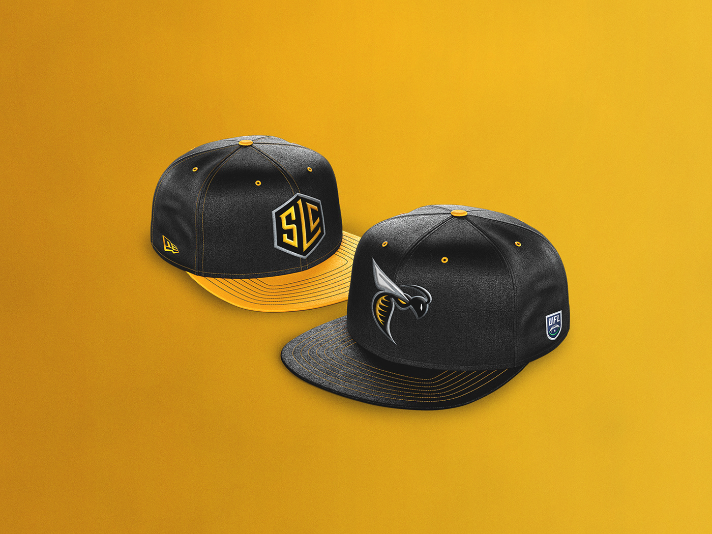
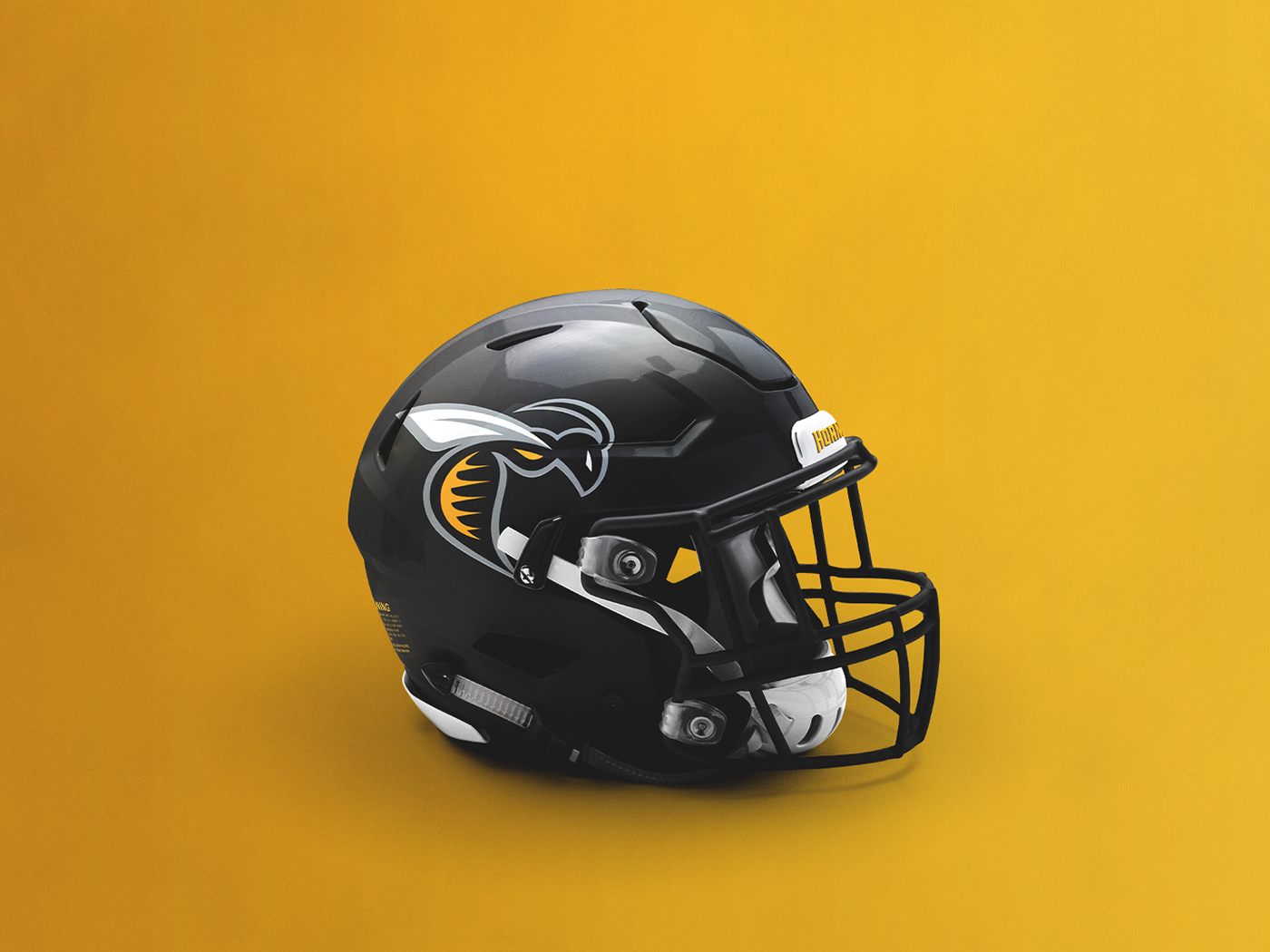
The Hornets sport a black and gold color scheme, representative of the familiar markings of its real-life counterpart, with a silver accenting trim. The primary logo features a stylized hornet that was designed in a way to look agile and threatening as it appears on each side of the helmet. An “SLC” monogram that conforms to the shape of a honeycomb is featured as a secondary logo. The custom typeface and number set features barbs and flowing lines that allure to the characteristics of a hornet.