I. BRIEF
Inspired by Ruth Asawa’s signature Looped Wire Sculpture, the logo imitates the its silhouette. Asawa herself once discussed about the unique characteristics of these sculptures were the lightness and transparency. And that is what I find so fascinating about this particular sculpture style: how the metal material is able to deliver fluid appearance.

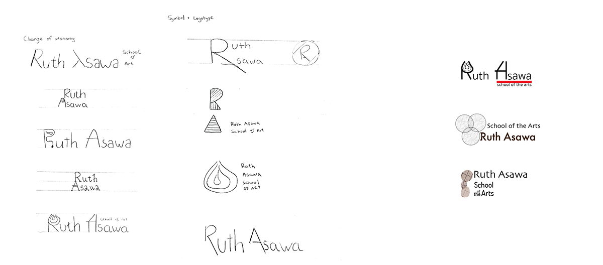
II. IDEATION
The majority of the ideas is based off the looped wire sculpture with overlapping, repeated shapes. The last column on the right includes different logo/ logotype ideas made in Illustrator.
III. LOGO LOCKUPS
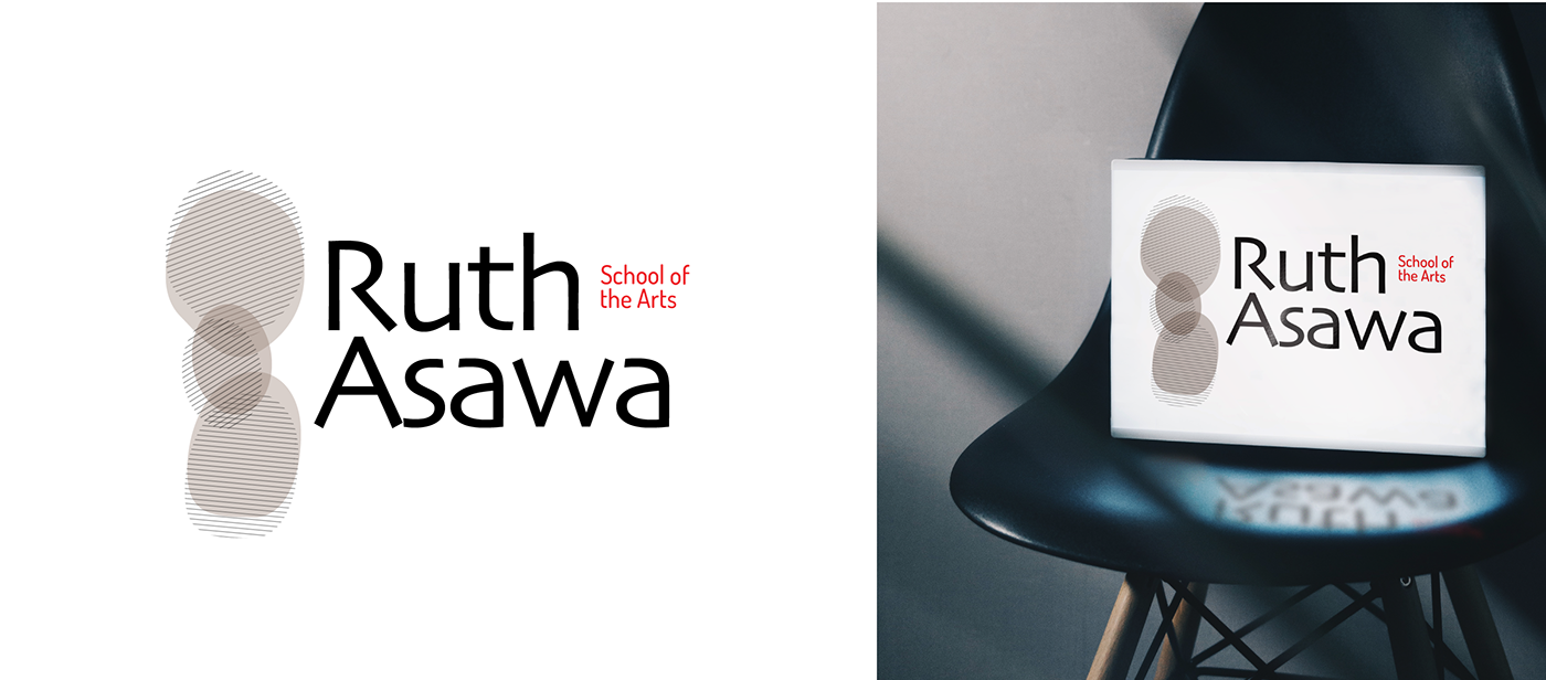
Having a low opacity, we are able to have some see-through parts between overlapping shapes. Thus, the rounds were slightly adjusted so that they look more natural and organic. The idea to have a second set of stripe pattern rounds and intersected that with the solid-color one was derived the metal material Asawa used to make the sculpture. I chose to go with a light grey color to represent a metallic look.
IV. APPLICATIONS
The versatile of the logo also offers other ways to arrange the elements.


