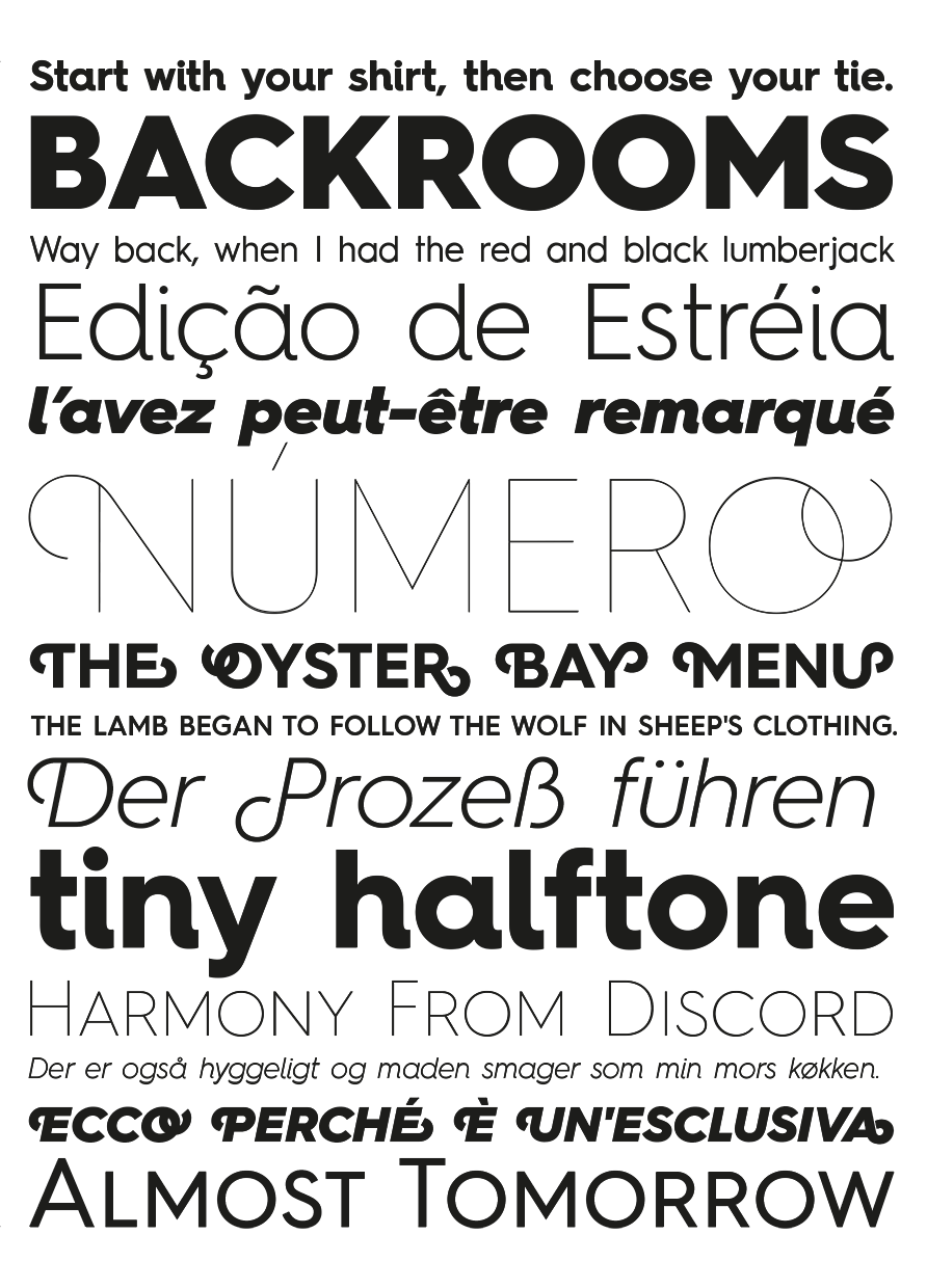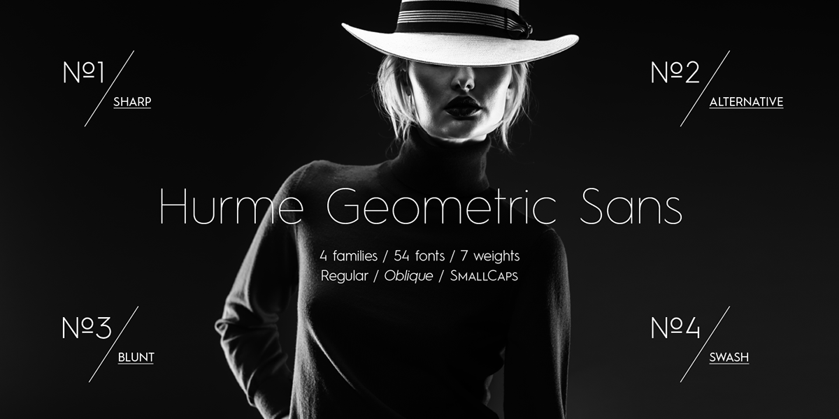
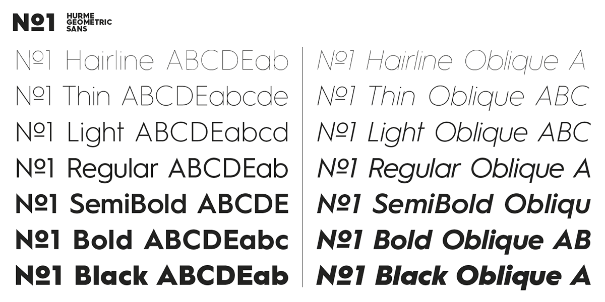
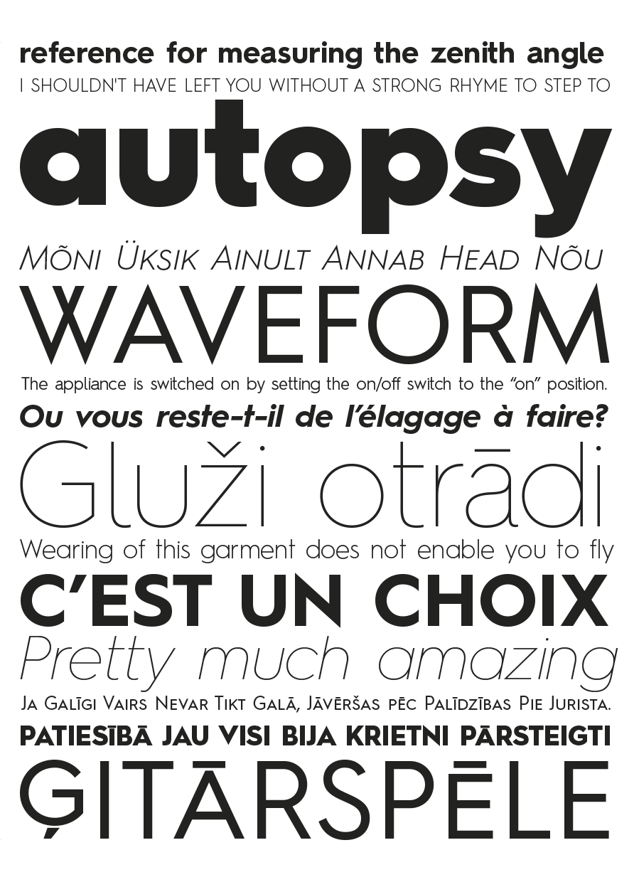
Hurme Geometric Sans is a series of font families all with distinctive qualities and features but share the same basic construction and proportions. Each of the four Hurme Geometric Sans sub-families includes seven weights and matching obliques, ranging from hairline to black. Alternate characters and other Opentype features make for a versatile family that can be adjusted for specific needs. Please see the overview specimen PDF for complete overview of the typeface and its features.
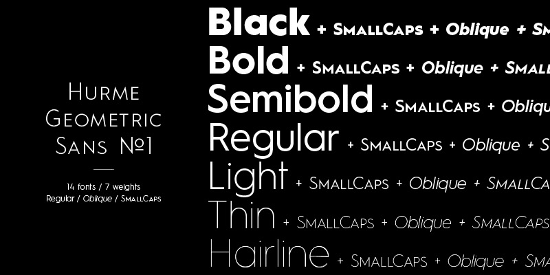
Hurme Geometric Sans No.1 and No.2 features sharp corners. Hurme Geometric Sans No.1 and No.2 are essentially the same font with different characters set on as default. The two families are sold together.
Available at → hurmedesign.com
Available at → hurmedesign.com


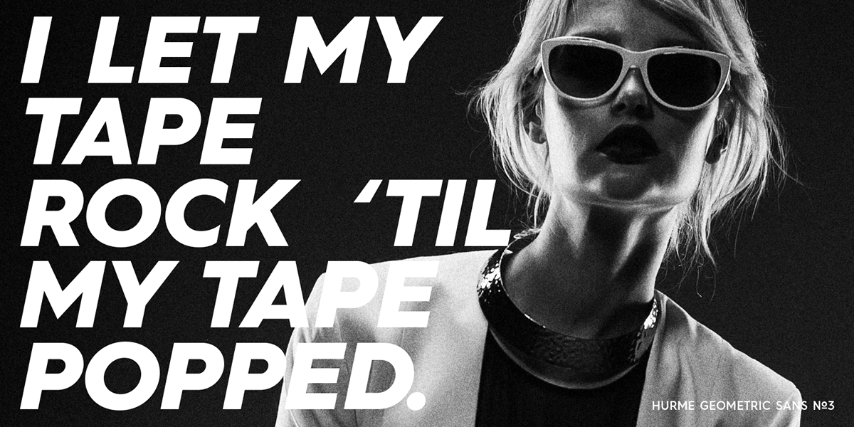
Hurme Geometric Sans No.3 features blunt corners as opposite to HGS No.1 and HGS No.2 where corners are sharp. In HGS No.3, all characters shapes follow the caps height and baseline levels. This makes it the most effective of the HGS series in smaller sizes.
Available at → hurmedesign.com


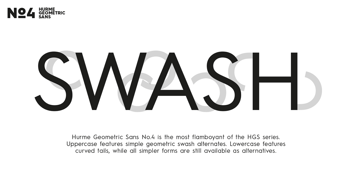
Hurme Geometric Sans No.4 features swash capitals. Uppercase swash alternates can be automaticly applied to all characters or just to first and last characters of each word. Lowercase default is with curved tails, but alternates without tails can be accessed via Opentype.
Available at → hurmedesign.com