

B.Life Ecological Product for Sacma S.p.A.
Customer: Sacma S.p.A. di Gabriele e Marco Maestri - Adro (Brescia - Italy)
The Customer
Sacma S.p.A. is one of Europe's leading companies in the production of paper bags and wrapping paper. Founded by Eligio Maestri in 1967, it is known and appreciated for the quality and reliability of its products.
The Required
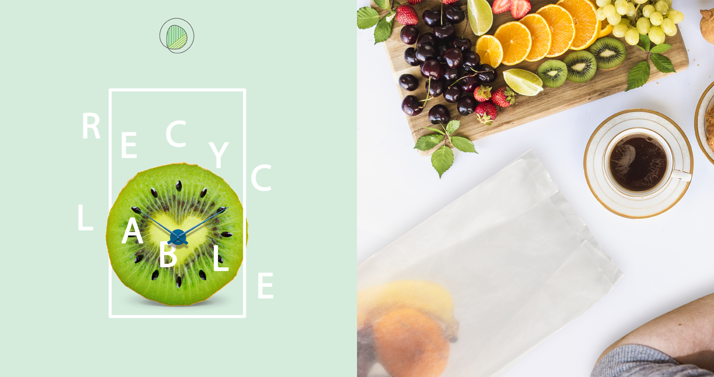
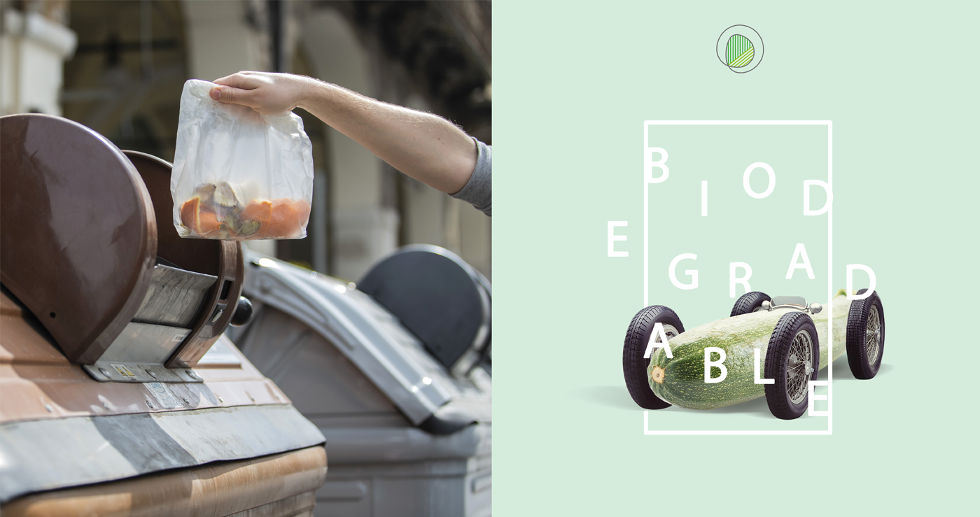
Create a logo for a series of 100% organic products and make a presentation for a very transparent "green" bag for vegetables and fruit.
The Solution
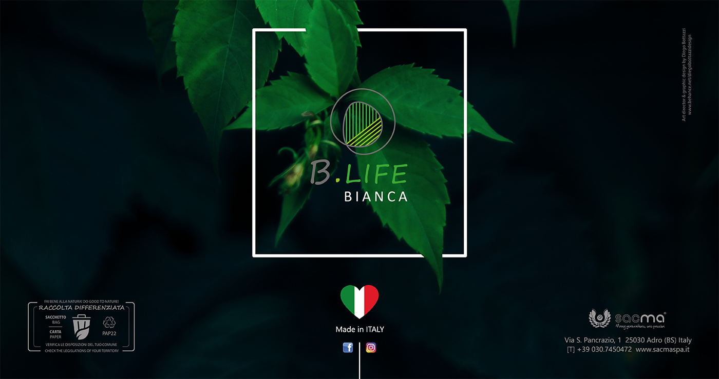
Considering that environmental protection is a widely recognized value, the first step was to find an ideal name for the new ecological bags. By carefully analyzing the new product conceived with a paper that does not damage the environment, I have associated the letter "B" which evokes a reference to the words biological / biodegradable and the word "Life".
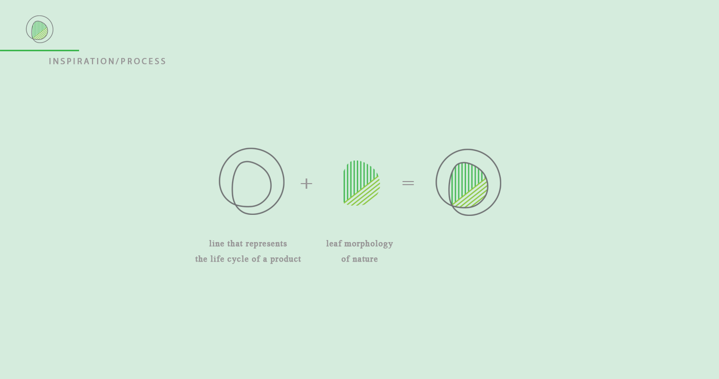
The pictogram of the B.Life logo is characterized by a circular line, which represents the life cycle of the product, while the intersection of the circular line determines the second life of the product, highlighted by the morphology of the leaf, symbol of nature and at the same time of the "Life".
https://www.sacmaspa.it/innovazioni.php?lan=en
______________________________________
Il Cliente
Sacma S.p.A. è uno dei leader a livello europeo per la produzione di sacchetti di carta in formato. Fondata nel 1967 dal Cav. Eligio Maestri è conosciuta e apprezzata per la qualità e l’affidabilità dei suoi prodotti.
La Richiesta
Creare un logo per una serie di prodotti 100% biologici e realizzare una presentazione per un sacchetto “green” molto trasparente per la verdura e la frutta.
La Soluzione
Considerando che la tutela dell'ambiente è un valore ampiamente riconosciuto, il primo passo è stato nel trovare un nome ideale per i nuovi sacchetti ecologici. Analizzando attentamente il nuovo prodotto concepito con una carta che non arreca danno all’ambiente, ho associato la lettera “B” che evoca un richiamo alle parole biologico/biodegradabile e dalla parola “Vita”.
Il pittogramma del logo B.Life è caratterizzato da una linea circolare, che rappresenta il ciclo di vita del prodotto, mentre l’intersecazione della linea circolare determina la seconda vita del prodotto, evidenziato dalla morfologia della foglia simbolo della natura e al tempo stesso della “Vita”.
https://www.sacmaspa.it/innovazioni.php


Directions given by the customer:
Presentation of the first 100% eco-sustainable product from the company for vegetables and fruit. Enhance the transparency of this bag and its features.
____________________________________
Indicazioni date dal cliente:
Presentazione del primo prodotto 100% ecosostenibile dall'azienda per la verdura e la frutta. Valorizzare la trasparenza di questo sacchetto e le sue caratteristiche.


Realizzazione di un flyer formato A4 da inserire all'interno del catalogo Sacma S.p.A.
Ho voluto dare al cliente "un impronta". . .la possibilità di toccare la qualità della carta "B.Life" e la sua trasparenza, applicando sul fronte del foglio A4 un campione originale della carta.
_____________________
Creation of an A4 format flyer to be included in the Sacma S.p.A. catalog.
I wanted to give the customer "a footprint". . .the possibility of touching the quality of "B.Life" paper and its transparency by applying an original sample of the paper to the front of the A4 sheet.


CREDITS
Customer: Sacma S.p.A.
Art director / Graphic designer / Illustrations: Diego Bottazzi
/
Thanks for watching


