品牌簡介
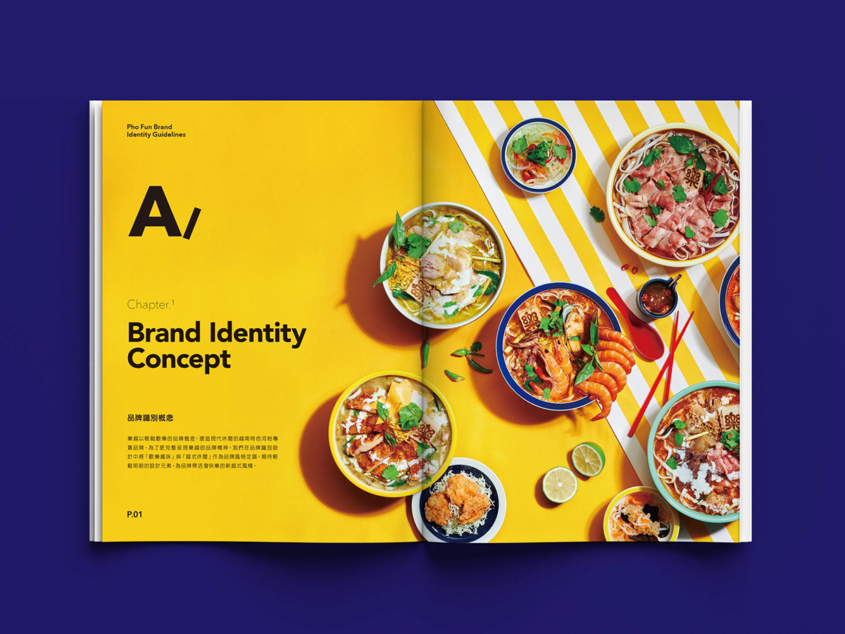
樂越 Pho Fun 品牌背景為東南亞的歡樂國度,熱帶氣候襯托出歡樂無慮的越式情懷,直接又不造作地展現當地的飲食縮影。歡樂趣味、越式休閒,是品牌的核心精神;交叉視覺與味覺,雙向體驗活潑快樂的異國風情。越南濕熱又多雨的環境,孕育出豐富的文化與食材:以特色河粉專賣店定位,樂越遵循在地食譜重現街頭美味,讓層次豐富、新鮮爽脆的好滋味深植於味蕾記憶。品牌帶領好奇的美食家,如同身歷其境走訪這座充滿驚喜的土地,淋漓恣意、隨心所欲地探索辛香國境的道地佳餚。
Background
The background of the brand Pho Fun is a joyous country of Asian island. The tropical climate brings Vietnam a joyful and relaxed vibration, naturally expressing an optimistic personality of this exotic territory. Happiness and Vietnam's leisure are the core spirits of the brand, which introduce eaters to experience the unique aura through vision and taste. Vietnam's moist and rainy weather grows the distinct culture and multiple ingredients. The targeted positioning of Pho Fun is a professional rice noodles brand, and the delicacy followed by local recipe is to arouse the desire of delightful taste. The brand conducts the true food connoisseur to explore this marvelous island, freedomly and unrestrainedly enjoy the most authentic cuisine.
設計方案
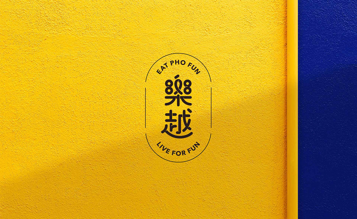
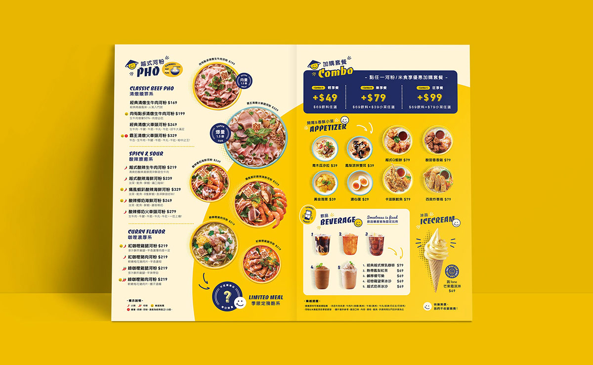
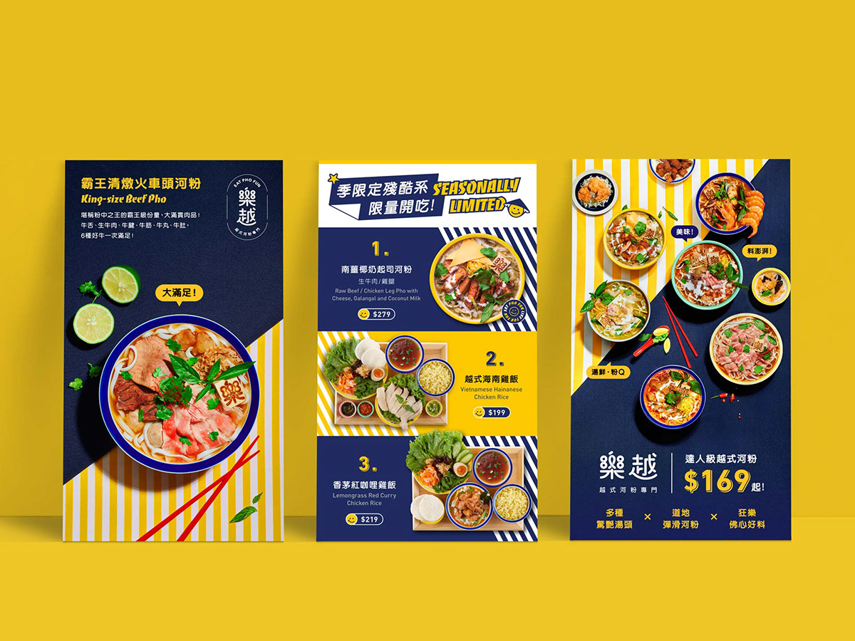
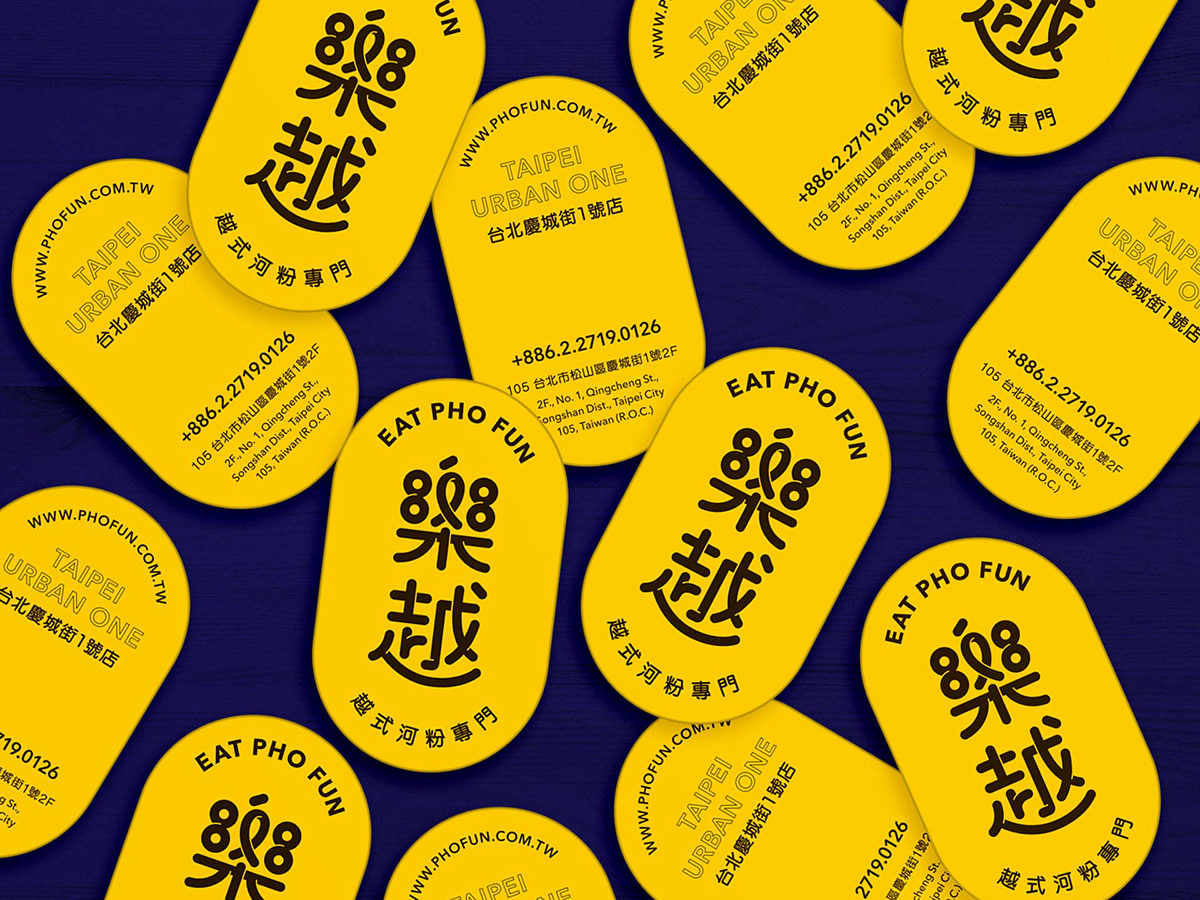
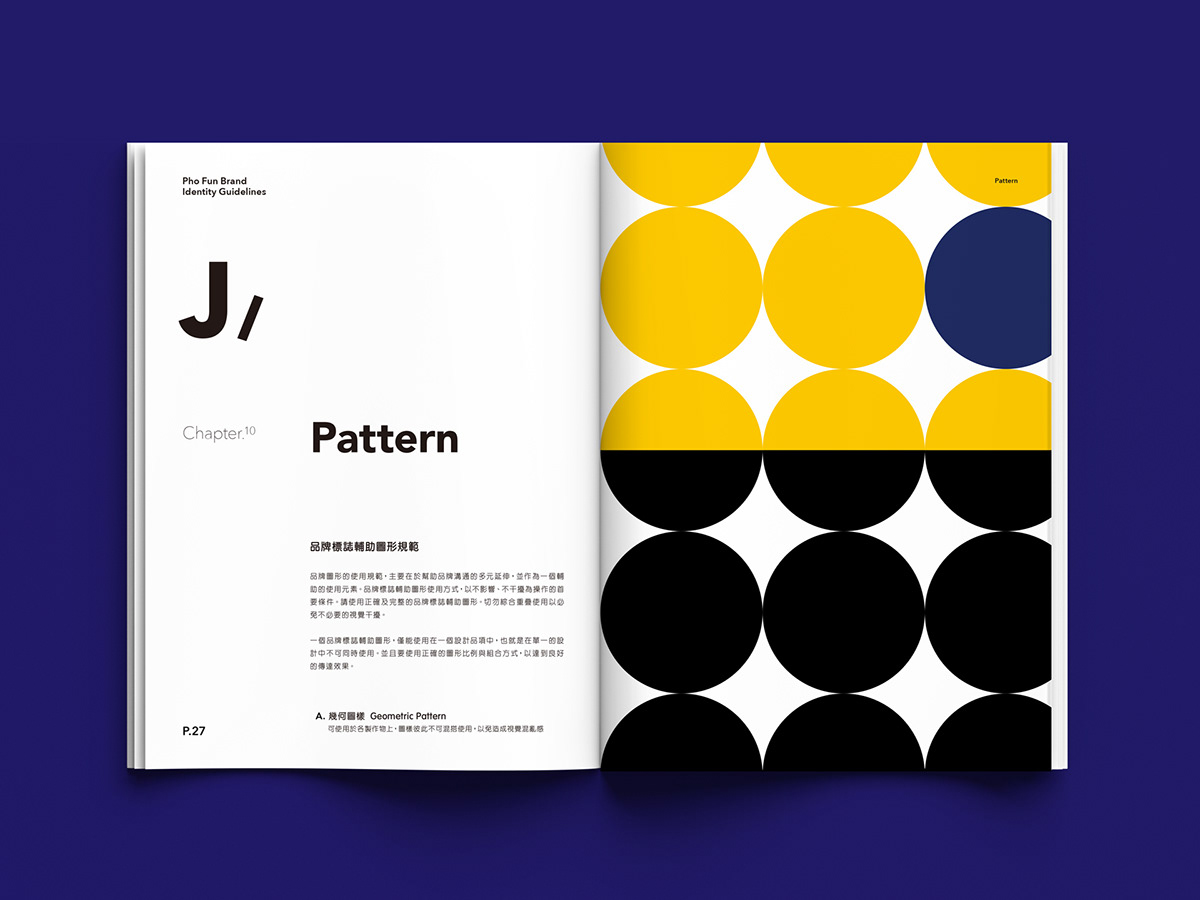
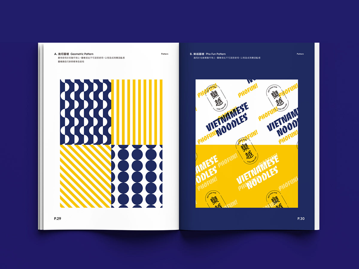
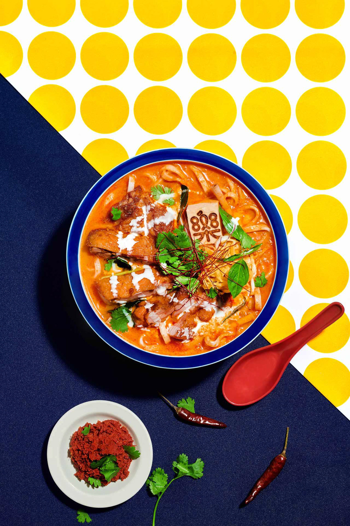
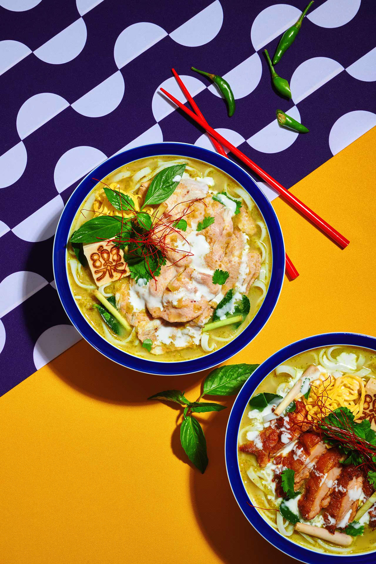
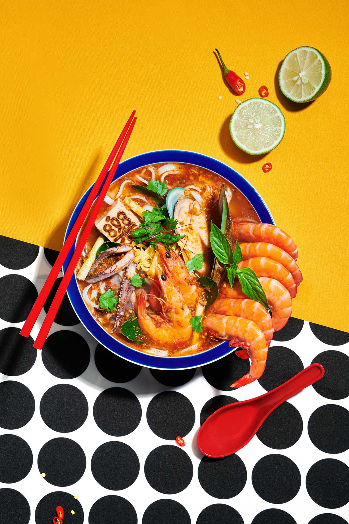
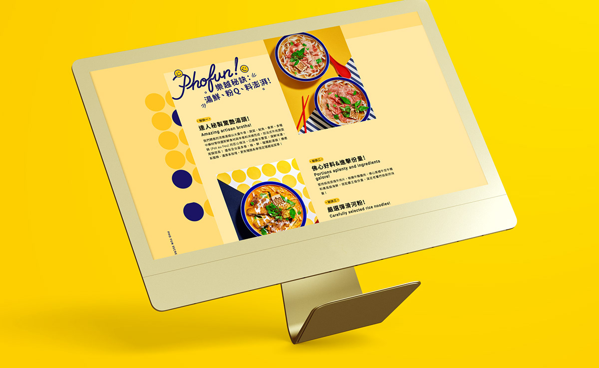
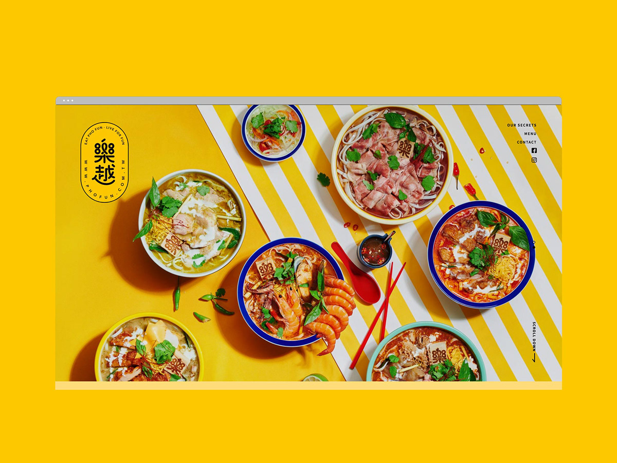
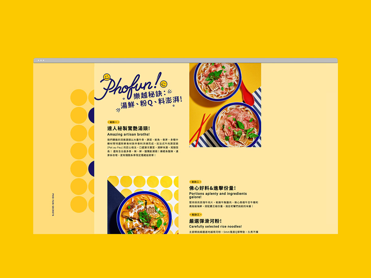
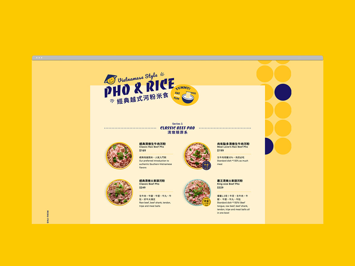
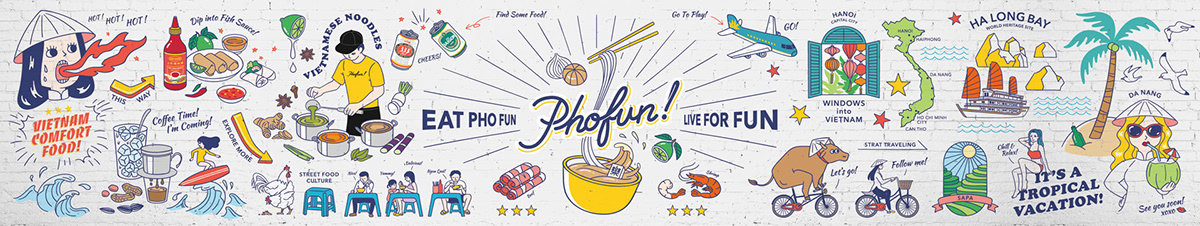
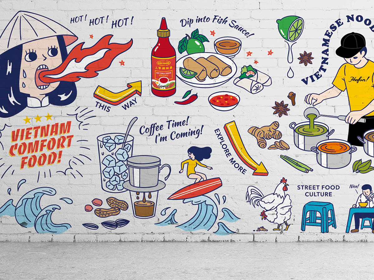
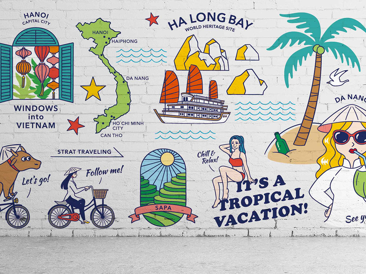
樂越 Pho Fun 標誌外型以「快樂」為設計出發點:以圓潤流暢的線條增添輕鬆歡樂的品牌氛圍,在筆畫重疊的地方設計缺口,使得標誌更具些微立體感,帶出活潑跳動的品牌個性,凸顯整體「快樂趣味」的氛圍。擷取自越南在地的傳統包裝,獨特的視覺語彙尤其在食品包裝上最為顯著:疊印、斜排、滿版,樂越創造一系列展現東南亞印象的圖樣;無論是帶有東南亞風情的字型輪廓、圓滾俏皮的笑臉圖形、還是越式麵碗的幾何元素,多元圖文組合的設計細節,大量增加與消費者接觸並溝通的機會。歡樂的黃色、明朗的藍色,樂越 Pho Fun 鮮亮飽滿的色盤,引導聯想辛香可口的湯頭及食材,視覺上同樣感受酸甜適宜的越南滋味。
Design
The bilingual logotype of Pho Fun based on the idea of happiness, and the outline is constructed by sleek and smooth lines, spacing several gaps between overlapping areas of strokes, making the type more stereoscopic and playful, and to create a cheerful atmosphere. Inspired by the traditional packaging in Vietnam, the overprint, diagonal, duplicate patterns are selected to transform to a series of new visual language. The southeast Asian style font, round playful smiley graphic, geometric elements of Vietnamese noodle bowl, all these design details of graphic combination increase the opportunity to relate and communication with consumers. The main colors of Pho Fun are yellow and blue, both contains bright and positive features, visually guiding people to feel the sweet, spicy and sour taste of Vietnam.