A complete Rebrand and identity for C & J training limited
Since the redesign the company has grown to be the largest specialist access and rescue company in the northeast with the following new clients: IKEA, DHL, Mitie, Lancashire Constabulary.
The old logo (below left) didn't give a clear representation of the companies service. It was misleading, dated and was hard to work with in different medias.


The Guidelines
A company who provide training, instruction and information for people who are required to be part of a rescue team or complete work tasks in dangerous and exposed conditions or locations. Their main cliental was small local companies, but the main aim of this redesign was to reach out and acquire business from large companies.


The company required a new company name, the old name and logo didn't reflect the companies line of work or the high level of training offered.
Ideas of names and imagery were offered to the client. At this stage the idea for the new name of the company and style was very open and this gave more of a direction as to what style and branding the client liked and didn't like.


These were some of the ideas presented to the client.


Brand Direction
The ideas gave the client more of a direction and this helped us to start to develop and define the image of the company.
The name 'Axiom' was decided at this stage, but the creative tone wasn't set and this required more imagery development on the name and new look.
The client’s liked the idea to incorporate a piece of equipment within the design of the logo, as well as having a modern and simple branding.


The Outcome
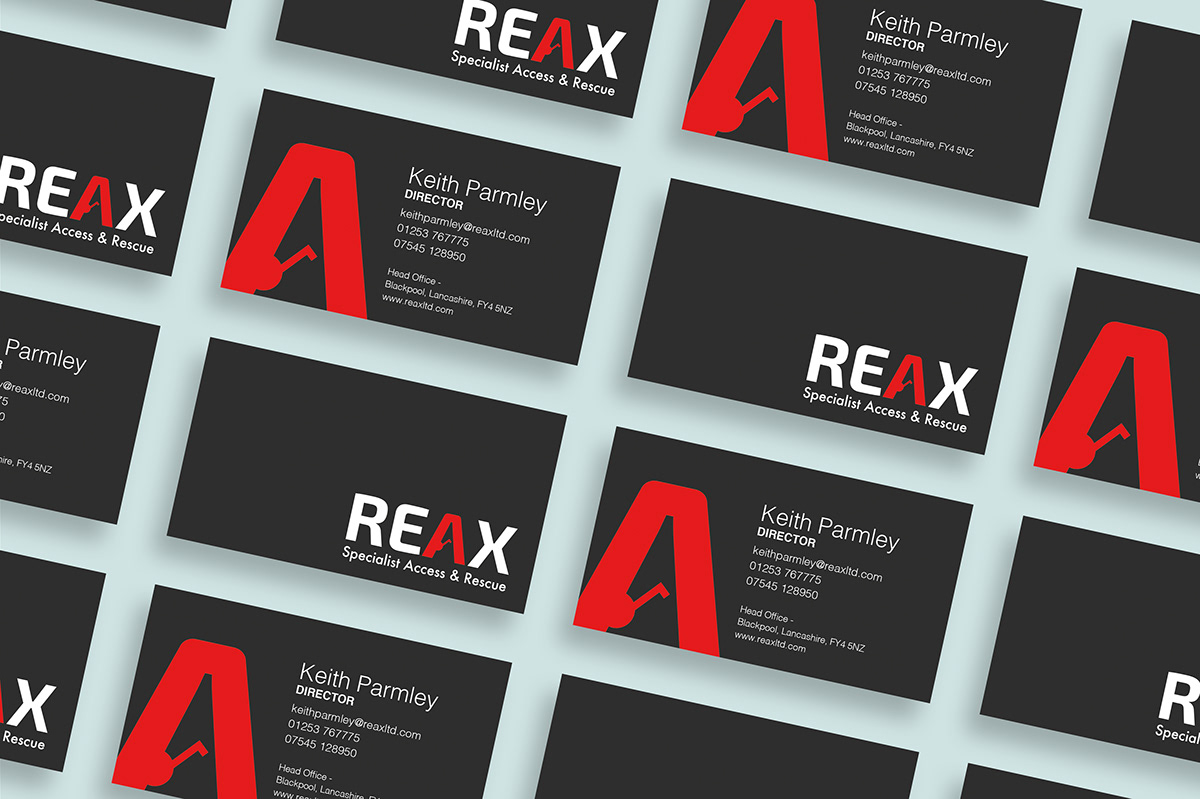
The 'A' shaped tripod is an important piece of equipment which is used in confined spaces; a main criteria for this company.
The development opened a change of direction in the name and identity of the company.

The Brand
The word 'Reax' is unique, created to be bold and stand out. Incorporating the words 'react' and 'rescue'; the colour red emphasises the relation Reax has with emergency rescue training.


Font
Exo 2.0 Bold - REAX
The level of professionalism with the instructing needed to be reflected and the reliability and safety of the courses they provide. The choice of this bold and strong font gives a solid and professional look, while the curved corners gives a sense of safety.
Futura - Specialist Access & Rescue
The modern and reliable sans serif font was used so its clear and easy to read and contrasts well with other font.


www.reaxltd.com


Reax provides up to 40 courses, with different skills and equipment. We needed to find a simple and clear way of displaying the courses on offer, that were able to be used on multiple medias. We chose to use Infographics to represent each course, as together with the course name they help to give customers a clear and simple insight of what each course entails. Infographics also created a continuity and have connotations of emergency and safety signage.
The infographics were uniformed following the brand guidelines and kept simple by only featuring 1 or 2 objects.


