The Space Between
The Hainish Cycle is Ursula K. Le Guin's anthology of novels and stories set across numerous times, cultures, and worlds. As I read the books I was struck by the many ways that “space” manifests itself. While wars take place in the continuum they don't happen on the pages, but in the space between the books. Traveling between worlds means losing years of time, and even when characters are on the same world you get a palpable sense of the space between their souls.
This space and quietness inspired me to create a series of cover art.
LeGuin developed and evolved as a writer over the decades that she added to these worlds, and her shifting interests and experience drastically changed themes. So while every cover aims to be spare, they are not meant to feel like a single family, but more like a single species. I wanted each cover to be directly influenced by the events of that book but allowed he specific style to wander as needed to capture the right mood.

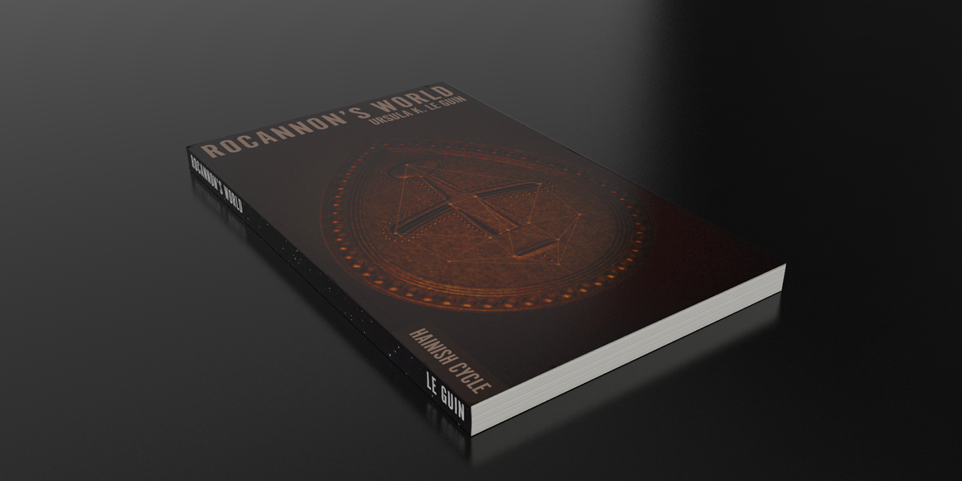
Rocannon's World
This is the first and to my mind most idiosyncratic novel in the series, and so I treated it as a bit of an outlier. Generally the story involves a bronze age culture and so I took stylistic and executional inspiration from the art of that era.
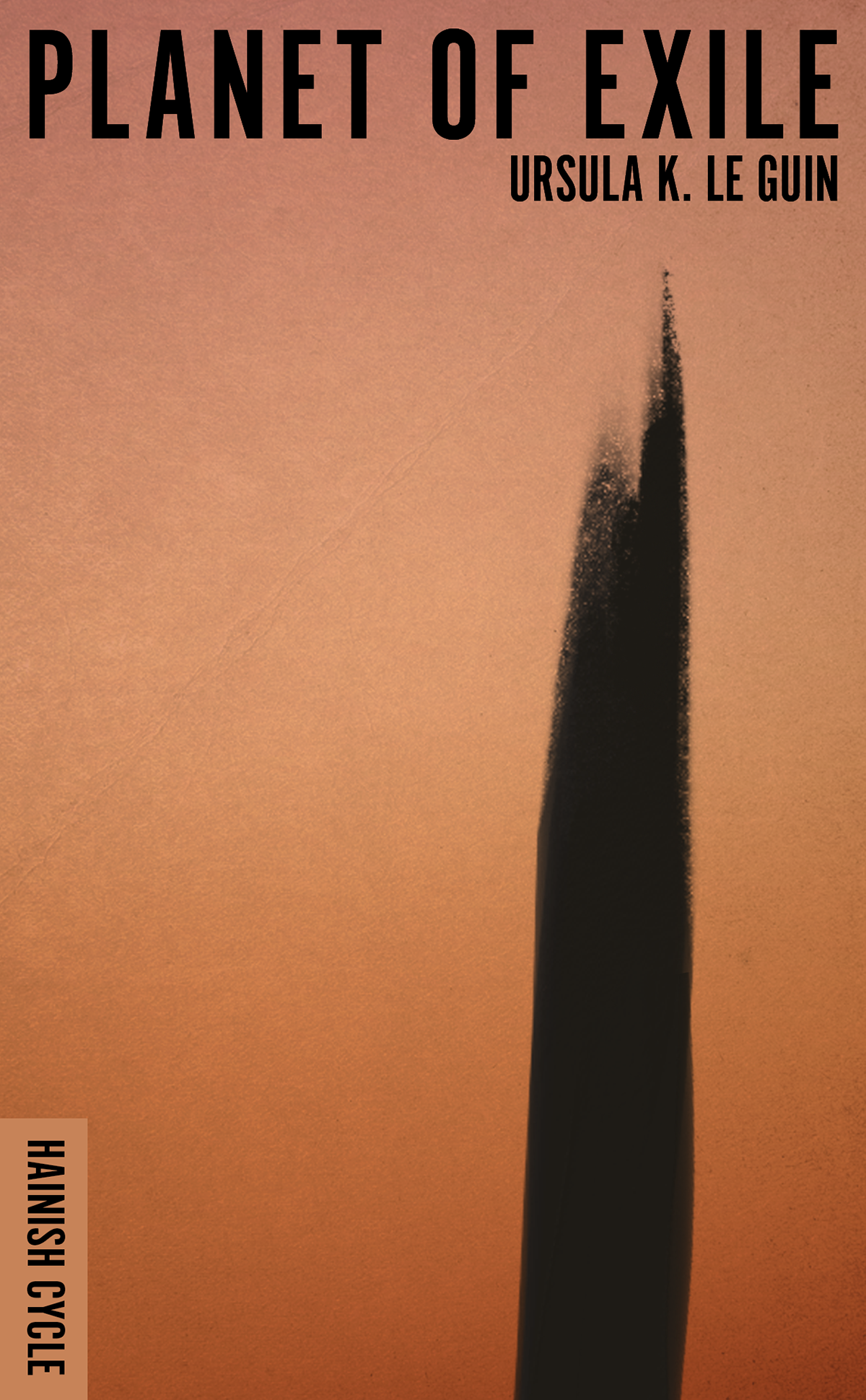

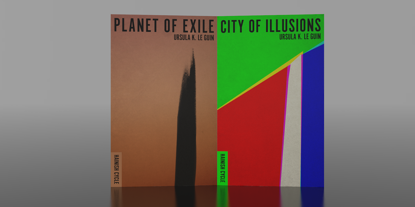
Planet of Exile
This novel was the first time I felt a theme of deep loneliness that pervades all of the stories. After a bit of searching, the solitary black alien tower felt like an appropriate metaphor for the story.

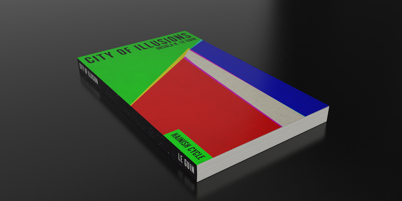
City of Illusion
Initially I was at a loss for this book. However, this cover came together very quickly once I completed Planet of Exile. These are the most directly connected novels in the series and so I wanted the to relate to one another without being a direct set. The bright colors are set in contrast to 'exile’ and capture the feeling of disorientation in the book.
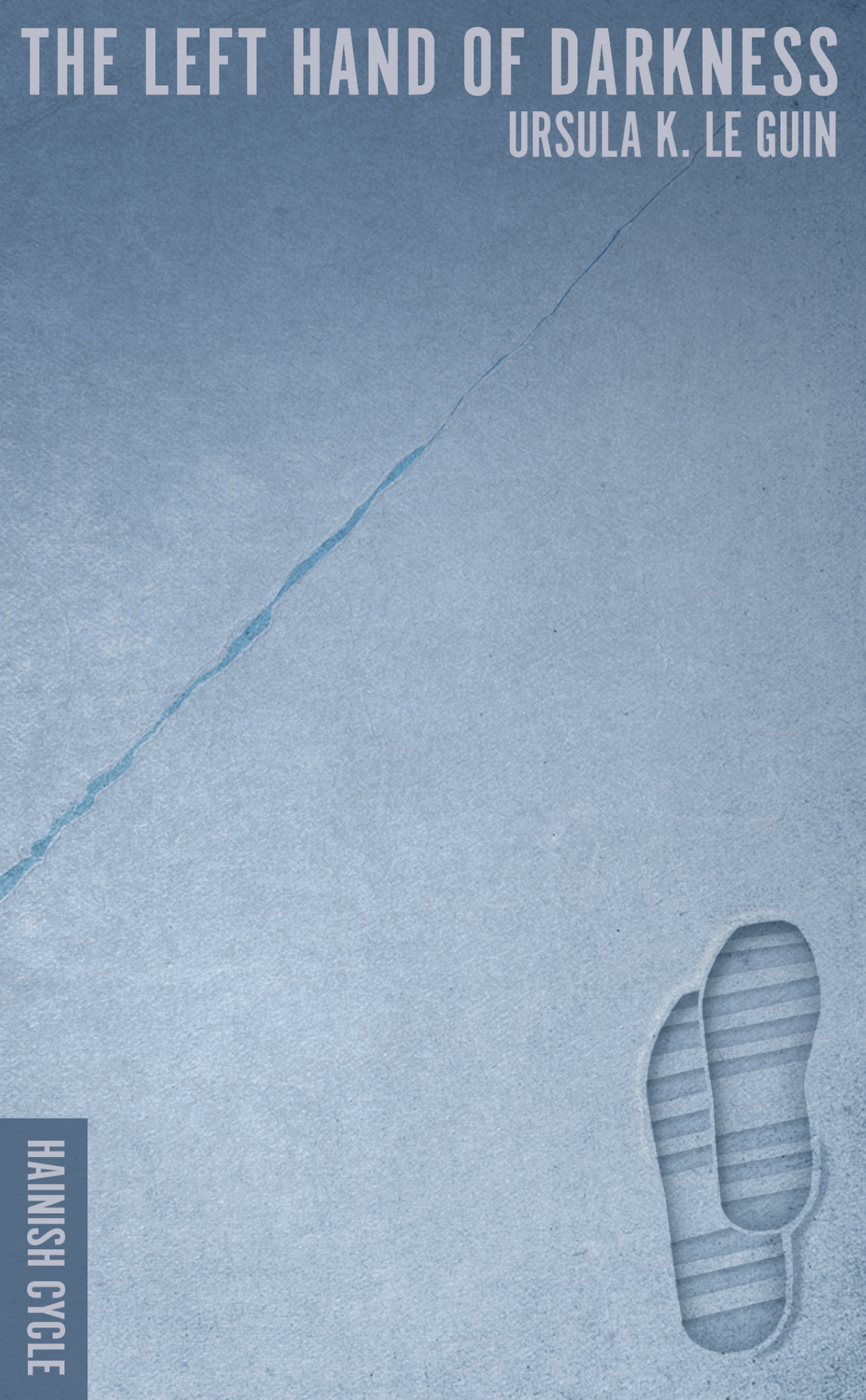
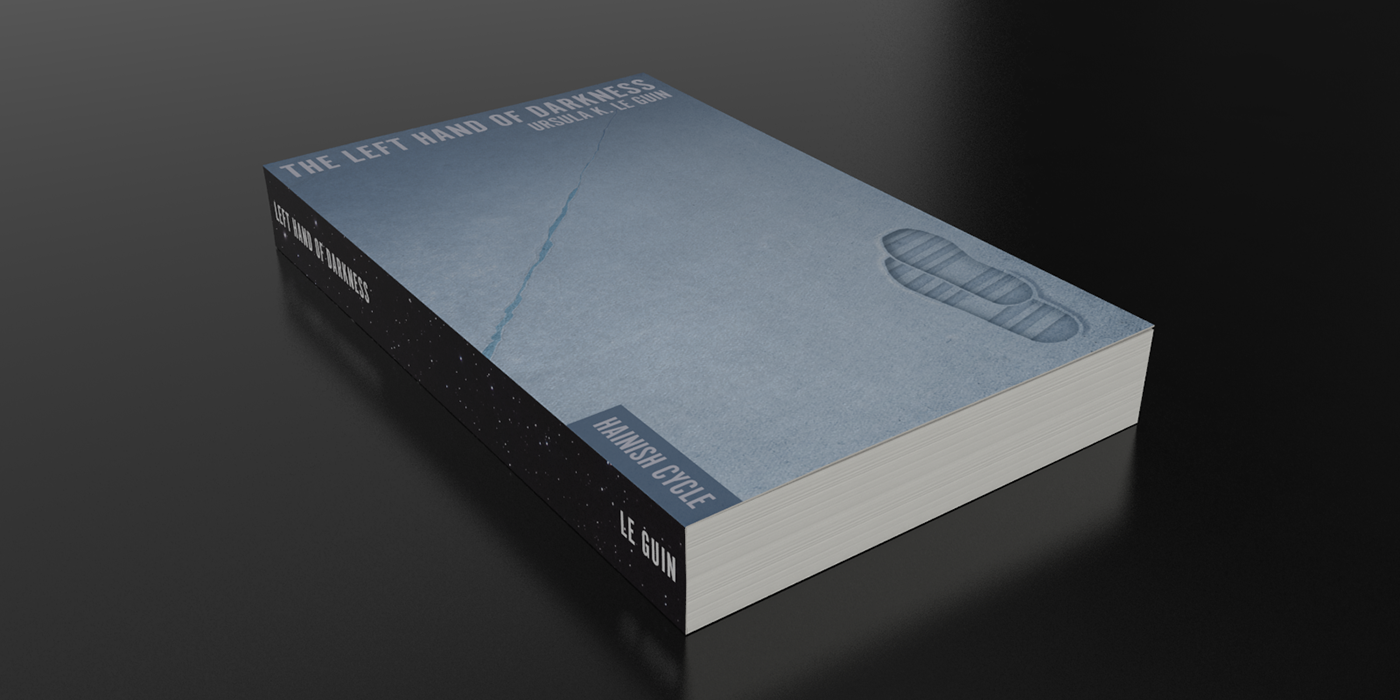
Left Hand of Darkness
This is the most notable book in the cycle, and very clearly focuses on duality. Lonely footprints may not be left by hands but at least by the left.

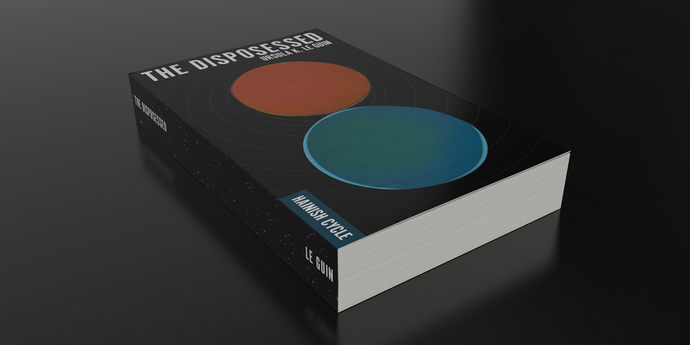
The Dispossessed
This novel takes place on a set of “twin” planets, and this relationship was an obvious starting point. The difference between the cultures also work as a Venn diagram with no overlap. Also, I believe that this book actually was published after The Word for World is Forest, but I've seen collections position it before that book, and thematically it feels more connected to the early novels anyway so I figured I'd do the same.
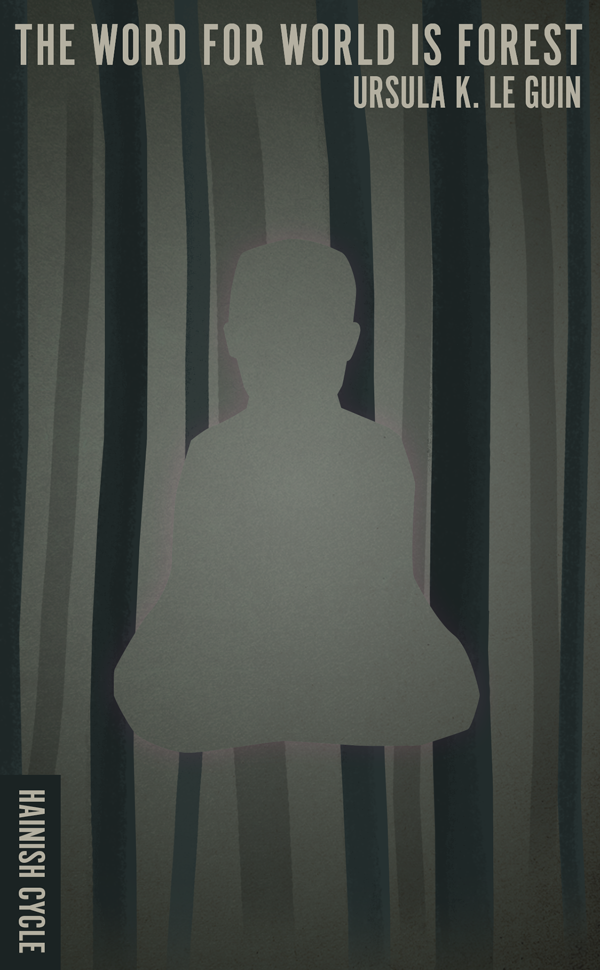
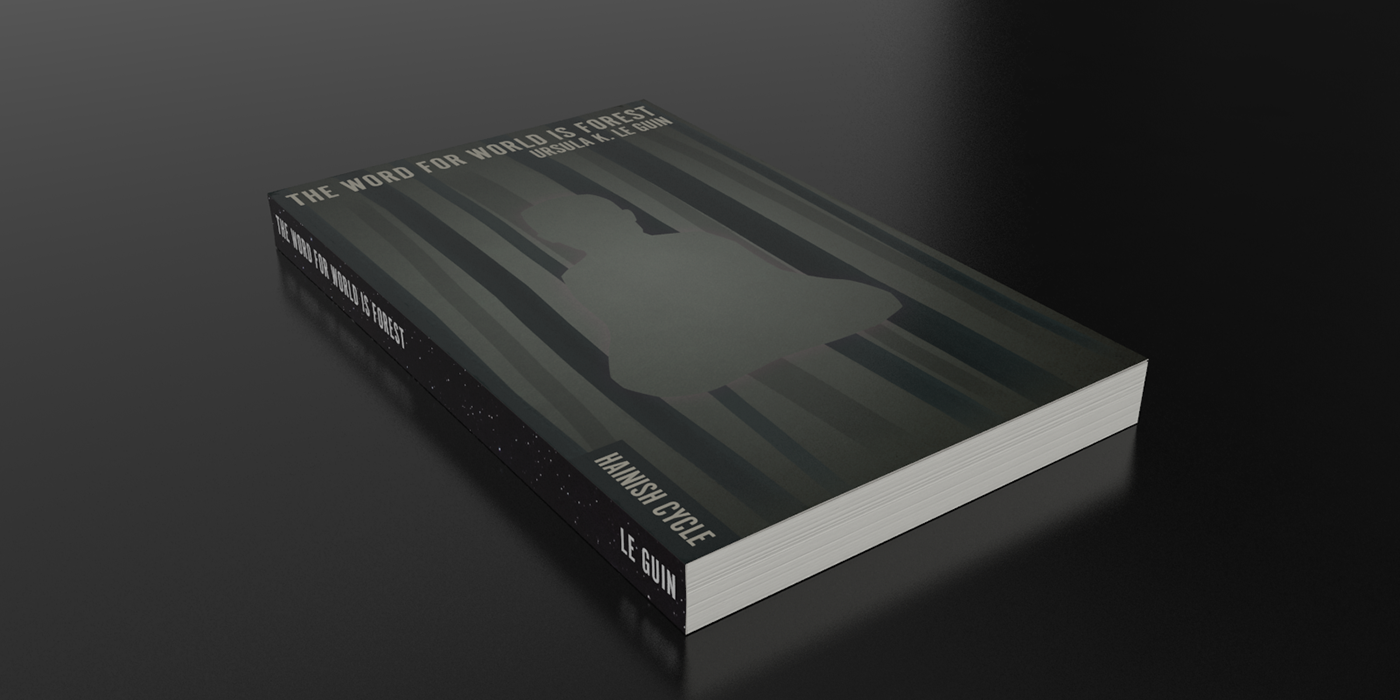
The Word for World is Forest
The Word for World is Forest seems to mark a shift in the Hainish stories. They seem to add a political bent to what have up to now felt like more personal themes. The explicit moral tone made me feel more confident in using directly referential imagery. I do like that the pattern is reminiscent of both trees and prison uniforms.
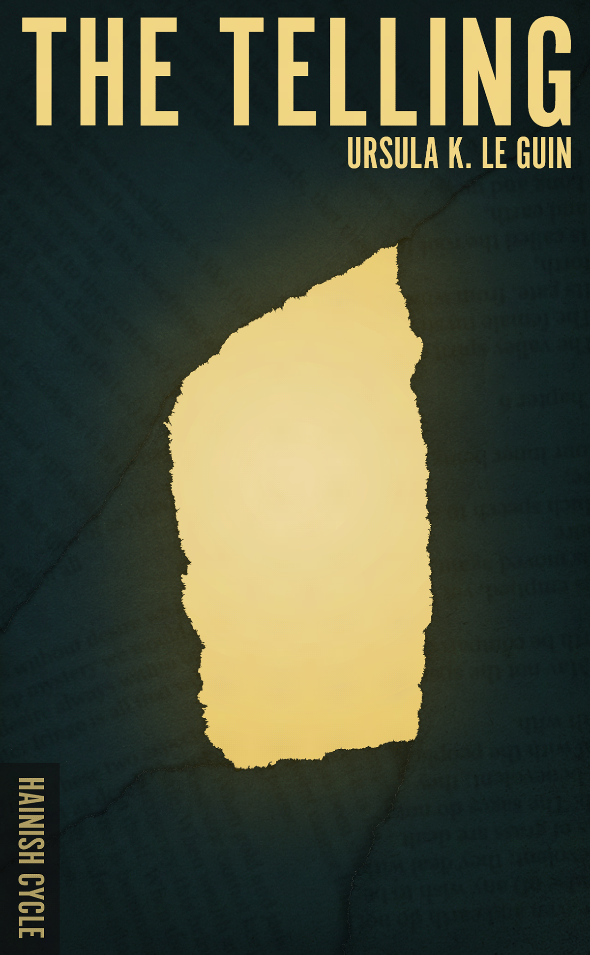
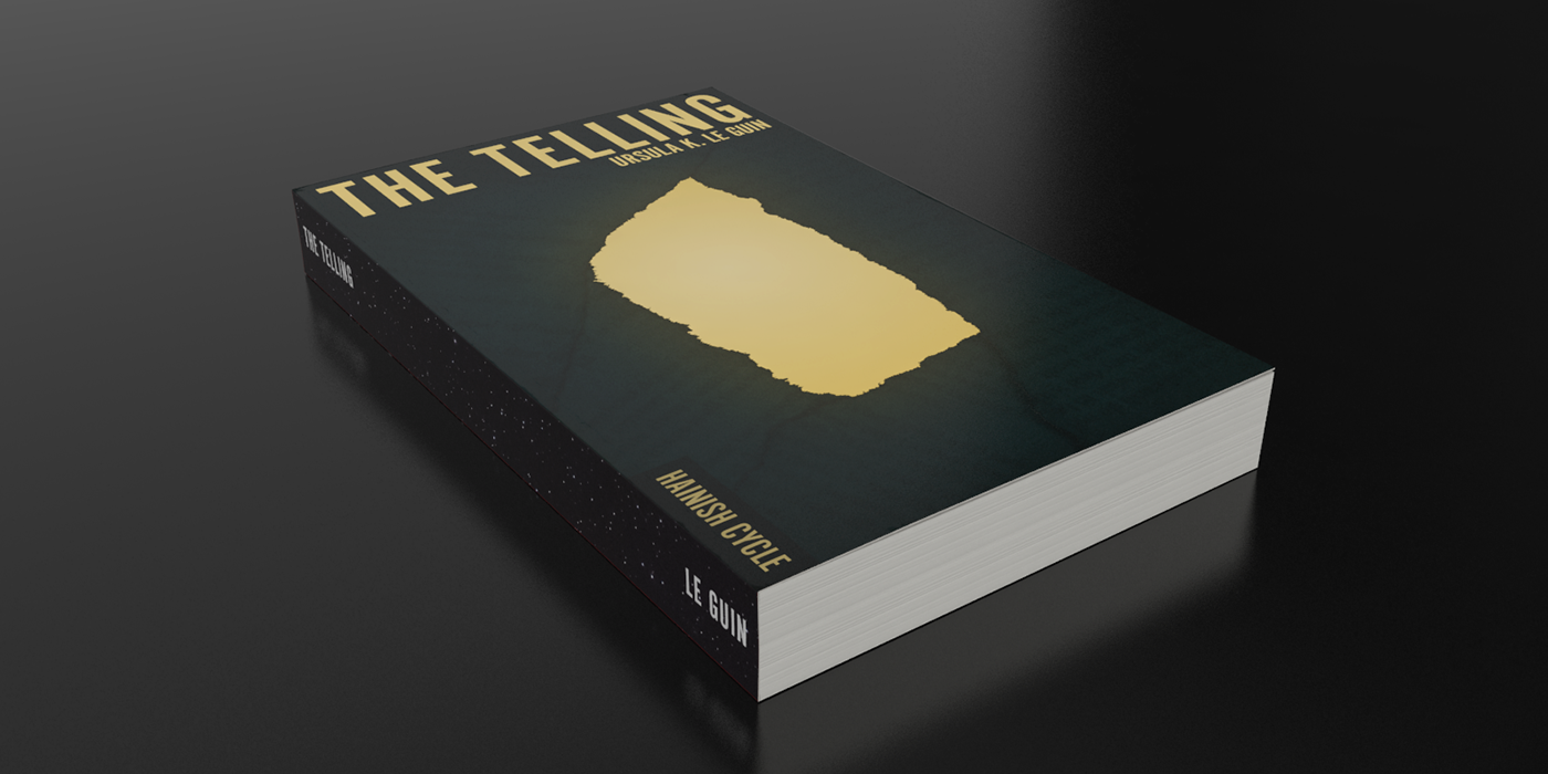
The Telling
The Telling was another challenge and in the end I combined inspiration from the both the caves and the writing that they contain as the core of this concept.
There are a few more covers on their way as I complete the series so if you enjoyed them, stay tuned...

