


TV+
BRANDING
CLIENT: MEDIAMAS
YEAR: 2018
TV+ is the oldest TV station in Chile (when it started in 1957 it was called UCTV though), and now after the rebranding we can say it's one of the freshest stations too.
They ask us for an image capable of expressing the channel vibe that is based in three core attributes: TV+ it is mainly an entertainment channel, their contents are light and fresh, and it in this new stage they aim to get closer to its audience.


The colour palette of many open TV channels in Chile range between orange and yellow (the old UCTV was this way, as well) so we wanted to differentiate ourselves from the old brand and from our competition, but without completely breaking from the brightness of the old identity.
The scheme we choose is bold, the hues are saturated, and, even though blue is the principal colour, is very cheerful. The audience immediately noticed (and liked!) the new TV+.


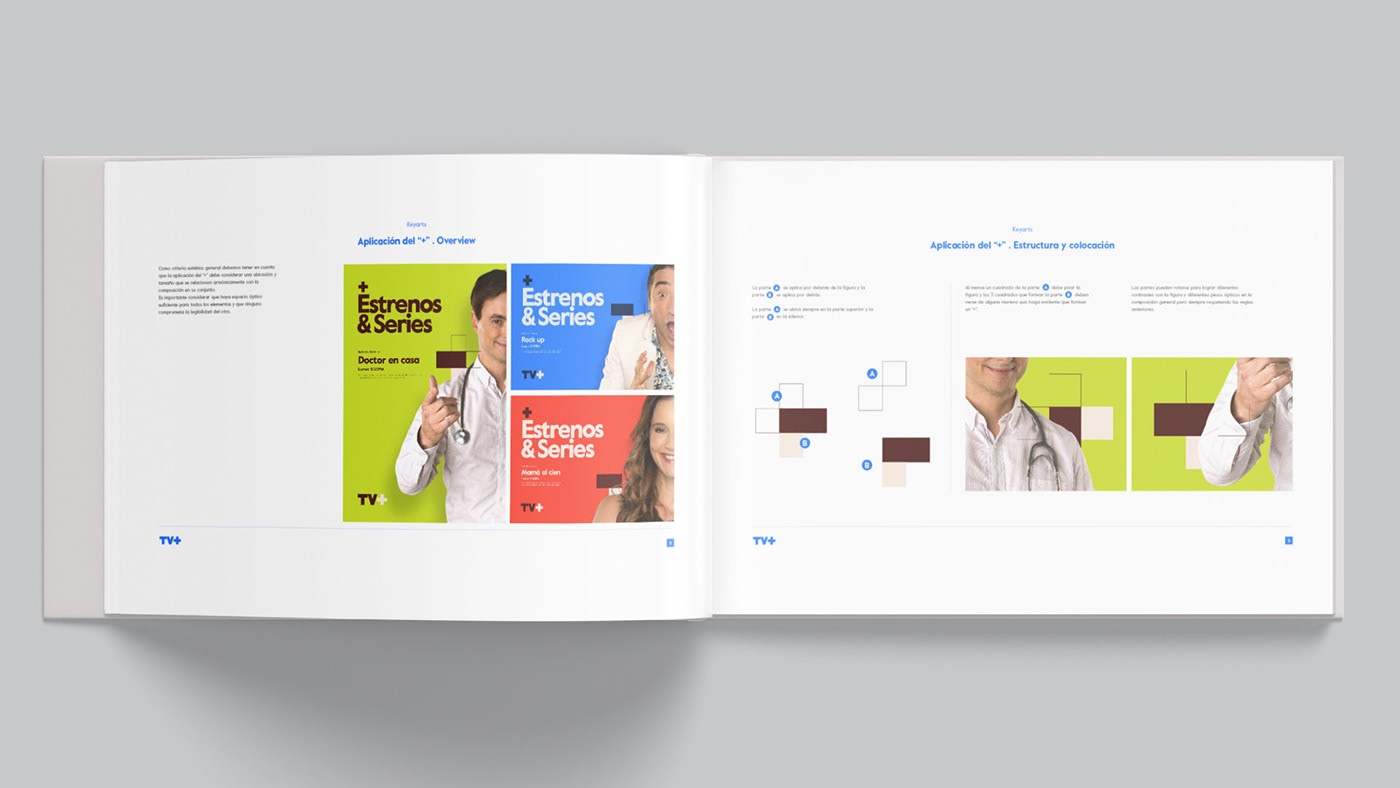
The branding system starting point is the "+" which we formed using 5 squares.

This informed the rest of the pieces we created. The modular square repeated, expanded, solid or outlined, was the base for the different grids and layouts, in combination with a geometric font and the channel main hosts.
The animation, on the other hand, was very minimalist to emphasise that this new channel was down-to-earth, friendly and close to its audience.


The launching of the brand new TV+ included a big colourful and bright off-air campaign that included posters, billboards, newspaper ads, banners, stationary, office dressing and more.


CREDITS
Client:
Sandra French, Maria Jose Muller, Mediamas.
Creative Direction, Art Direction and Graphic Production:
Inhouse team:
Florencia Picco, Fernando Vallejos, Natalia Español, Pablo Camino, Alejandro Guatelli, Martín Polech.
*
Thanks for watching!


