A new fast food chain of spanish breakfasts and lunches.
A franchise model that would offer the famous andalusian breakfasts and lunches all over the world: bocadillos, tapas and of course the different types of coffees of the region.

Brand platform.
Through a consulting process we carried out the strategic analysis and diagnosis of the situation in order to later define the new brand's identity and experience.
A fresh concept was proposed, based on a healthier, more ecological and natural option. We escaped the traditional fast food coldness to remain as cozy and friendly as the typical bar of Andalusia (Spain).

Naming.
We had to express our uniqueness in comparison to other similar chains through an impeccable brand, which would transmit Mediterranean warmth and good treatment.
The name had to be fun, easy to remember, efficient, familiar and ambitious.

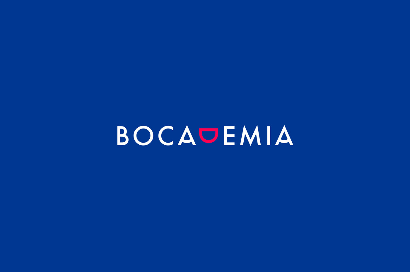
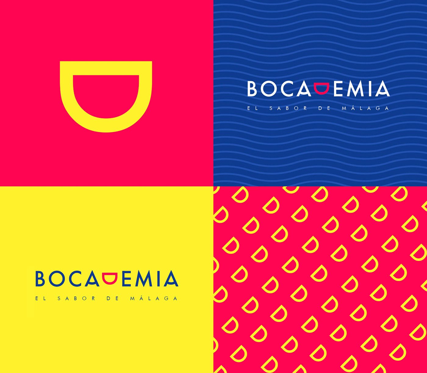
The symbol or anagram of Bocademia is a graphic representation of a smile and transmits one of the fundamental values of the brand, which is joy. In addition, the anagram with its mouth shape is the simplification of the brand name and a wordplay in Spanish: Bocademia.
Our style of visual communication should help convey the commitment and promise we make to each of our audiences.
The corporate image reflects all the values we aim to express through the brand:
Modernity: We offer a fresh and contemporary image that differentiates us from the majority of companies in our sector.
Proximity: For Bocademia every client is unique. Our communication is human and friendly, in tune with their expectations and lifestyles.
Quality: Our brand enhances the image of a company that always offers quality products to the consumer.
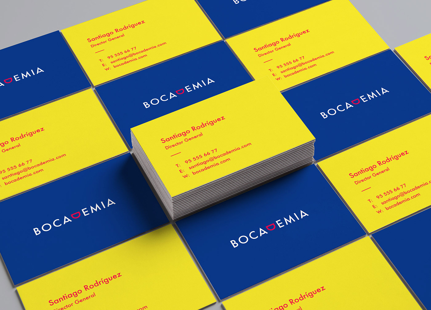
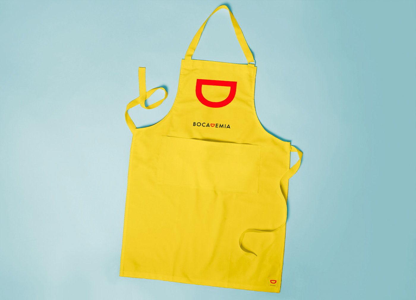
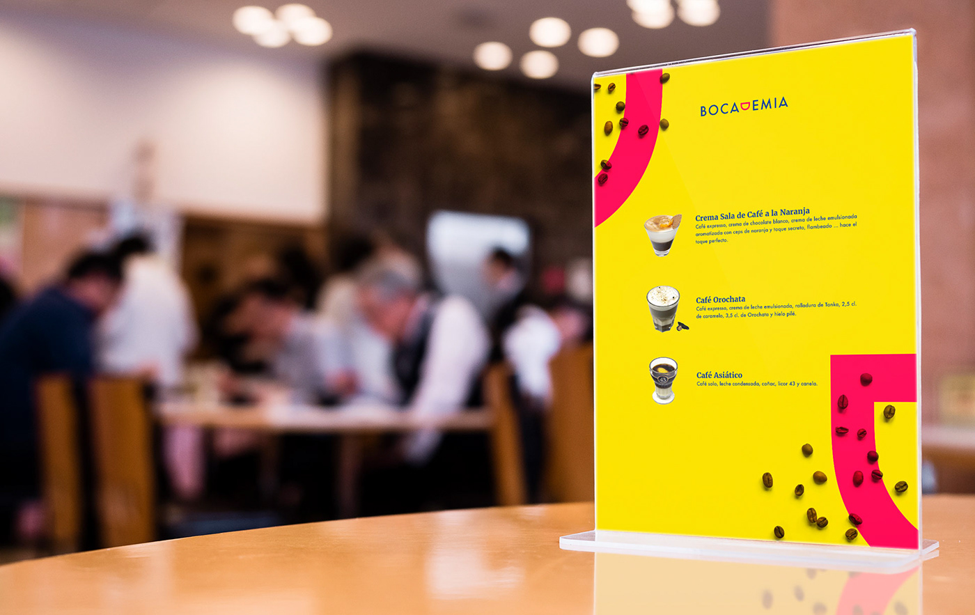
We used the brand’s 3 corporate colours, sea blue, passion red and sun yellow, to create imaginary ornamental elements, illustrations and patterns that can complement the brand in its various applications.