


[English text below]
Contexto
O projeto “Passeia, Jardim Nakamura” tem por objetivo garantir maior conforto e segurança nos deslocamentos a pé, que são maioria no bairro – localizado no Jardim Ângela, em São Paulo –, e valorizar o território e a comunidade local. A iniciativa é um projeto piloto de “legibilidade cidadã”, ou seja, implantar, no espaço público, elementos de comunicação que promovem a possibilidade de cidadãs e cidadãos conhecerem melhor seus próprios territórios, entenderem seus caminhos e se apropriarem das histórias contadas pela paisagem.
Desafio
Criar a identidade visual e as placas dos três diferentes níveis de informação (informativas, indicativas e de localização) e criar identificação por parte das pessoas que moram no bairro, fugindo de estereótipos presentes em representações de regiões afastadas de grandes centros.
Solução
Inspirados pelas formas encontradas no bairro, criamos grafismos que foram utilizados nas peças e também aplicados em estêncil pelas crianças em uma caça ao tesouro no mutirão de aplicação da sinalização. As cores foram inspiradas no contraste dos diversos graffitis da região e a tipografia escolhida dialoga com as letras presentes nas redondezas do bairro, além de seu aspecto condensado otimizar a aplicação de diferentes tamanhos de texto nas placas.
Leia mais sobre o projeto no seguinte link: https://medium.com/@sampape/pela-primeira-vez-sinalização-para-pedestres-chega-a-bairro-da-periferia-de-são-paulo-395a40d99bb0
Context
The project aims to ensure greater comfort and safety in walking, which is the major transport in the neighborhood – located in Jardim ngela, in São Paulo –, and to valorize the territory and the local community. The initiative is a pilot project of "citizen readability", that is, to implement, in the public space, communication elements that promote the possibility for citizens to better know their own territories, to understand their surroundings and to appropriate the stories told by the landscape.
Challenge
To create the visual identity and the sign boards of the three different levels of information (informational, indicative and location) and to create identification by the people living in the neighborhood, avoiding stereotypes present in representations of regions away from large centers.
Solution
Inspired by the forms found in the neighborhood, we created graphics that were used in the pieces and also applied in stencil by the children in a treasure hunt in the event whereupon people from the neighborhood joined forces to implement the signage. The colors were inspired by the contrast of the various graffitis of the region and the chosen typography dialogues with the letters present in the vicinity of the neighborhood, in addition, its condensed aspect optimize the application of different sizes of text on the plates
More about the project: https://medium.com/@sampape/pela-primeira-vez-sinalização-para-pedestres-chega-a-bairro-da-periferia-de-são-paulo-395a40d99bb0

Listas de produtos, informações, avisos e demais elementos textuais encontrados no bairro serviram de inspiração para a fonte escolhida para o projeto. Por ser levemente condensada, a fonte otimiza a inserção de diferentes tamanhos de texto nas placas. O desenho das letras é bastante legível e apresenta caracteres distintos entre si – característica visível, por exemplo, em letras como o "I" ("i" maiúsculo) e o "l" ("L" minúsculo).
Lists of products, information, warnings and other textual elements found in the neighborhood served as inspiration for the typeface chosen for the project. Because it is lightly condensed, the font optimizes the insertion of different text sizes on the boards. The letter design is quite legible and has characters that are distinct from each other - a feature that is visible, for example, in letters such as "I" (uppercase "i") and "l" (lowercase "L").


As grades, cobogós, tijolos e texturas presentes na região inspiraram os grafismos criados para a identidade visual.
The grids, "cobogós", bricks and textures present in the region inspired the graphics created for the visual identity.


Os pictogramas criados indicam desde as escolas e pontos de ônibus presentes no bairro até elementos mais particulares, como a mina de água potável e a propriedade onde o bairro começou – onde havia jacarés "de estimação" favorecidos pela abundância de água e umidade das terras da região.
The pictograms created indicate places such as schools and bus stops in the neighborhood to more particular elements, such as the drinking water mine and the property where the neighborhood began – where there were "pet aligators" favored by the abundance of water and humidity of the region.

As placas informativas contam a história e trazem informações sobre lugares importante para os moradores.
Information boards tell the story and bring information about important places to the residents.

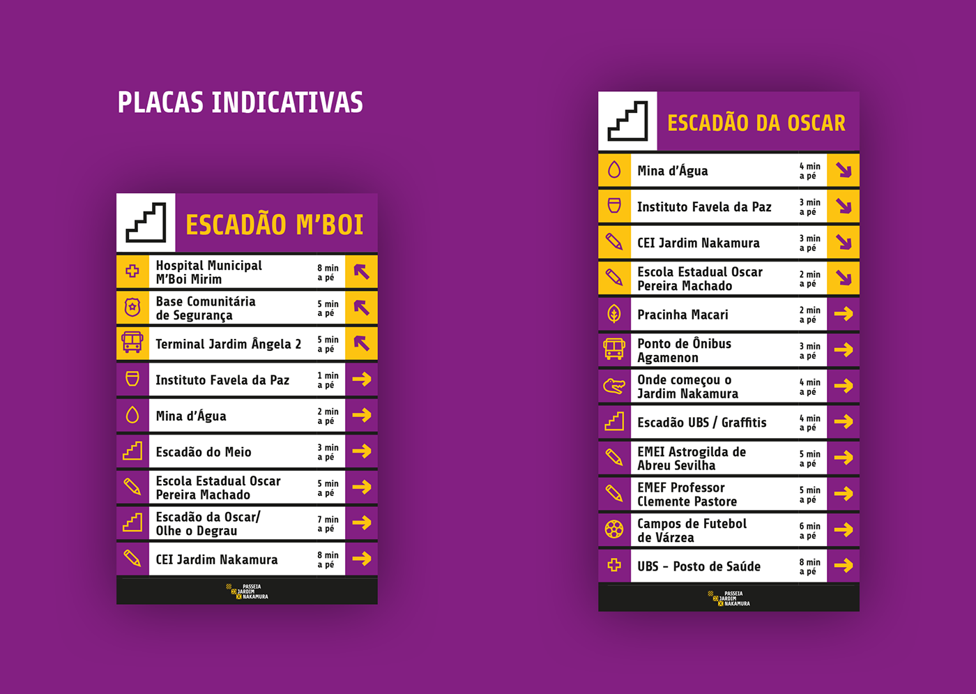
As placas indicativas apontam a direção dos pontos de interesse e trazem informações como a distância caminhando da placa até o local e os pictogramas que auxiliam no entendimento da informação.
The indicative signs show the direction of the points of interest and bring information such as the distance walking from the board to the place and the pictograms that help in the understanding of the information.
As placas de localização apontam onde a pessoa está no bairro com apoio de um mapa, além de indicar a localização dos pontos de interesse. As placas também contém um círculo cujo raio representa onde a pessoa chega caminhando em 5 minutos.
The location signs point to where the person is in the neighborhood with the support of a map, as well as indicates the location of the points of interest. The boards also contain a circle whose radius represents where the person arrives walking in 5 minutes.


A visualização de cada mapa corresponde à direção para onde ele aponta. Essa particularidade fez com que o norte de cada mapa esteja em uma direção diferente, pois foi priorizada a percepção da localização onde a pessoa está e o que ela vê ao redor de si própria. Em cada mapa há também uma indicação da localização do centro da cidade com relação ao local da placa.
The view of each map corresponds to the direction it points to. This particularity has caused the north of each map to be in a different direction, since it has prioritized the perception of the location where the person is and what he sees around himself. On each map there is also an indication of the location of the city downtown relative to the location of the board.

Na implementação realizou-se um evento de mutirão comunitário para a instalação das sinalizações, envolvendo voluntários, organizações e moradores locais. Três intervenções visuais em pontos estratégicos do bairro foram realizadas pelo Manifestintação Crew e CicloSocial Arte, grupos locais de graffiti, representando temáticas de mobilidade ativa e a valorização da identidade comunitária. Crianças também foram envolvidas no processo: enquanto acontecia o mutirão para instalação, aplicou-se uma ferramenta desenvolvida pelo Instituto COURB para engajamento, denominada Caça ao Tesouro. Nessa atividade, os “urbanistas mirins” receberam pistas de locais atrativos, localizaram os pontos no mapa e exploraram o território.
In the implementation, a community outreach event was held for the installation of signs, involving volunteers, organizations and local residents. Three visual interventions at strategic points in the neighborhood were carried out by the Manifestintação Crew and CicloSocial Arte, local graffiti groups, representing themes of active mobility and the valorization of community identity. Children were also involved in the process: while the joint effort for installation was applied, a tool developed by the COURB Institute for engagement, called the Treasure Hunt, was applied. In this activity, the "little urban planners" received clues from attractive locations, located the points on the map and explored the territory.


