
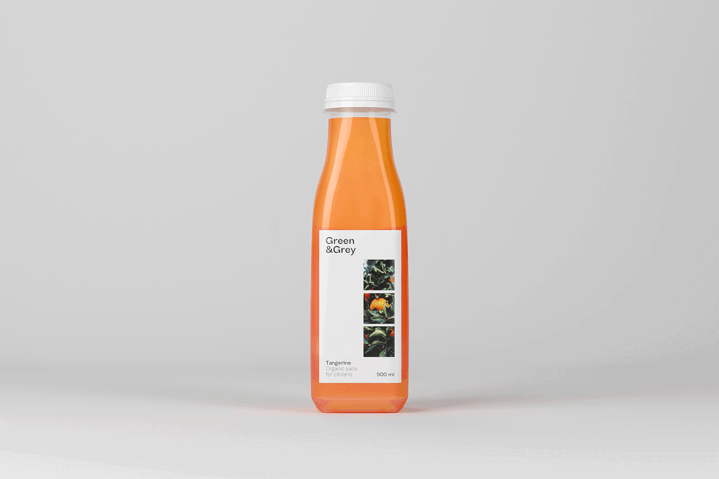
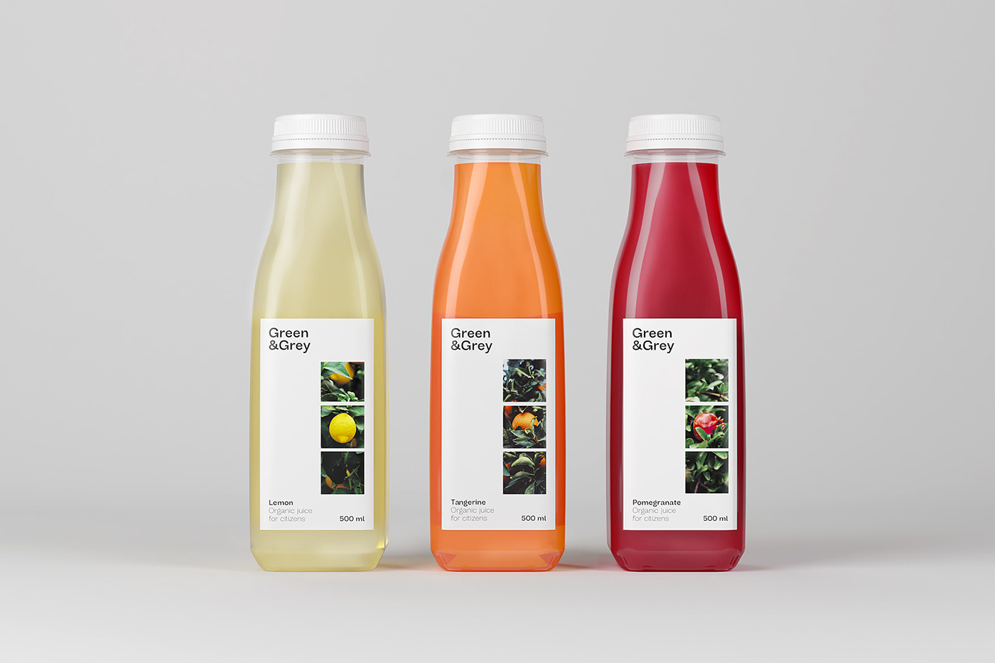
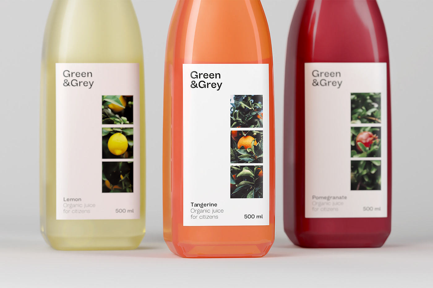
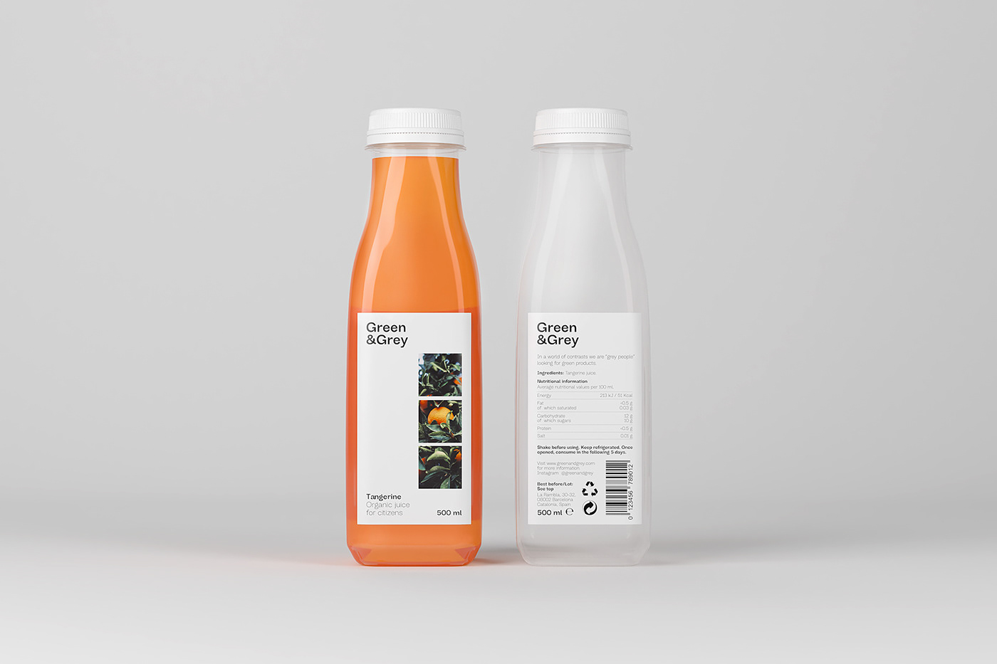
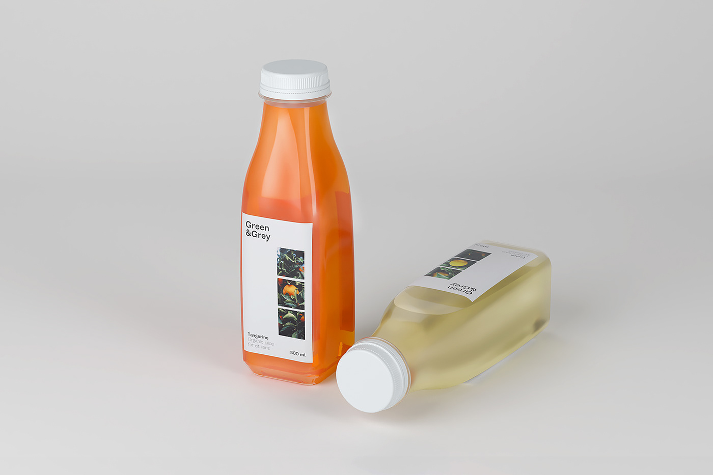
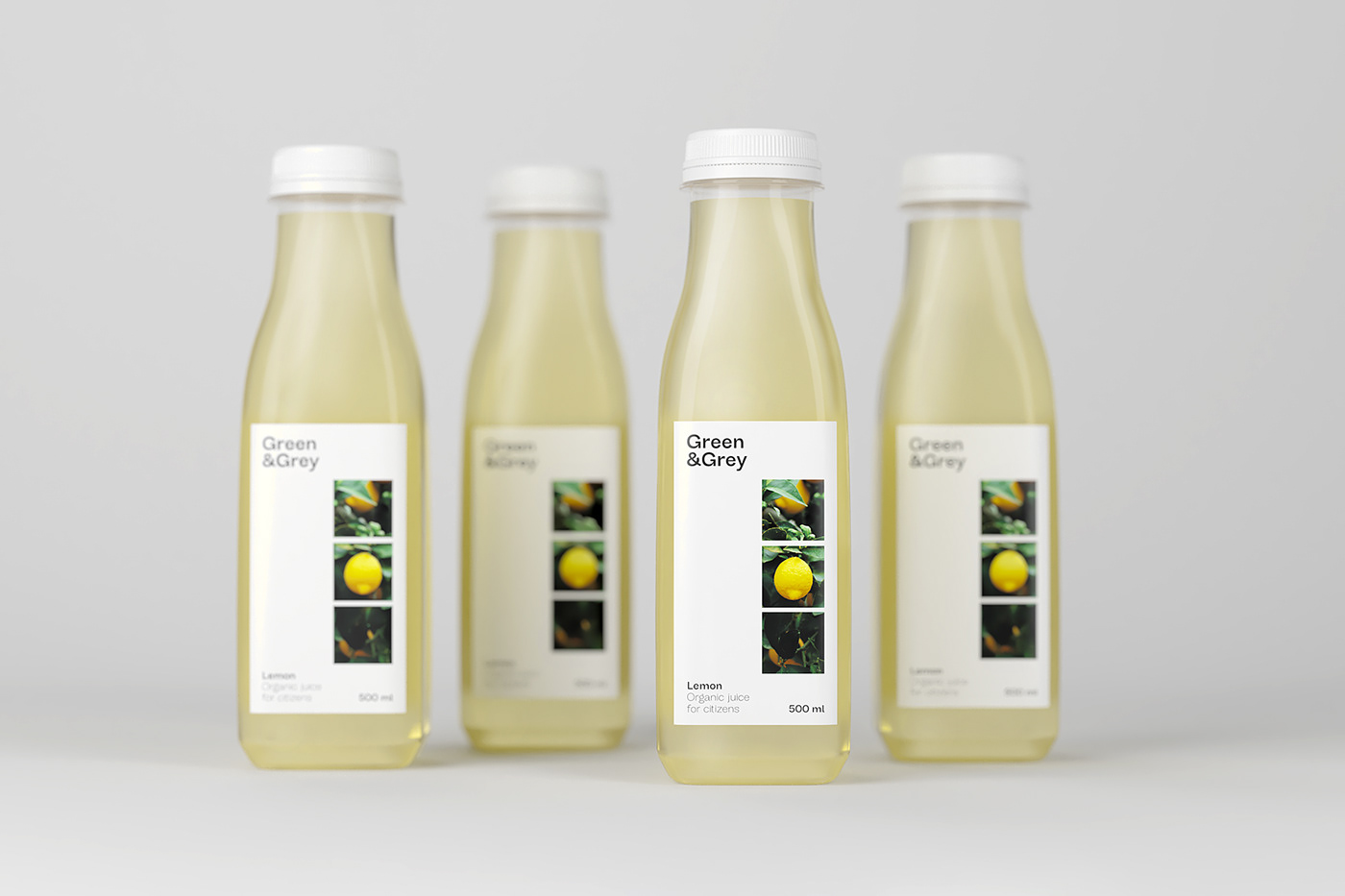
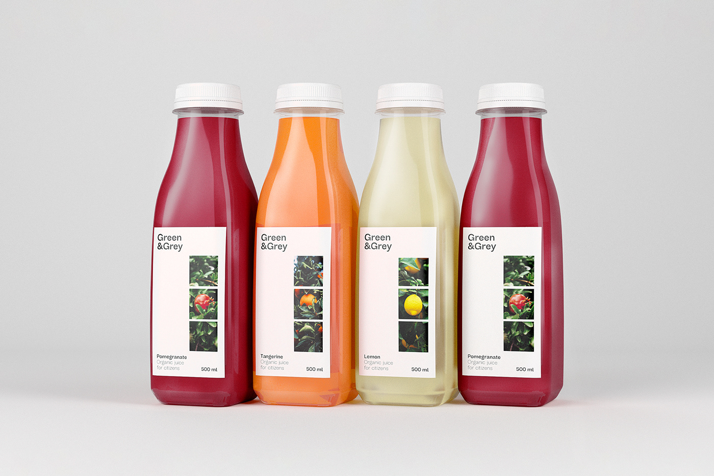
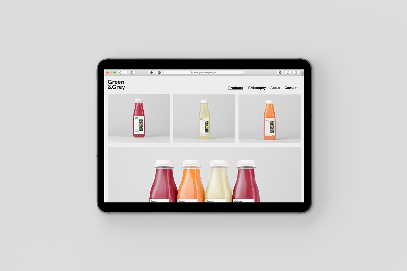
In a world of contrasts, we are urban people longing for what is really real. We are "grey people" looking for green products. Green&Grey is an organic juice brand focused on urban and adventurous youth who are attracted to the rural environment and nature. Our goal is to create an escapist brand and represent the contrast concept: countryside and city, natural and artificial, curve and sharp, green and grey.
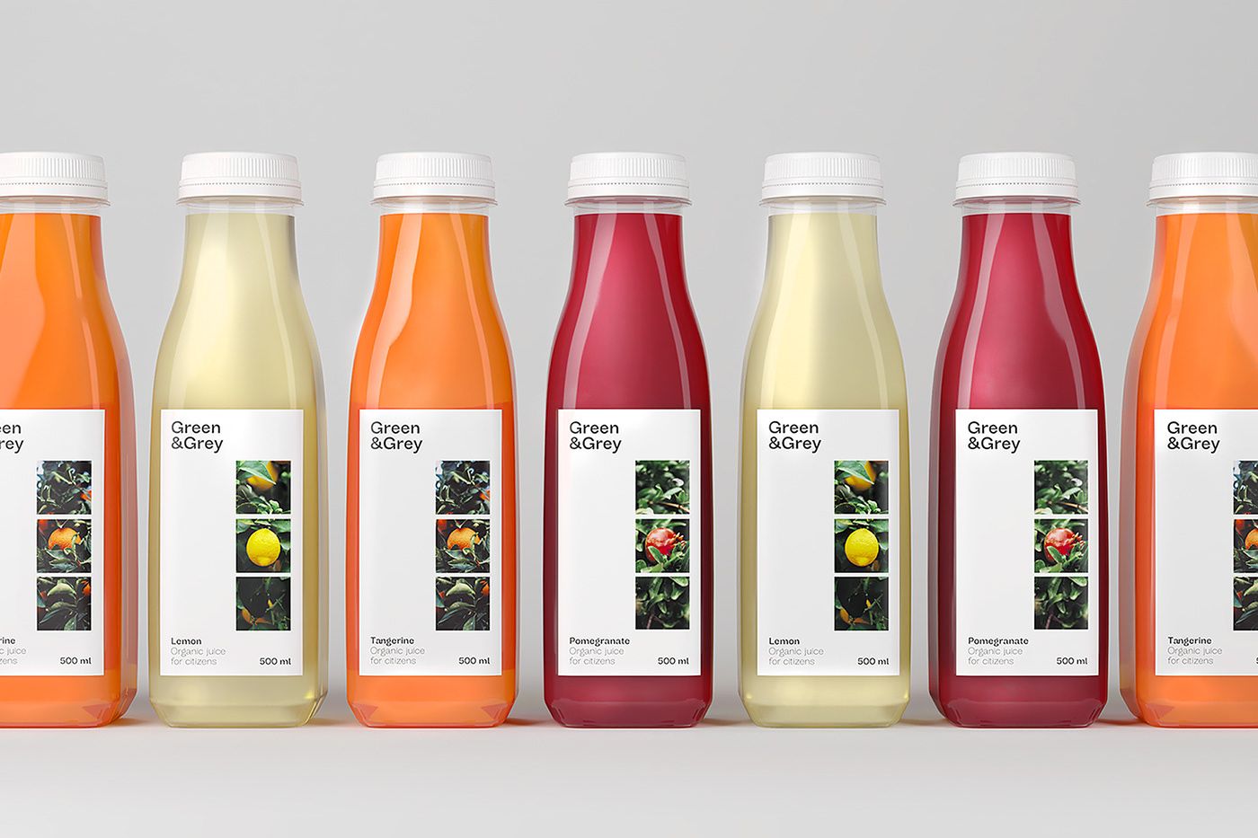
The idea of escape is created through photography framed in three squares that represent what a person would see through a window. We love the feeling of longing and depth that this resource obtained. Besides, there is a color contrast with the foliage photographies and the white background. Regarding the composition, we have generated a simple and clean balance between the different justified elements to the left and to the right side of the label. Structurally the contrast is represented in the bottle with a transition between a square at the base and a circle in the upper part.

Master in Packaging Design | ELISAVA | Barcelona, Spain | Mar. - Apr. 2019
Tutorized by Alex Pirard, Pau Llavador, David Sagarzazu.
Tutorized by Alex Pirard, Pau Llavador, David Sagarzazu.
Featured on: Packaging of the World, Mark J Jeffries' Blog, Page Magazine 02.2020


