
ABOUT
COFE is an otorhinolaryngology and speech therapy medical center.
These two specialties, in conjunction, can provide comprehensive care for patients with disorders related to the nose, ear, and throat. With an interdisciplinary approach, patients receive the most comprehensive and personalized care possible, improving their communication skills and overall quality of life.
GOLDEN CIRCLE

LOGO CONSTRUCTION
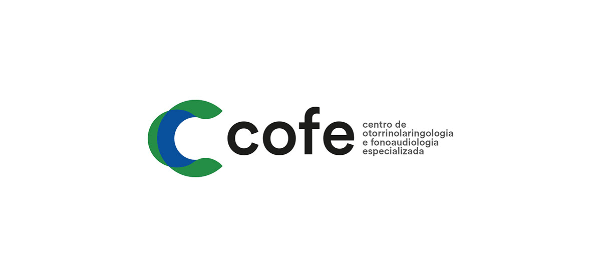
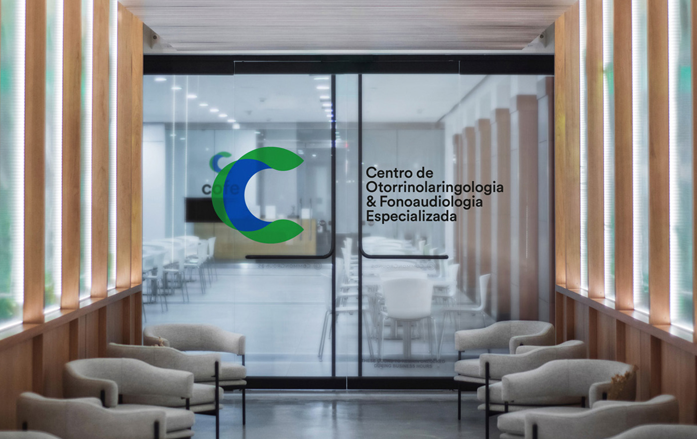
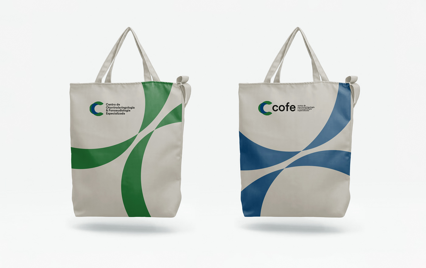
The logo has been created based on the communication flow concept. The symbol starts from the bold letter C representing a desire to assume a highlight position and the sector leadership in the estate. The three green areas divided through a wave movement represent the nose, ear, and throat, connected by the interception of the two medical areas. In addition to the form construction, the colors (green and blue) represent seriousness, vitality, and confidence and can be used as a graphic element to separate those two specialties. The typography used was the Circular Std, a geometric sans-serif font that maintains the symbol aspect adding a friendly and comfortable touch.


