

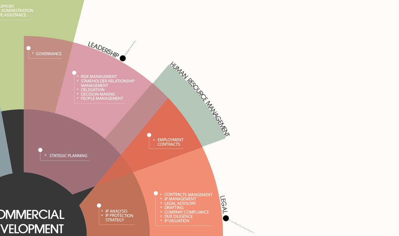
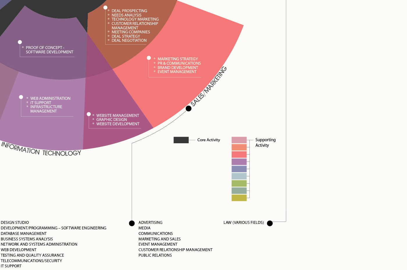
This infographic represents the structure and functionality of a commercialization office.
Each sector represents a unique profession and the arrangement of overlapping sectors shows how different
roles within the office collaboratively work together.


This infographic was designed to visually communicate the quantity of news headlines from various sources over a period of 24 hours.
Each colour represents a unique news source - thousands of headlines are categorized by these colours and divided into groups depending on the hour in which they were published. This mass display of coloured columns shows dominant news sources at different times of the day.


