
CFC has established a new BTS album Map of the Soul: Persona's album identity and conducted graphic and application design.
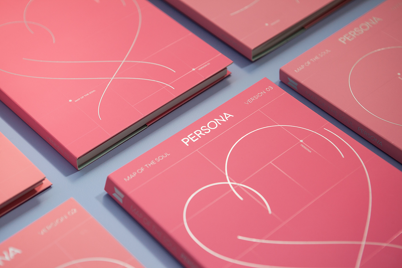
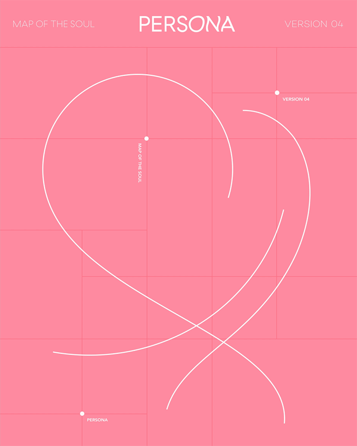
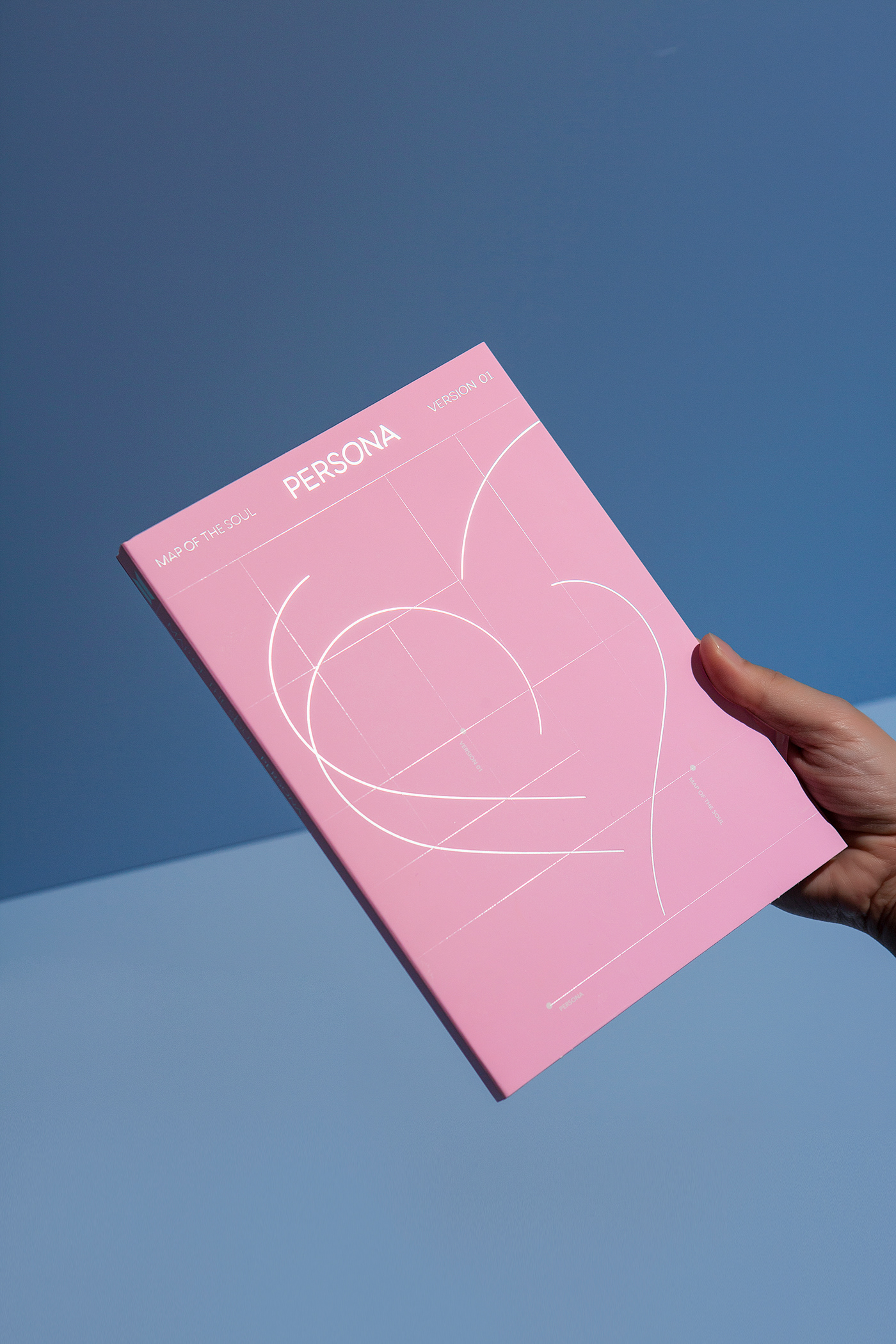
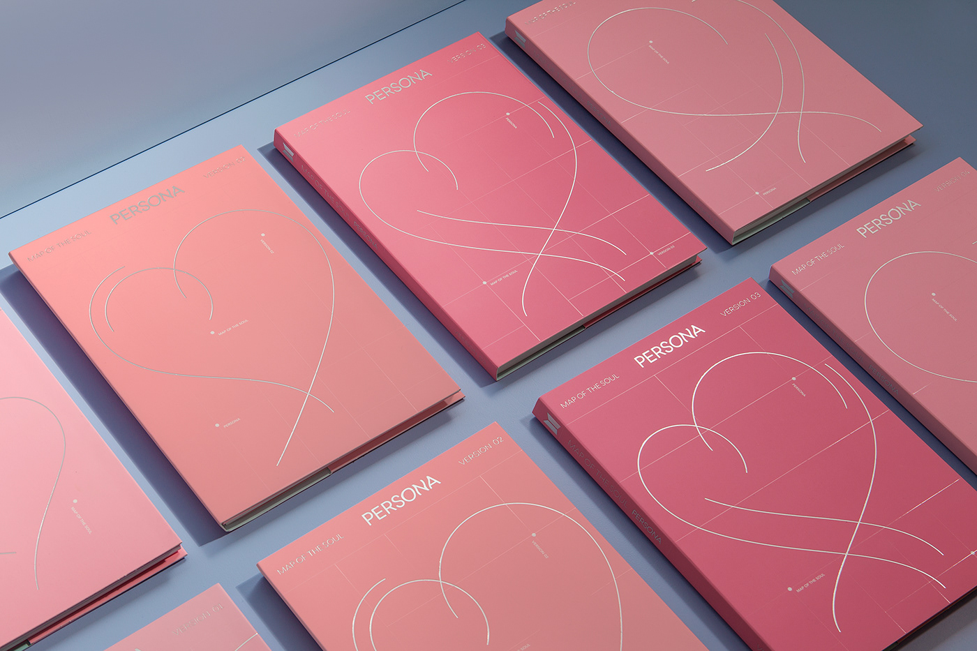
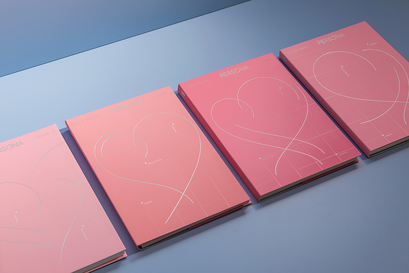
The album design is a form of Persona's graphic spread over a variable grid that metaphorizes the map. In order to capture the excitement of love, the rhythmical form of heart is expressed in a graceful line.
The line that runs freely through the grid, drawing hearts, metaphorically represents the trajectory of love that unfolds on the map. Persona's Wordmark, located in the top center of the album, contains emotions that are stirred by the mood of love.
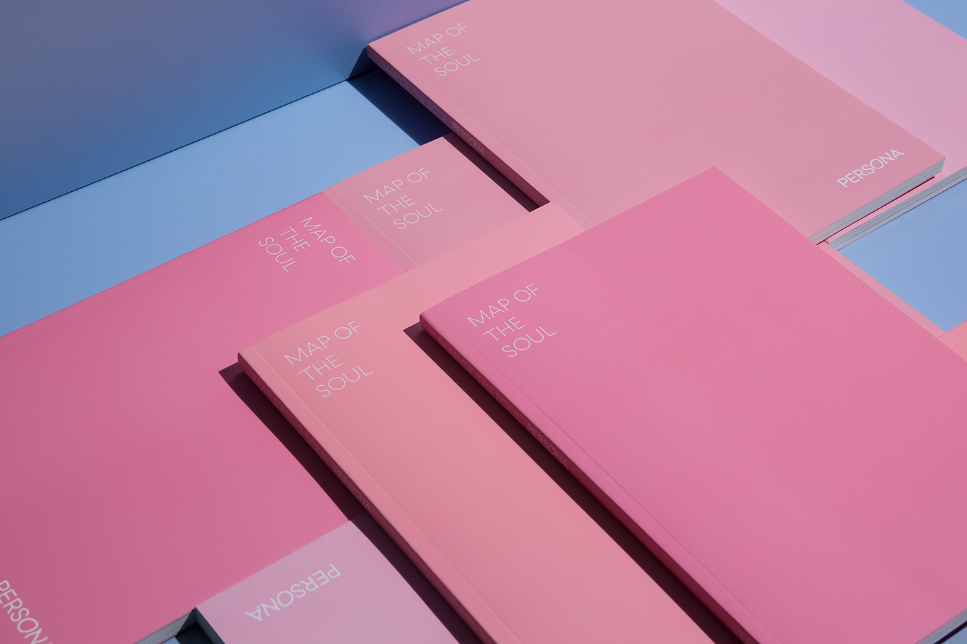
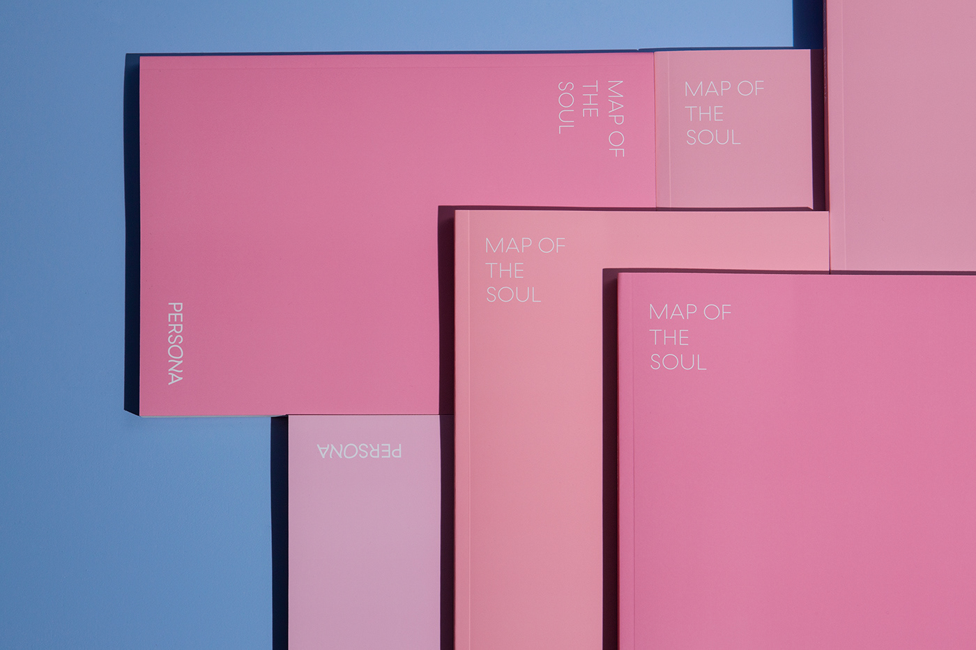
Pink, which is the main color of this album, would be transformed into four tones in each version and would convey the album's emotion with the light blue that appears when the album cover is opened.
When you open the album cover, the booklet, which is plugged into the right side, can be separated from the album to increase convenience. The grid within the Booklet connects organically to the album cover and delivers the album's consistent identity.


BTS Map of the Soul : Persona Album Visual Identity & Application Design
-
Project Owner: Big Hit Ent.
-
Project management: Big Hit Ent. Visual Creative Team
Identity Planning & Storytelling: J&Brand
Album Visual Identity & Application Design: CFC
-
CFC
Art Direction & Design: Charry Jeon
Design: Eunju Kim, Minsun Lee
Photography: Kiwoong Hong