

Hello,
Mi chiamo Carlo, sono un art director e lavoro nel campo della comunicazione dal 2001.
Con il passare del tempo ho sentito l’esigenza di creare una vera identità visiva in grado di trasmettere la mia personalità e il mio stile.
Descrivermi in una riga?
Una persona che ha la fortuna di fare della sua passione il proprio lavoro!
My name is Carlo, I am an art director and I work in the communication field since 2001.
Over time I felt the need to create a true visual identity capable of transmitting my personality and my style.
Describe me in a row?
A person who has the good fortune to make his passion his job!
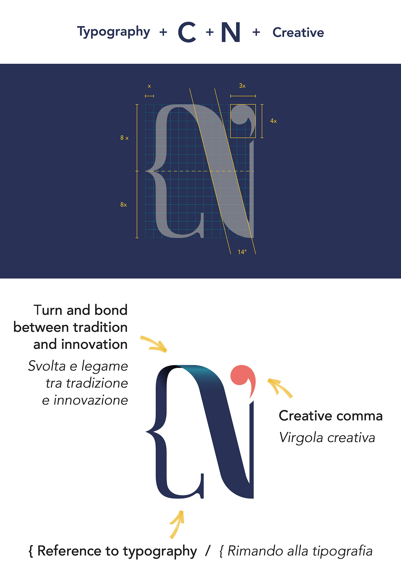
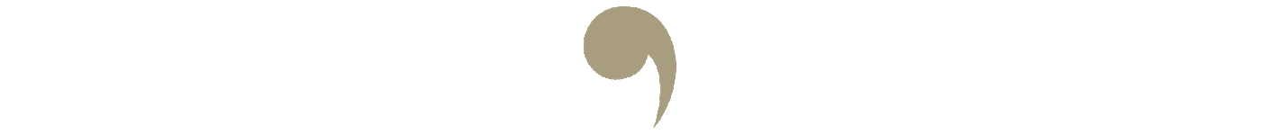
Pictogram,
Tradizione e tipografia sono per me elementi molto importanti e cerco sempre di trasportarli verso uno stile innovativo e creativo.
Ho voluto quindi affiancare questi concetti alle iniziali del mio nome così da creare un segno univoco che raccontasse di me e dei valori che sono alla base del mio flusso di lavoro.
Tradition and typography are very important elements for me and I always try to transport them to an innovative and creative style.
So I wanted to combine these concepts with the initials of my name so as to create a unique sign that would tell about me and the values that are the basis of my workflow.
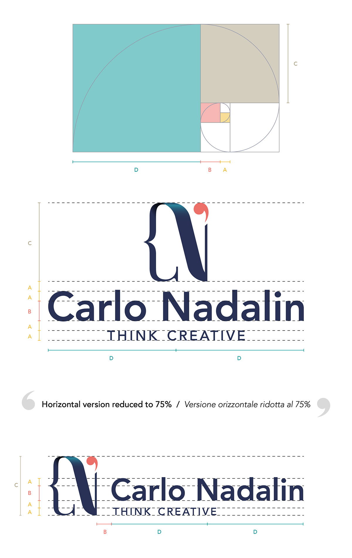
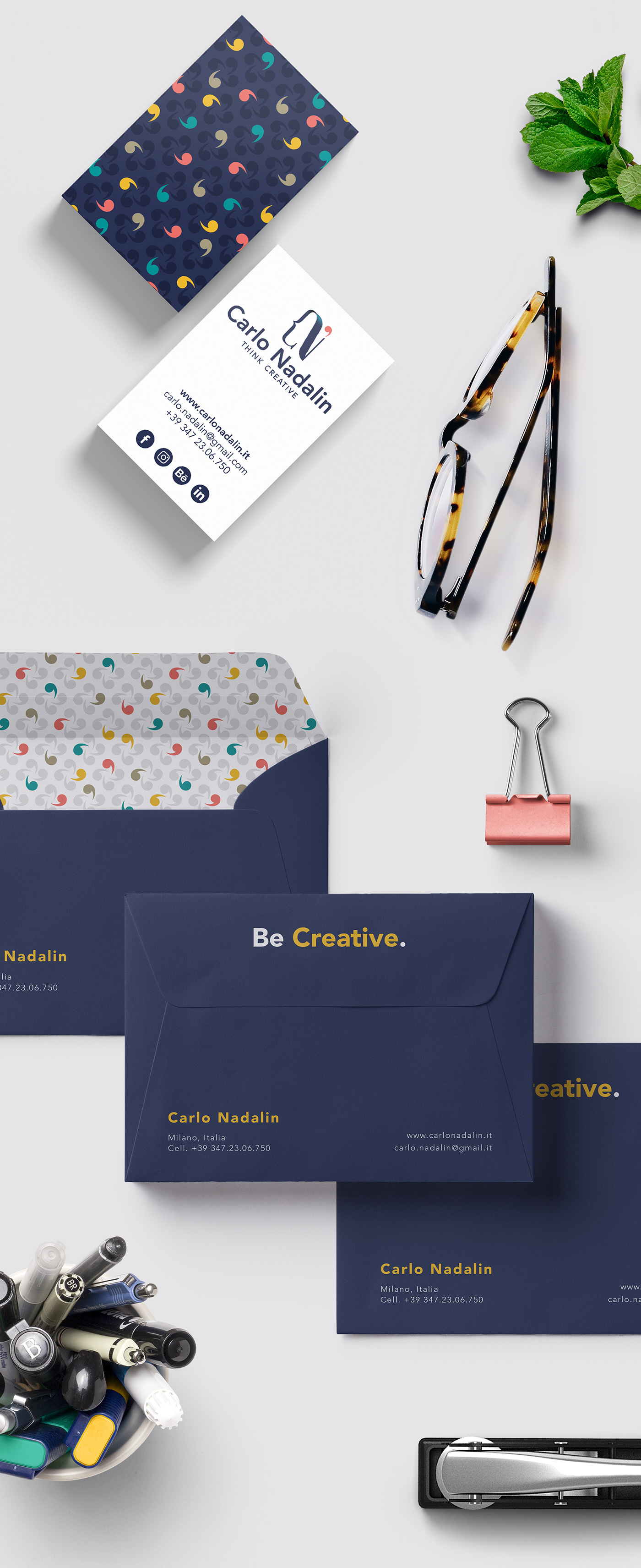
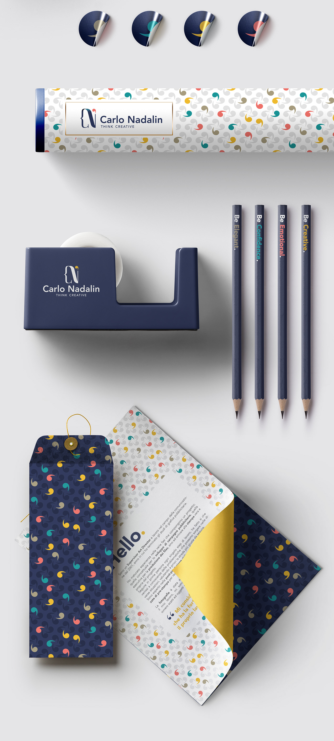
Logo,
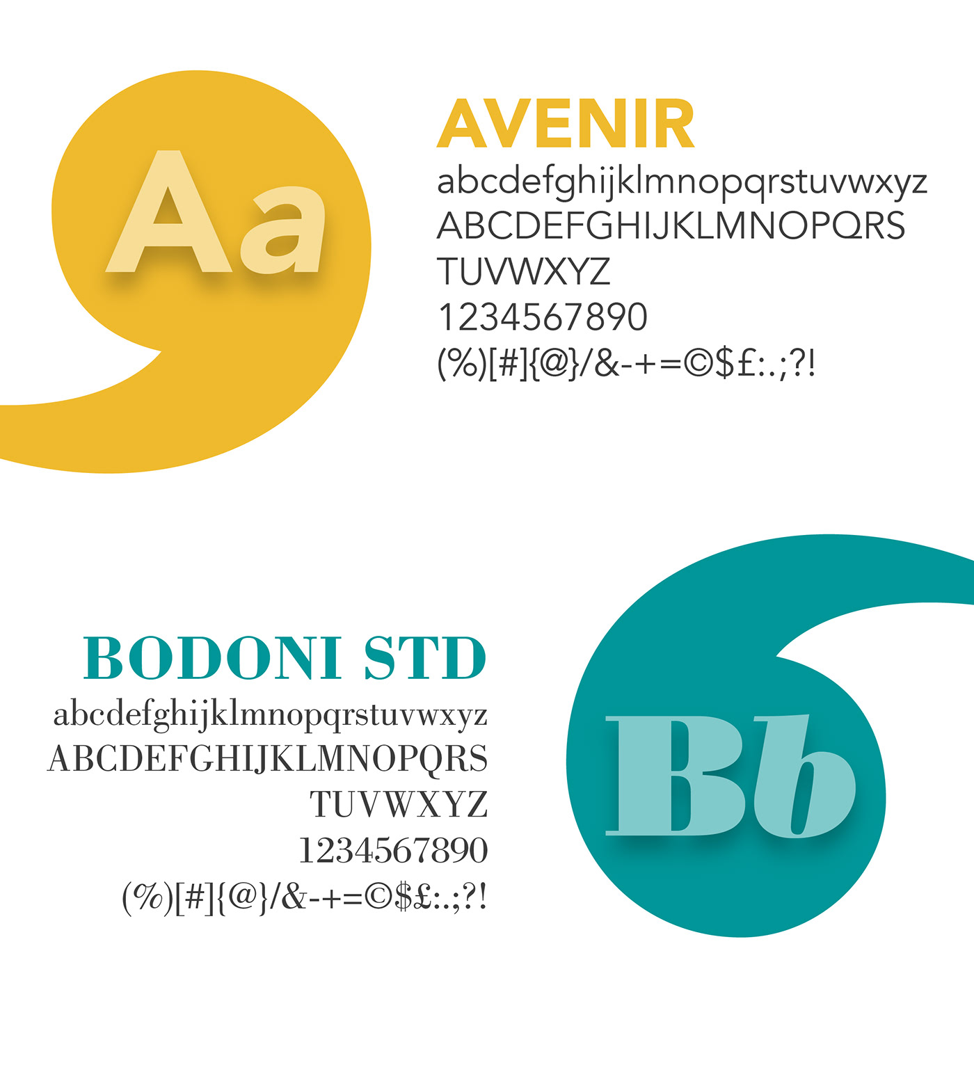
Per il logotipo ho scelto un font bastoni di qualità in grado di creare contrasto e staccarsi visivamente del pittogramma ma allo stesso tempo che restituisse un logo completo moderno ed elegante.
Per trovare le giuste proporzioni tra i due elementi e ottenere così un logo bilanciato e armonioso ho fatto riferimento al rettangolo aureo.
For the logotype I chose a quality sticks font that can create contrast and visually detach the pictogram but at the same time it returns a complete modern and elegant logo.
To find the right proportions between the two elements and thus obtain a balanced and harmonious logo, I referred to the golden rectangle.
Area of respect and negative version,
È stata definita un’area entro la quale non possono essere inseriti elementi così da lasciare il giusto respiro al logo. Per l’utilizzo del logo ad un colore su fondo scuro è stata realizzata una versione ad hoc che tiene conto delle correzioni ottiche così da contrastare quello che viene chiamato “Irradiation Phenomenon”
An area has been defined within which elements cannot be inserted so as to leave the right breath to the logo. For the use of the one-color logo on a dark background an ad hoc version has been created that takes into account the optical corrections so as to contrast what is called "Irradiation Phenomenon"

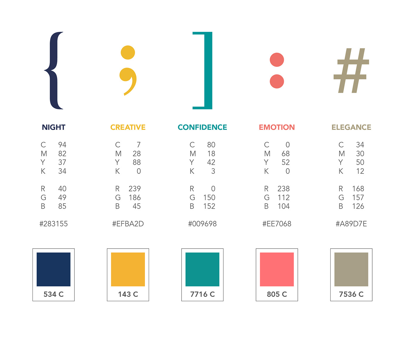
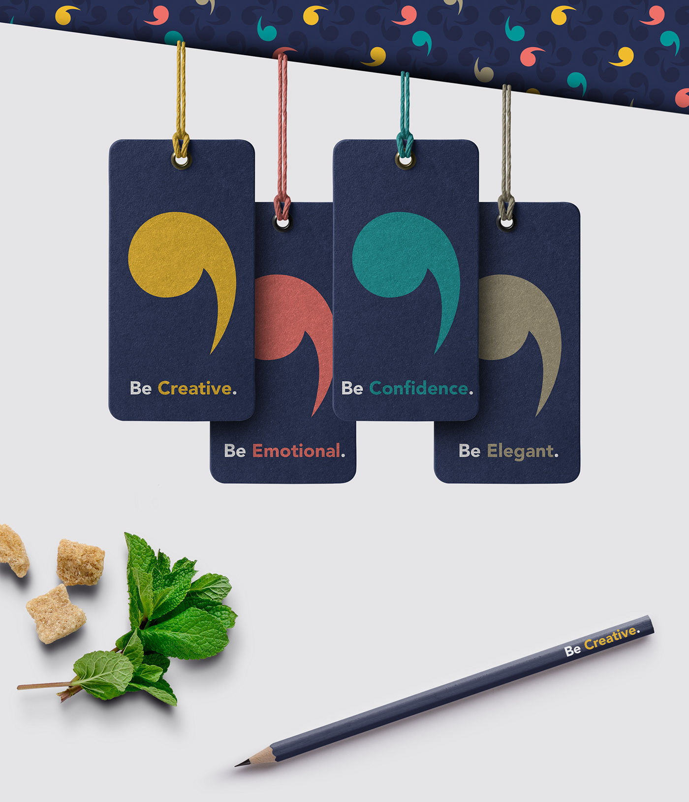
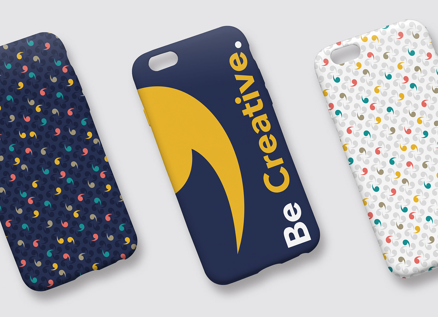
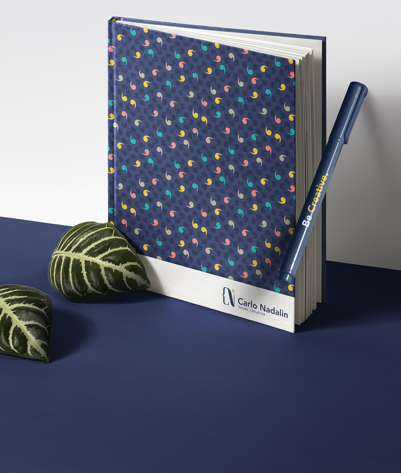
The language of colors,
Ho scelto una colors palette fresca e moderna che fosse in grado di trasmettere dei concetti e allo stesso tempo creare combinazioni di colori armoniose.
I chose a fresh and modern colors palette that was able to convey concepts and at the same time create harmonious color combinations.

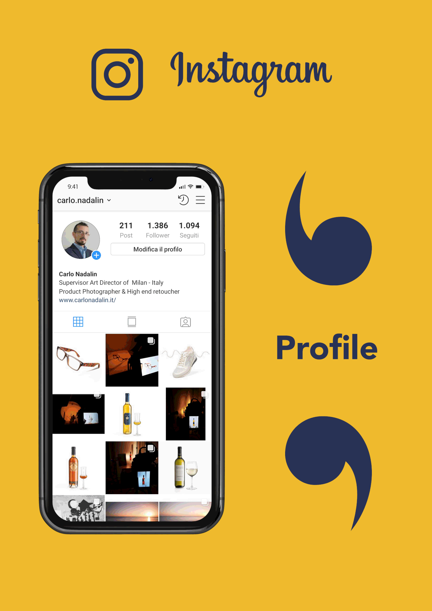
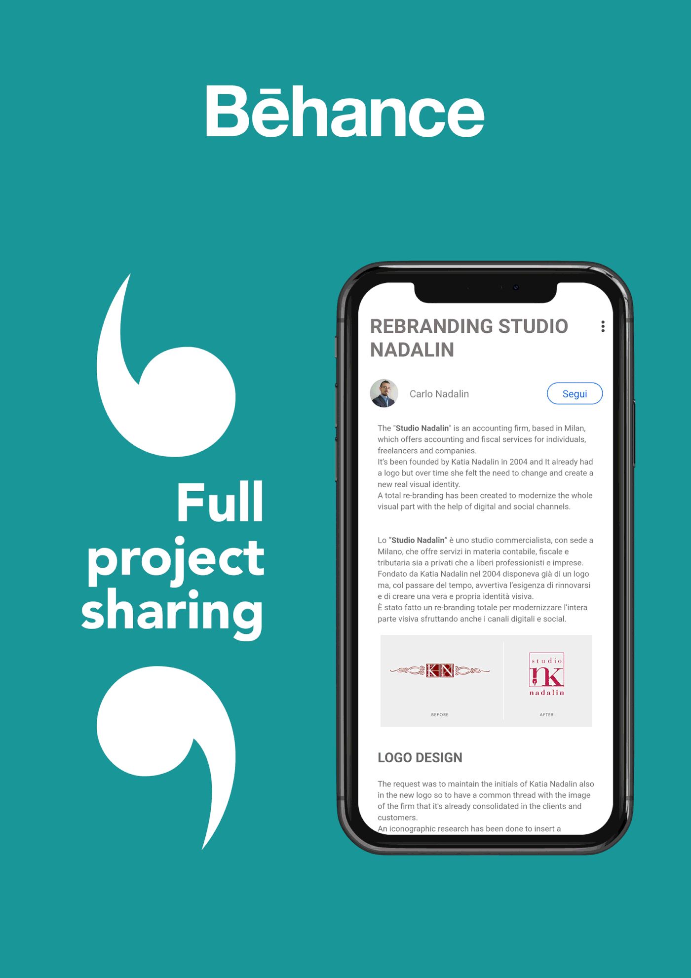
Digital and social solution,
Ho creato profili sui principali social network che, attraverso una partecipazione attiva e la condivisione di contenuti in linea con il mio lavoro, mi hanno permesso di creare una rete di contatti reali in continua crescita.
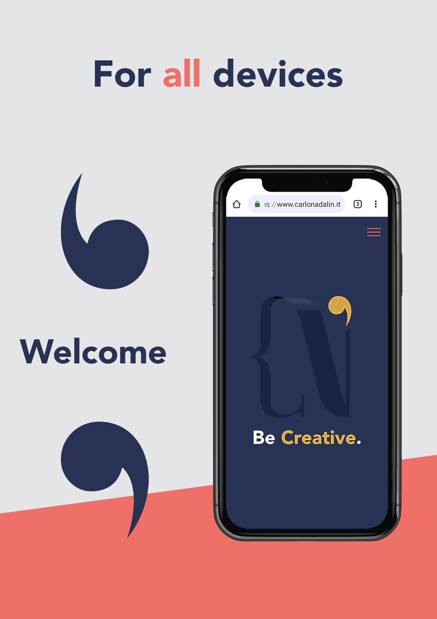
Ho realizzato poi una nuova release del mio sito molto più leggera e completamente responsive così da poter essere visionata su qualsiasi dispositivo in modo ottimale.
I created profiles on the main social networks that, through an active participation and sharing of contents in line with my work, allowed me to create a network of real contacts in continuous growth.
I then made a new release of my site that is much lighter and completely responsive so that it can be viewed on any device optimally.
WEBSITE
INSTAGRAM
LINKEDIN
BEHANCE

Thanks for watching
Don't forget the like :-)


