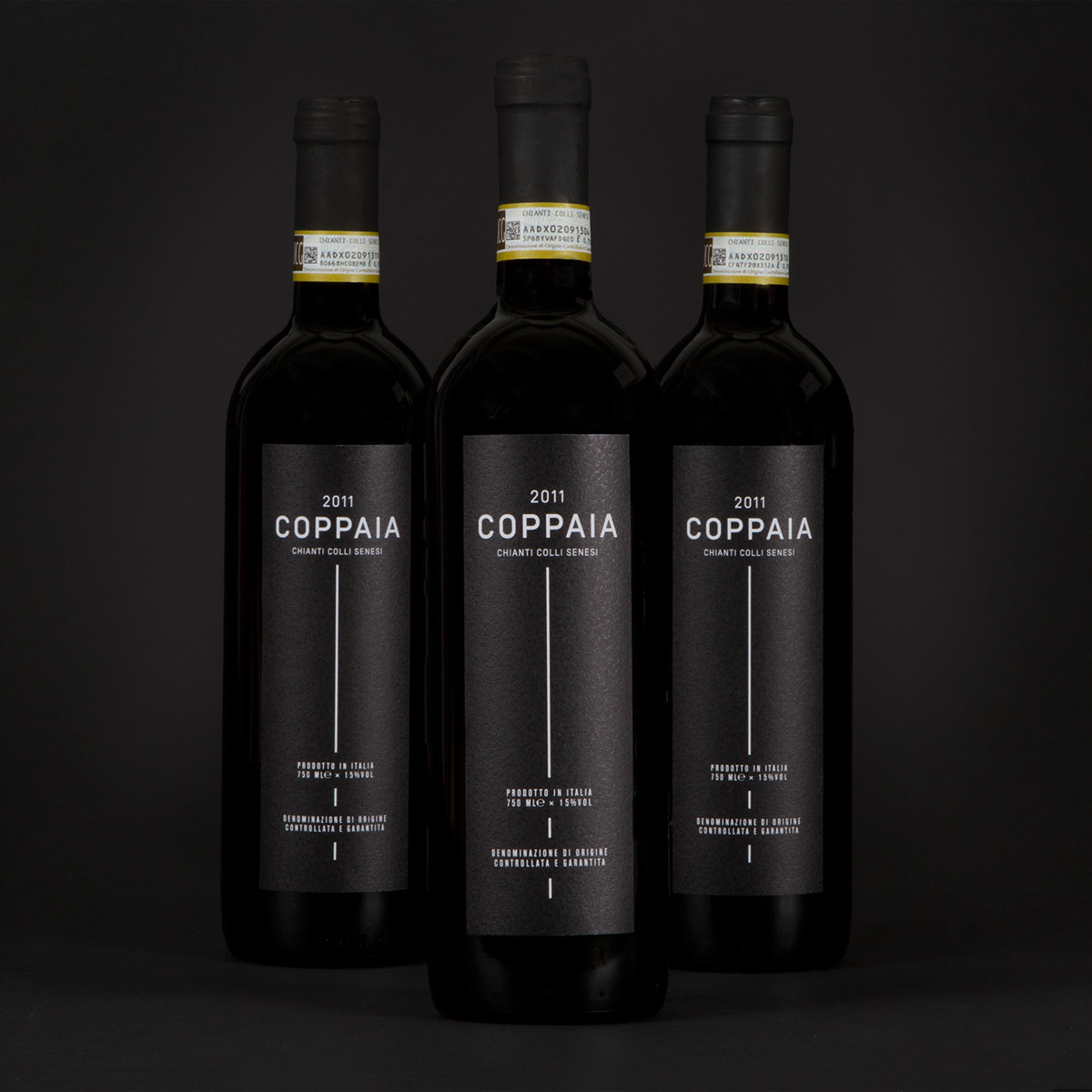
Coppaia
ANTI modernised the typical Chianti look with a big and narrow label. The elegant design makes the wine look more expensive than it actually is. This was also the client´s brief. The target group are people who are looking for a fairly priced, yet elegant quality wine. A wine suitable for most occasions.
Graphic design: Mari Oshaug
Consultant: Kenneth Pedersen
Project manager: Tine Moe
Consultant: Kenneth Pedersen
Project manager: Tine Moe
www.anti.as