
A Redesign of JAMB's Website
Intro:
The Joint Admissions and Matriculation Board (JAMB) is a Nigerian entrance examination board for tertiary-level institutions. The board conducts entrance Unified Tertiary Matriculation Examination for prospective undergraduates into Nigerian universities. The board is also charged with the responsibility to administer similar examinations for applicants to Nigerian public and private mono-Technics, polytechnics, and colleges of educations.
There's definitely a reason why JAMB has their website looking the way it is, one reason that comes to mind is probably "download speed", I don't know for sure. I could have found out but for time constraint.
Constraints:
I had less than a week to provide final mock ups, so I focused on the sign up, login and examination registration for UTME(Unified Tertiary Matriculation Examination) students as they are the first and major users.
Process And Approach:
User Research:
I surveyed 5 people, they had recently written the UTME(Mostly within a year or two) the question focus about how much they interacted with the website during registration.
Main Takeaway:
1. None of them completed the online registration themselves.
2. All them complained about bio-metric capture been the major cause of delay.
Pain Points:
After making few assumptions myself, I joined it with questions asked to validate or nullify my assumptions with data and help me find major/minor pain points.
1. The current website does not satisfy any of the user account as they are forced to pay "JAMB verified registration vendors" to complete registration for them.
2. 3/5 only used the site to verify results.
3. 4/5 complained the process was tedious.
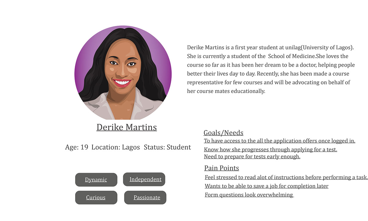
Personas:
I created a persona that captures the traits of the target website user.
Suggested Solution:
The solution breaks the UTME registration into three easy parts which is Registration, Bio-metric Capture and Submission. After registration, a user has access to a dashboard which has all the functions that might be needed within JAMB's website.
User Flow:

Sketches:
I sketched out a visual before going on Figma to design. Although modification happened several times during the design.
Here is the initial sketch:

1. Declutter the landing page:
The landing page will only show convincingly how easy the process of registration should be.
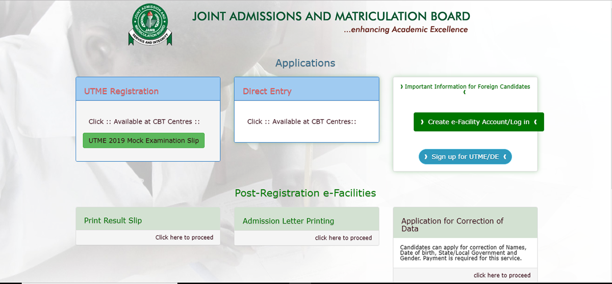
Jamb.org - Current Landing Page.

1/4 of the Suggested Landing Page
2. Simplification of Registration and Login:
There's too much to read for instruction on how to sign up on the current website, it's quite overwhelming almost anybody will pay someone to help with the registration.
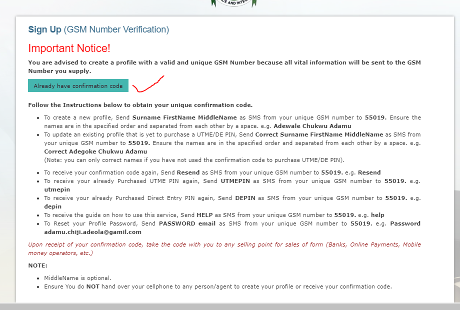
Current registration page
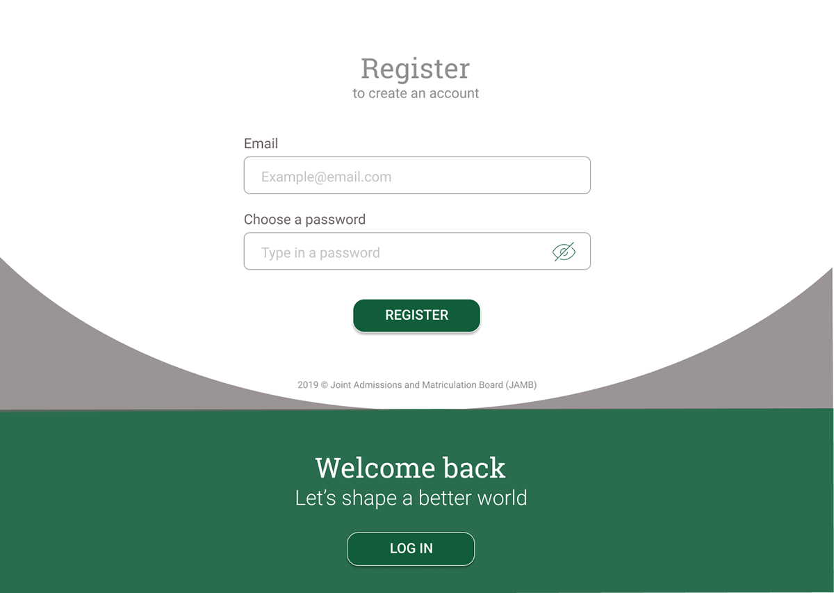
Suggested Registration Page

Suggested Login Page
3. Dashboard:
A dashboard will make sense as it will help simplify post registration processes so that users will at least be able to go through with registration until bio-metric capture where those who do not have the luxury to get a fingerprint scanner can complete registration when then can. The dashboard has functionality that will help personalize the experience for users.

Suggested Dashboard Design
Reflect:
Looking back at the design, I noticed areas of opportunities.
1. The landing page is not full (I use to think it was the part of the website you see first, I know better now).
2. I read through my user persona and something seems a little bit off about it, I'm looking to crafting a better one going forward.
What I Would Do Differently:
Better User Research: Because I had a short time, I wasn't able to conduct an ample amount of research and the questions for survey needs to be better also as bad question lead to bad data.


