

SOMEPLACE
Branding
As part of a project, my colleagues and I created a modern brand concept for a virtual travel agency called »someplace«. The brand concept focuses on alternative and up-to-date transport facilities and accommodations, such as FlixBus, Carpooling, AirBnB, Couchsurfing and many more. In the first place the fictional travel agency operates individually and based on the customers’ needs and desires. Only then the company deals with the travel destination.
We decided to name the travel agency »someplace«, because that is everywhere and nowhere. It is a place that can be discovered independently and based on customers’ individual imaginations and wishes. The company’s corporate design and logo were developed accordingly.
Surface feel and details played a particularly significant role when selecting the right materials and technology for the advertising material of »someplace«. We used coarse and pure materials in order to form a link between people’s raw travel feelings, the handwritten postcards they send, as well as the nature they may encounter on a journey.
2018 / Art Direction and Graphic Design:
Valentina Hagendorfer, Sandra Schablas und Carina Schleich
Valentina Hagendorfer, Sandra Schablas und Carina Schleich
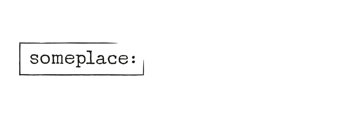


We looked into the analog world so we could find the perfect font for »someplace«. When being on a journey, it is said that one usually gets in touch with oneself, with other travellers and with the worlds and cultures around. Thus, travelling leaves traces – in form of sand in one’s shoes and memorable images in one’s head. Either way, it changes a person’s life inevitably. On a trip people write postcards and letters with unique stamps and postmarks on them, all completely different to one another. In a similar way, every encounter on a journey is unique and does not resemble the other. This is the main message of our logo.
In addition to the logo, there are two artistic elements: a geometric world map and an open frame element. The clear lines of the geometrically abstract map harmonise perfectly with the logo’s design language and the body type. Based on the idea that »someplace« does not describe a specific destination, the national borders were deliberately neglected. Besides the world map, the advertising material includes a frame which is open in the right corner. The open frame symbolises the escape from everyday life and routine.


