Thoms Electrical Services Logo Design


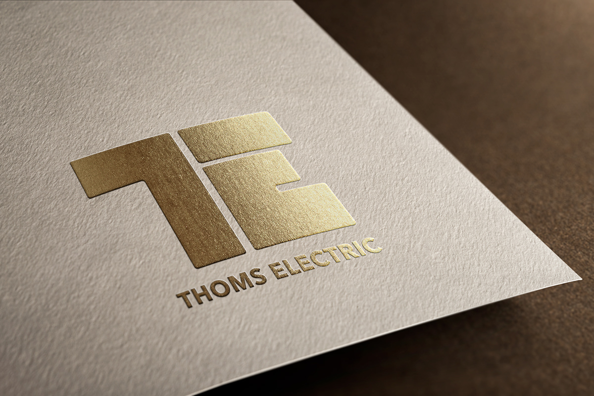
final logo mockup design followed by a paper print version and logo grid breakdown.


Logo Initial sketch Ideas followed by sketch development ideas. The main idea chosen was to take the two initials from the clients business name "T + E" and implement the shapes of the two letters into a simple but smart logo mark.
the problem being that the original idea looked too much like a T and a C so the plan was to try and make the design look less like that when not accompanied by a the full "thoms electric" text

after narrowing the sketches to these three ideas it was then time to create them in adobe illustrator to see which idea worked best. - we took to social media and created a poll to see which idea people liked the most and this is how we got out public response.

after choosing the design I thought it was best to add a very slight rounded edge to each corner of the logo to make it feel less aggressive and have a more welcoming aesthetic to it. As well as this I gave the logo a very subtle gradient as well as an underlaying shadow hidden under the head of the "T" as to give the very flat looking graphic a bit more depth and character. (of course there is also a flat version of the logo for print convenience)

afterwards was just a case of experimenting with colours an colour gradients to find the best option and then we landed on our final design.