koin is an app we created at Mazing Studio to help with your personal finances.
In this project I've been in charge of UI and Brand Design.
I also lead the Product Design process and participated finishing the front-end development (React Native).

Brand and Identity
Logo design
The logo is inspired by our most friendly and primitive form of personal finances:
Saving money in a piggy shaped moneybox.

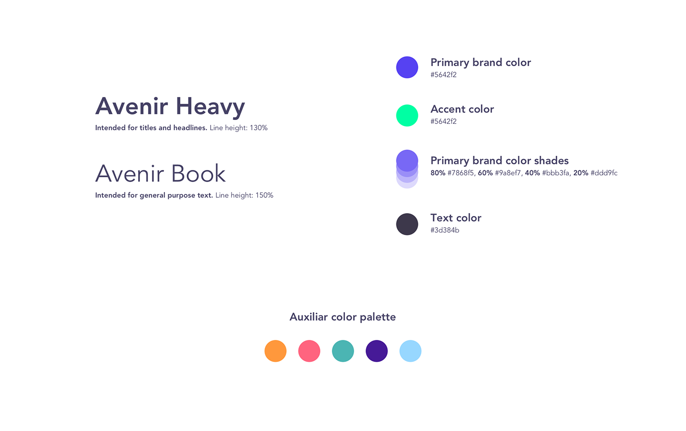
Typography and colors
I chose Avenir because even when it has geometric features, it also shows a quality that is close to handwritten letters. A good example is the lowercase "a"; a lot less mechanic than Helvetica.
Friendly, smooth, and still very readable for large texts 👍.
App Design
We've had 4 design iterations in the span of 3 years.
First iteration
At the beginning koin was intended to be a desktop web application.
I assumed ⚠️ that we needed a line graph in which you could see all your bank movements.
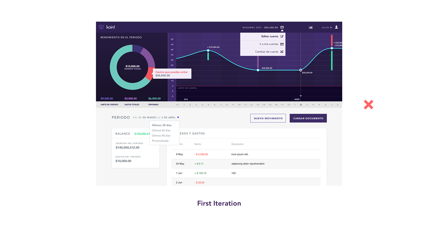
After some months developing this prototype we presented it to some users and nobody got the line graph 😬. Also, the users find the pie chart useful but I realized that they had a hard time reading it.
What I learned from it:
Simplifying and presenting information is not about being clever, is about being empathic.
There are a lot of ways to present information but the best way is almost always close to the most obvious.
-
Second Iteration
My next design attempt followed the feedback almost blindly 🆘 I just removed what our users didn't like or understand.
We moved to a mobile first approach and I was fiddling with the design almost directly in the code ⚠️ .
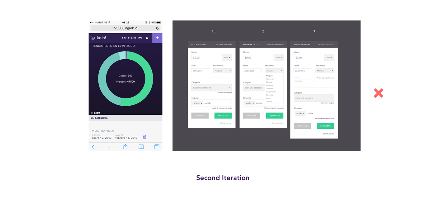
I was, designing interface components without even asking ⚠️ if this was a nice flow for the users, or if they were going to be willing to fill all this forms everytime they wanted to capture a new expense or income.
❌
-
Third Iteration
For the first time in the project I thought it'd be fashionable if I started to do the whole process the way I used to do when I designed for other media. Bottom line, I started to sketch ✏️.
Fun fact: When I started coding, and hence designing for technology, it was not so obvious to me that I needed to keep asking further. Not only getting a grasp of the domain and themes for the brand or design piece, as I did when I designed for other media, but getting a general sentiment and investigating use cases and pains for what I was designing.
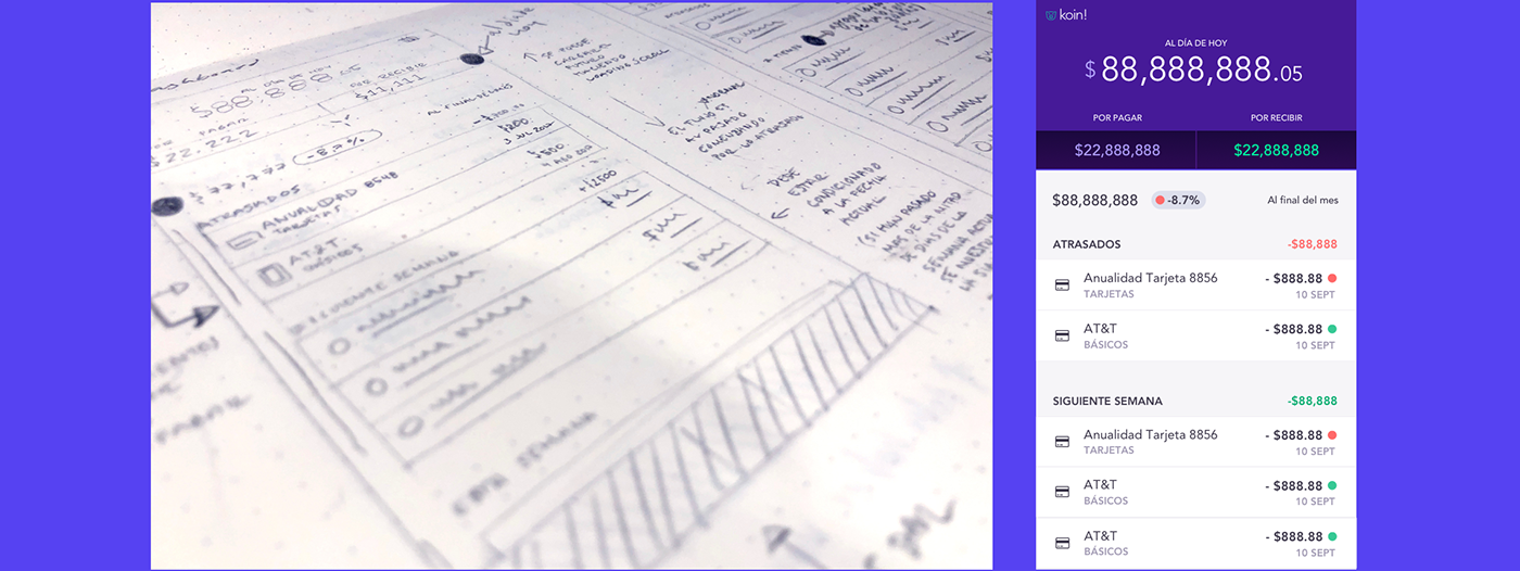
In this attempt besides from taking into consideration the user feedback, I tried to put myself in their place and make an effort to understand why our interface didn't make sense for them.
Financial graphs are hard to read, and one of our main goals was to make personal finances a lot less intimidating, so I tried to make it even simpler without trying to look "PRO" 🤓.
I presented my sketches to a small group of people and got new feedback immediately!✅
Fourth iteration - Current design
From the third iteration we had the essential useful elements in the app and got rid of the clever graphs.
There were still a lot of information in the screen, so the goal for this version was to make it more scannable and clean.
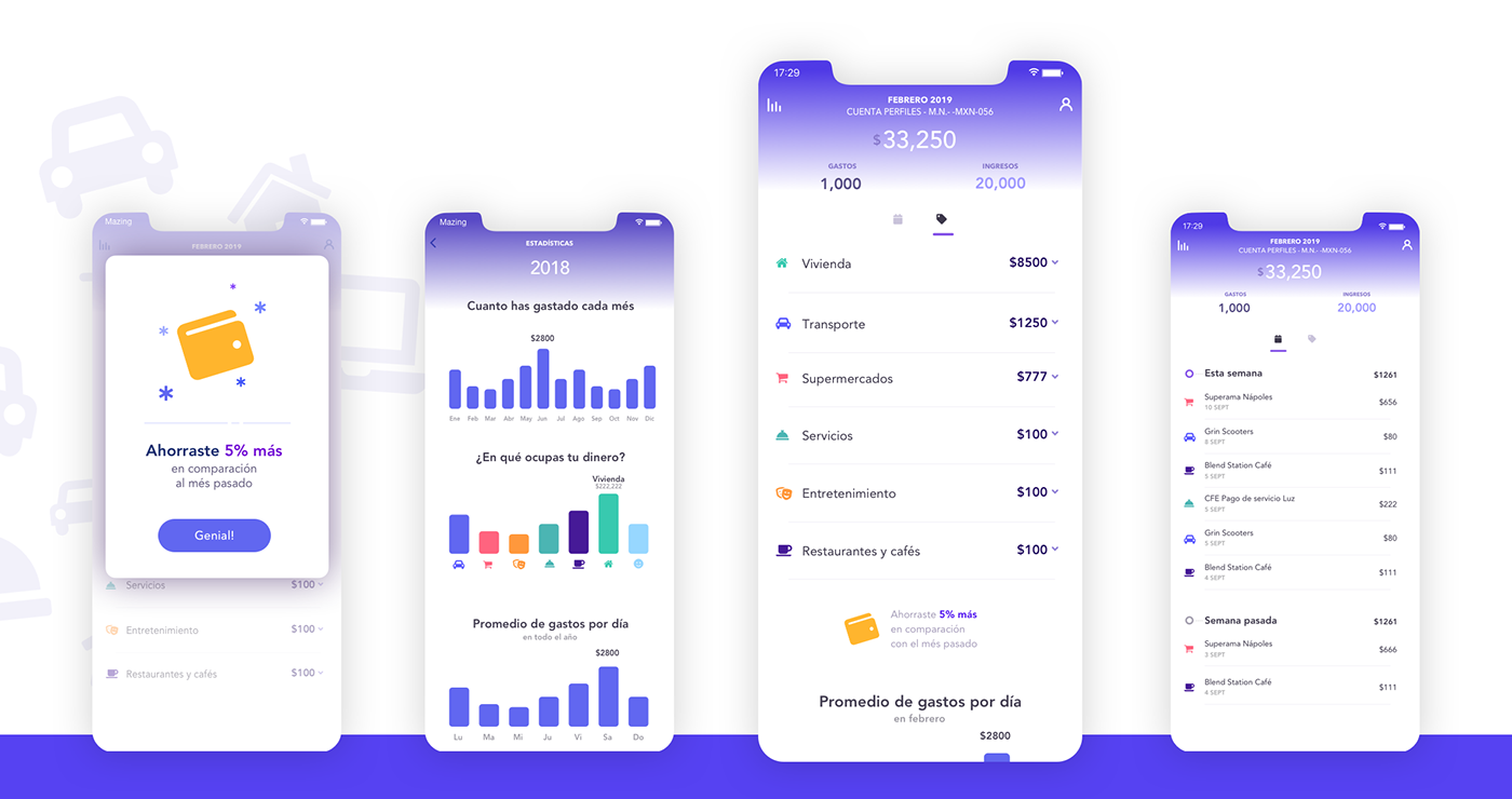
The data categorization is now evident and prominent, the list ordering is meaningful (the categories in which you spend the most are the firsts) and we used the icons in our favor to make the design more scannable.
We don't even need charts or graphs in the first scan. Now we use the charts to give insights and data that you might find interesting, fun and useful.
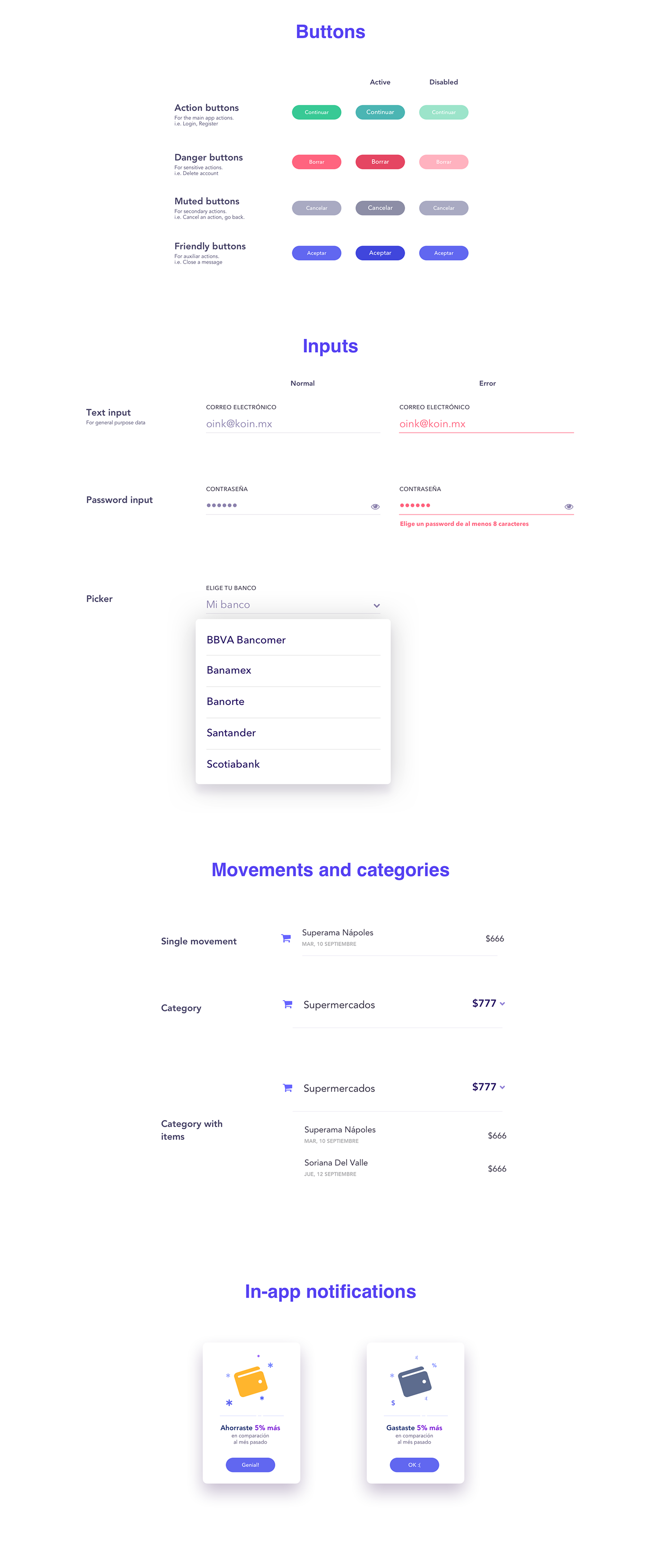
Design components
Bottom line: This project has been one of the most challenging and rewarding. I've learned a lot from making it, specially about product design. It took more time than I'd like to accept but the experience has been totally worth it!