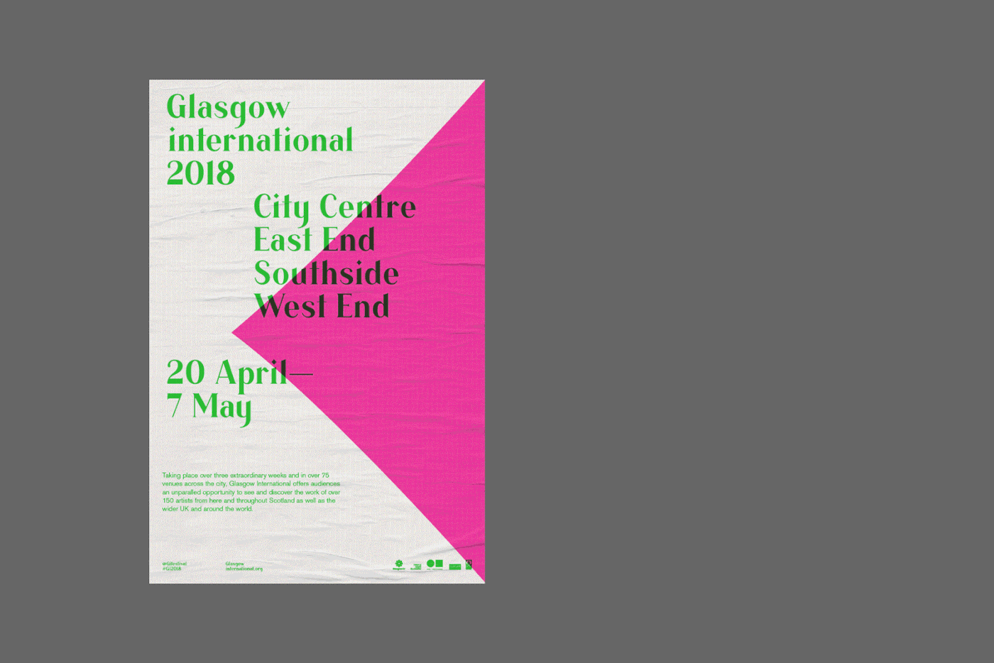
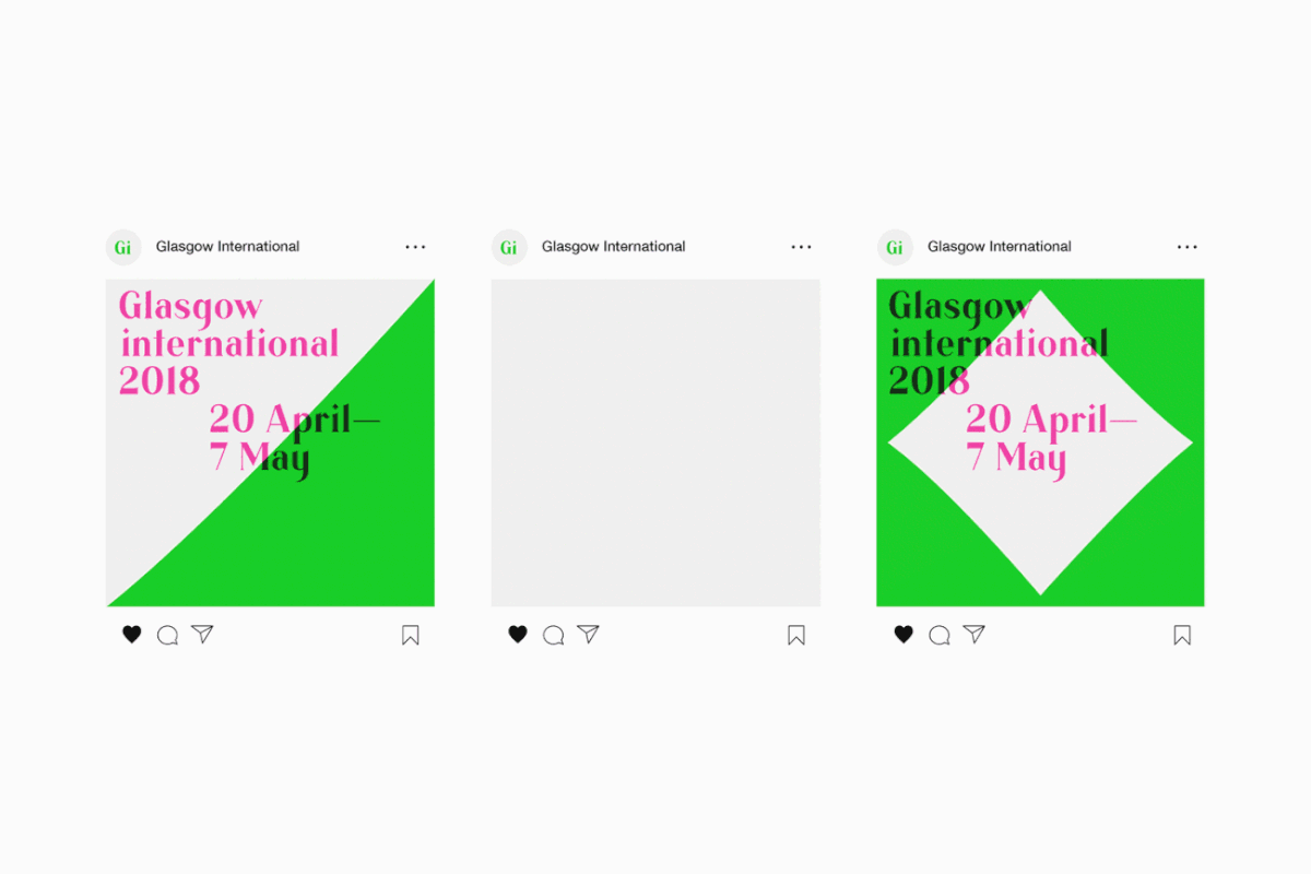
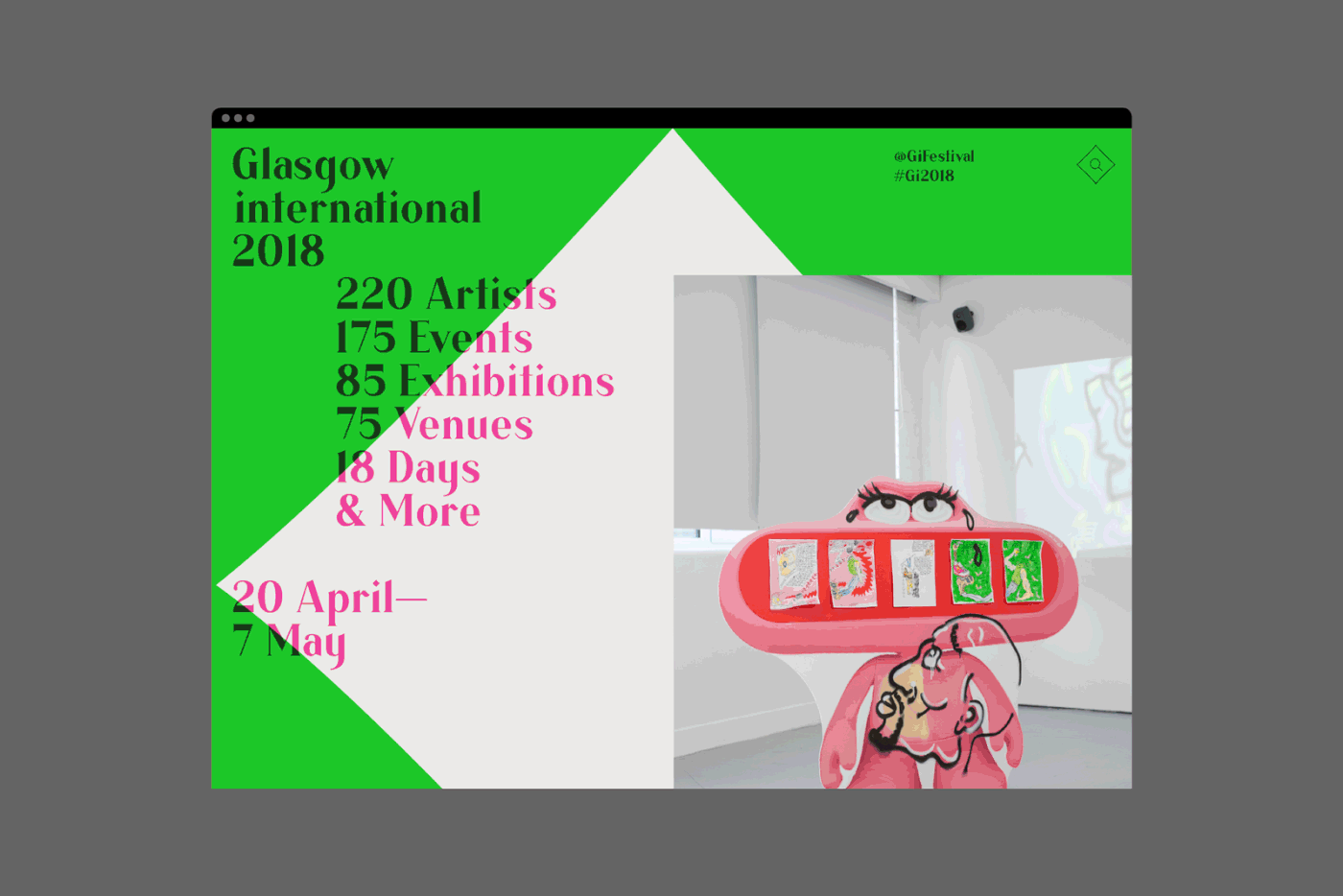
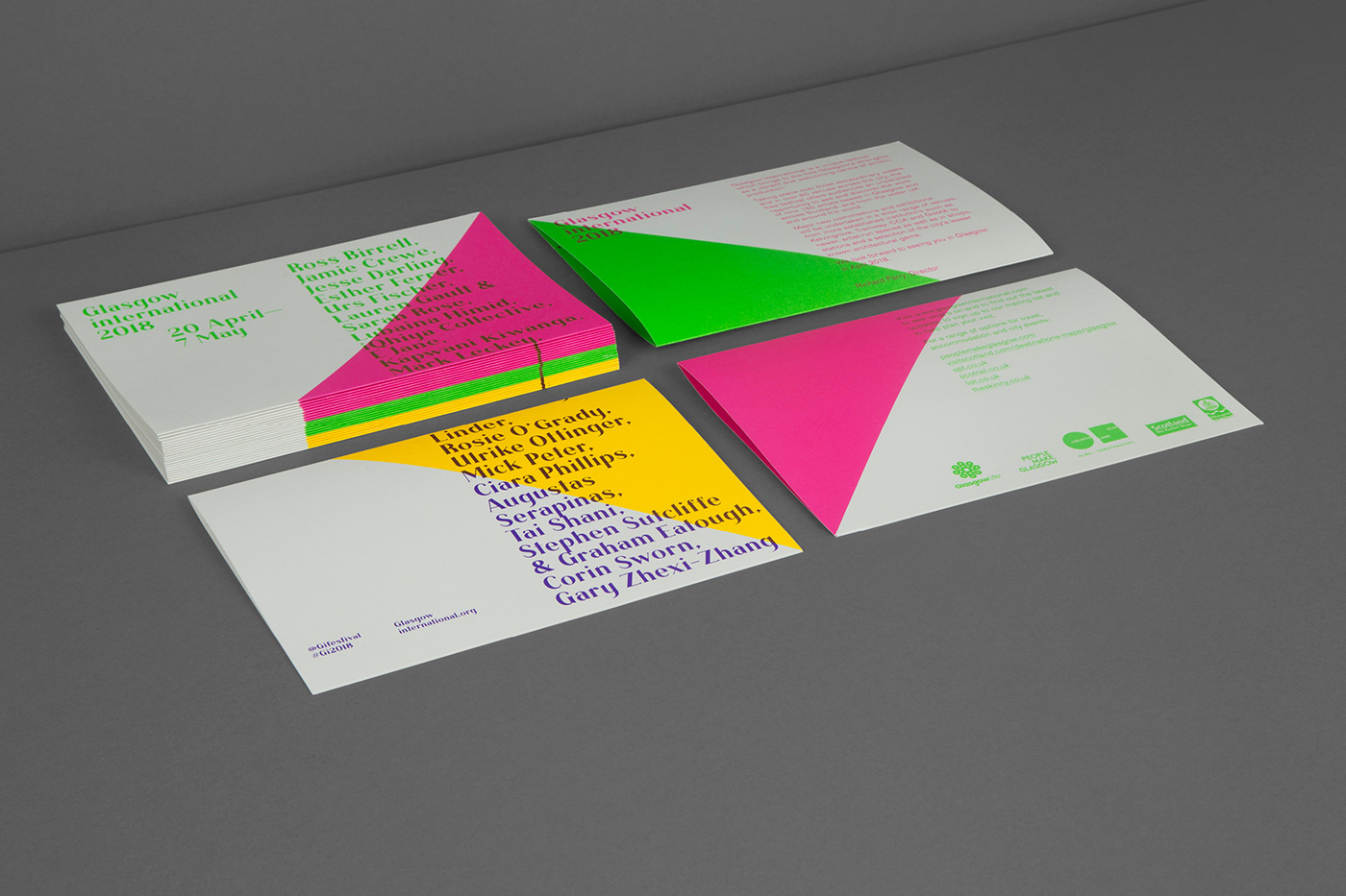
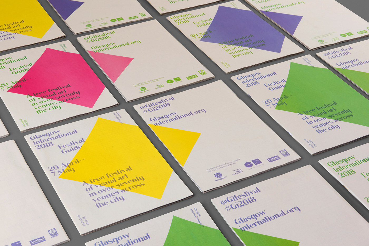
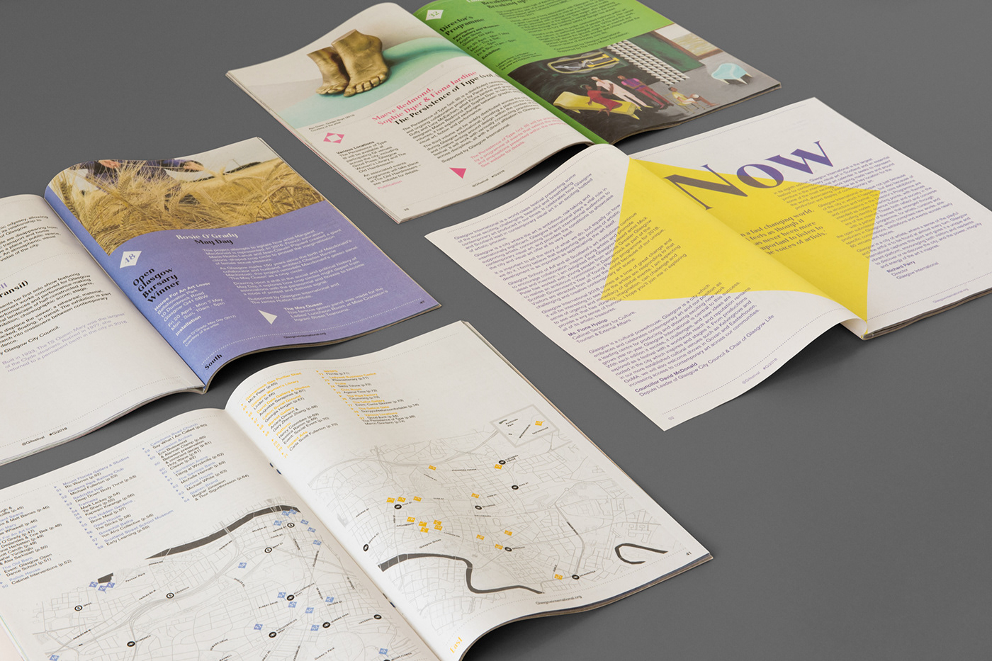
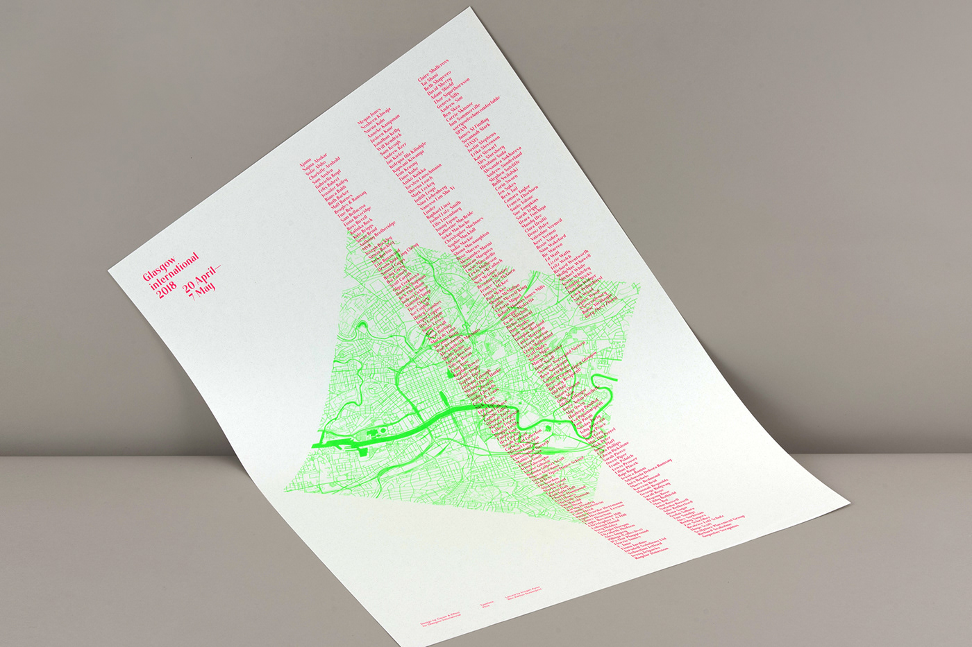
Glasgow International is Scotland’s largest festival for contemporary art. Cause & Effect designed an unmissable new identity to increase visibility of the festival and reflect its energy and vibrancy. Making use of bright fluro pink, yellow, green and purple, it’s the ubiquitous diamond which forms the basis of the identity. With its slightly concaved sides, it was originally derived from the tittle of the “i” in Lacuna, a typeface designed by Imogen Ayres, a graduate from Glasgow School of Art. In typography, the tittle refers to a small distinguishing mark, such as the dot on a lowercase “i” or “j”.
Client – Glasgow International
Design – Cause & Effect