CIRKUS CIRKÖRS VISION IS:
CHANGE WORLD WITH ITS CONTEMPORARY CIRCUS.
ABOVE ALL, DO THE WORLD AND LIFE MORE LIVING.
ABOVE ALL, DO THE WORLD AND LIFE MORE LIVING.
- Vision and values
Circus Cirkör is the first and largest contemporary circus company in Sweden. It was founded in 1995 as an association and since then they have grown steadily to one activities with two main focuses:
An artistic activity, which consists of a limited liability company (Cirkör AB) that produces well-attended performances on international tours and produces events and workshops for groups.
The second part is an educational activity that offers courses and workshops for mainly children and young people and with a lot of focus on the local youth life in Botkyrka - Cirkör's home municipality.
With our redesign we wanted to find the strength and joy of Cirkus Cirkör's brand.
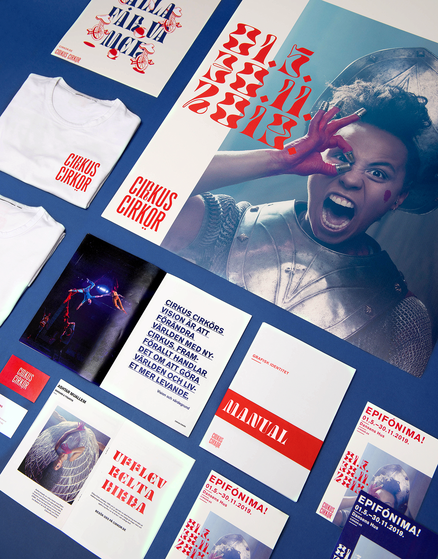
We wanted to address a broader target group and create a clear identity that would cover all Cirkus Cirkör's different parts. A new website, with readability in focus, an app, template structures for different types of marketing, such as posters and program magazine, are some of the things we worked with.
We wanted to address a broader target group and create a clear identity that would cover all Cirkus Cirkör's different parts. A new website, with readability in focus, an app, template structures for different types of marketing, such as posters and program magazine, are some of the things we worked with.
This project has got a content with 50% digital and 50% print media.


We concluded that Swiss typography had to go through the main theme throughout the typography.
It has a strong grid that allows the letters to take a great place, as far as they follow this strict grid.
We wanted the graphic style to radiate strength and a sense of activism, but at the same time feels mischievous and inviting.
It has a strong grid that allows the letters to take a great place, as far as they follow this strict grid.
We wanted the graphic style to radiate strength and a sense of activism, but at the same time feels mischievous and inviting.


For optimal readability and clarity we chosed Berthold Akziden's Grotesk as a primary font.
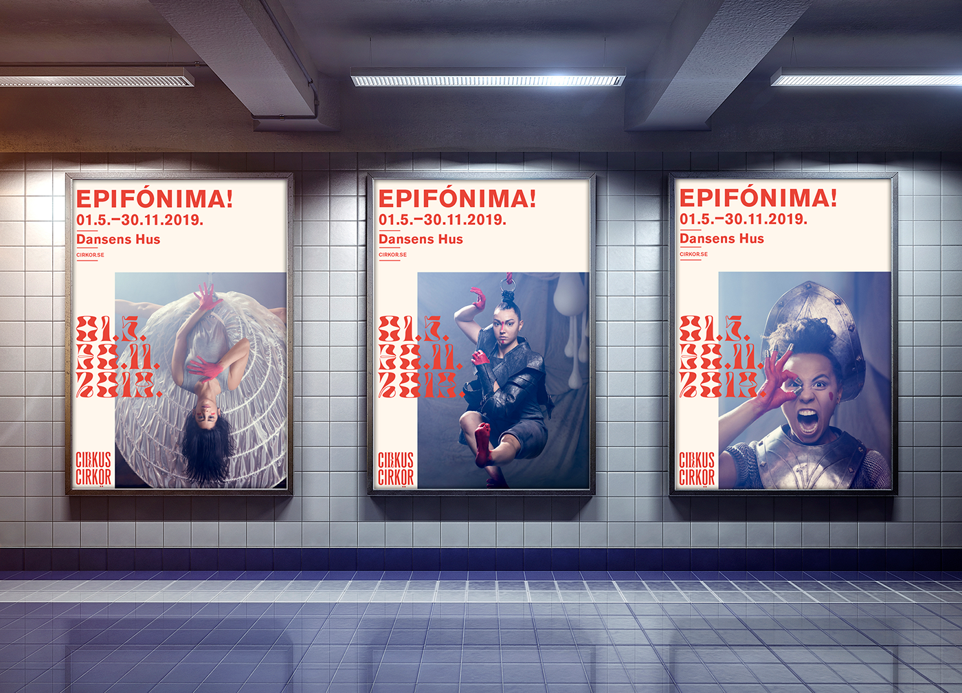
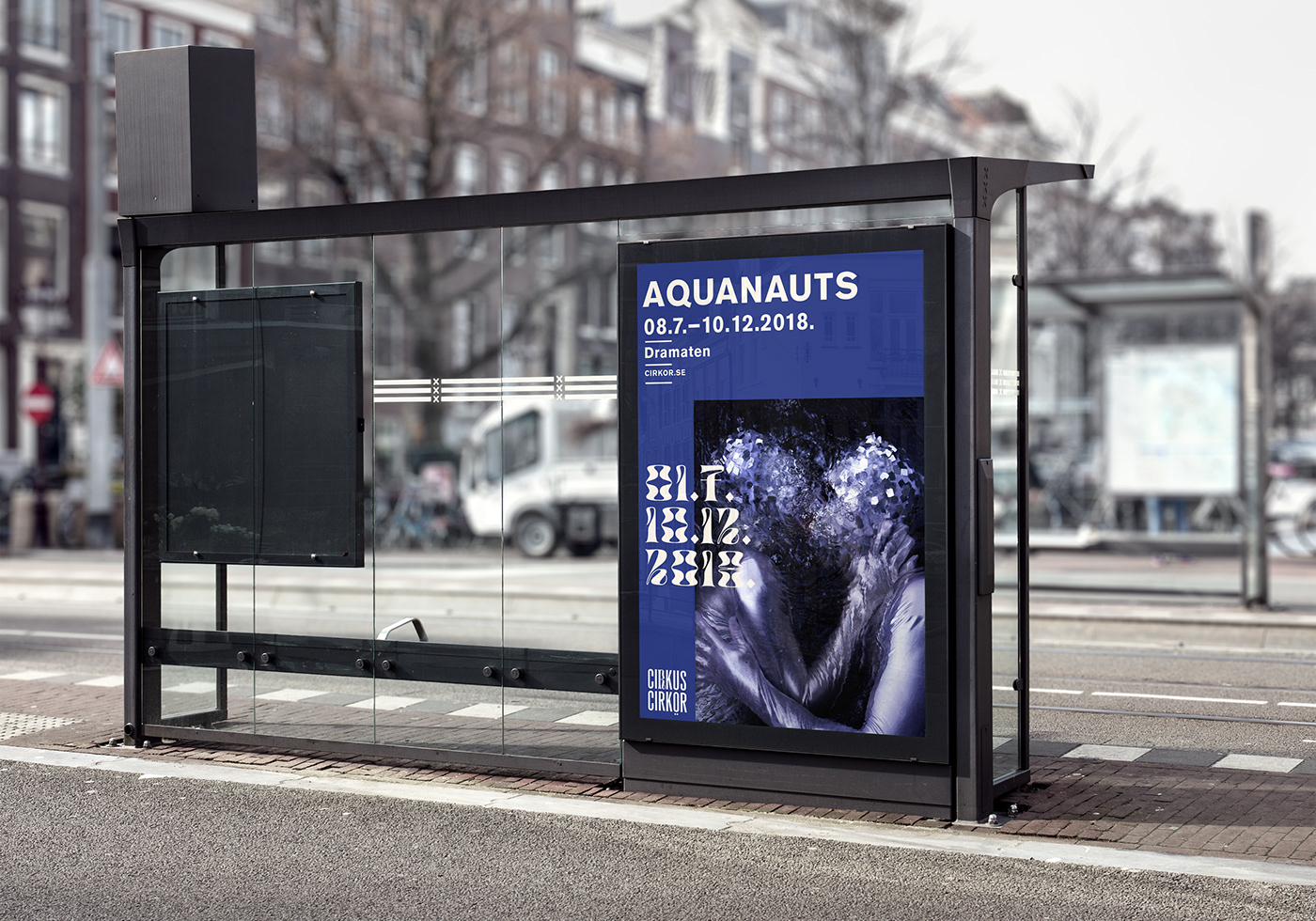
On a early stage we decided to build the graphic identity around a characteristic font. Digestive is the perfect circus font. It brings movement in an otherwise strict design.
SEE YOUR GREATNESS / TAKE PLACE / DO NOT REDUCE.
USE ALL YOURS POTENTIAL AND FORCES.
USE ALL YOURS POTENTIAL AND FORCES.
From Epifónima Manifesto


With a mix of clear and playful typography and an exciting, energy-rich imagery we have composed Cirkus Cirkör's new posters. A little “In you face” that brings both seriousness and playfulness that attracts both cultural enthusiasts as well as the younger urban individuals, who is out for something fresh. The information is easy to grasp, and its playfulness arouses interest and curiosity.

For recognition and clear identity, the front page of the application page is a modified one version of the poster. The insert follows to a certain extent the same structure as the cover, but is more free in its grid. We have also added other elements from the graphic manual, such as illustrations and underlining.
When the interface for App / Webb was sketched up, we used the KJ method (Jiro Kawakita) which is about writing down various functions on postit notes to then structure the page based on these.


To find an expression for Cirkus Cirkör, we looked through various image banks where many types of posters are available. It is basically the posters manner that sets the primary character of our workmanship. When we compiled how the poster should look like / Feel, this typography also permeated the app / web.
A large part of Cirkus Cirkör's business is aimed for children, so we agreed on a stage that we needed to work with illustrations in some form.


Merchandise adds value to both staff and visitors.
It gives a feeling of belonging to a community.


Circus Cirkör conducts both a circus school and a residence for artists and has allot of collaborations and exchanges with several different activities. That's why we think
It is important that they also get their graphic profile in their communication material.
It is important that they also get their graphic profile in their communication material.