
Photo by Thomas Richter on Unsplash - Slogan by eDreams
eDreams - New booking process
Analysis of the booking process and reformulation based on the brief from eDreams. Proposal of a new navigation system based on improving the user experience and the purchase process. Team collaboration with Kerstin Barth and Mandy Tsai. Assignment proposed by eDreams to the Master of Interaction Design of the IED Barcelona.
01_ The brief
The objective of the project was to improve the booking experience that comes once the flight search & selection process has been completed by the customer.
They provided us with an assumed hypothesis that combining all the selections in a single page would enhance
the performance of the ‘booking process’.
the performance of the ‘booking process’.
We decided to take this one step further and make it, also, a delightful experience.
02_ Analysis
During our analysis of the booking process, we encountered three main pain points:

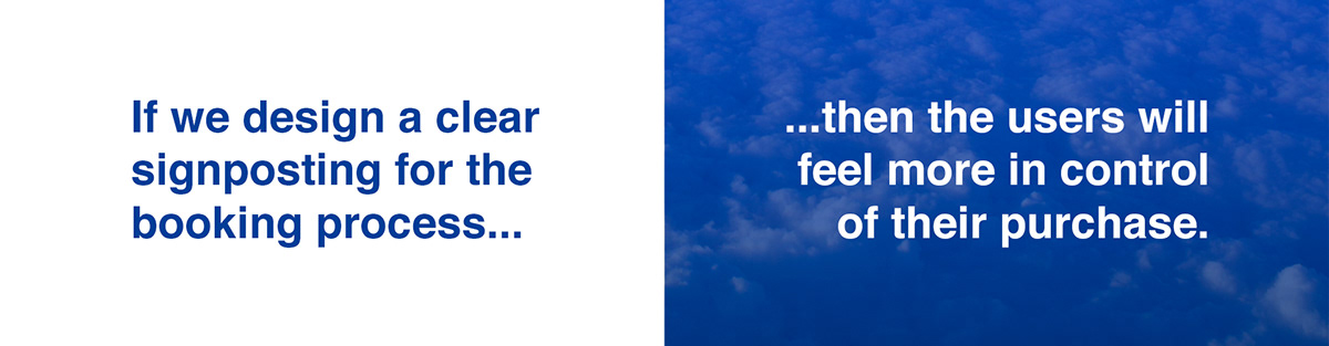
03_ Hypothesis
With the result of the analysis in mind, we came up with our hypothesis:
Testing
After comparing 8 different airlines with the same step in the booking process and asking related questions, we obtained the following result: 80% of the people think that having a navigation bar makes the process “easier to handle” and them feel more in control of the information.
Take outs
Introducing a navigation bar and a progress indicator is necessary to improve the customers' experience.
Furthermore, and considering what eDreams previously explained, if customers book one flight a year, then the booking process should be clear enough not to get lost during the process as well as delightful enough so that they will come back.
04_ Insights
With those definitions in mind, we went deep into analyzing the booking process. Very deep.
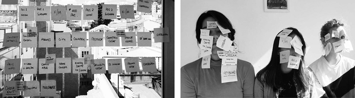
We discovered some insights:
Insight 1
The constant closing and opening of the keyboard makes it harder to navigate. Even if the keyboard takes only 0,2 of a second to open, the time adds up and amounts to a waste of time.
Insight 2
Users would be willing to complete lots of steps as long as they know in which step they are and how many steps are left to finish.
Insight 3
When booking a flight, every incorrect information that needs to be changed can be punished with a fee.
05_ The solution
Our proposal is composed of three main parts, based in our research:
1. Merging the three original main steps into one seamless process flow: a horizontal one-pager.
2. Introducing a clear signposting: a main navigation bar with icons and a secondary bar with substeps.
3. Going as simple as possible: asking one question at a time so that the user can focus in that answer.
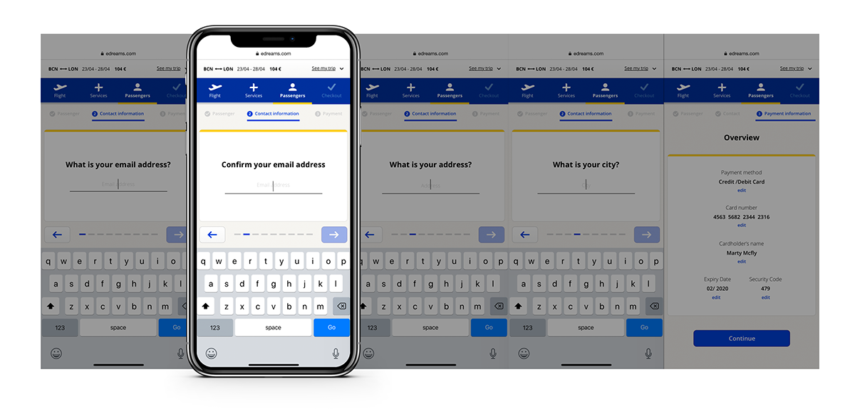
Main components of the new navigation

Finally, how we imagined the micro interactions, animations and transitions:
That's all, folks!
Thanks for watching :)
