Project Objectives
Our class was asked to conduct a visual identity redesign for local business of our choice. We were to create an identity manual and show how the branding would be implemented.
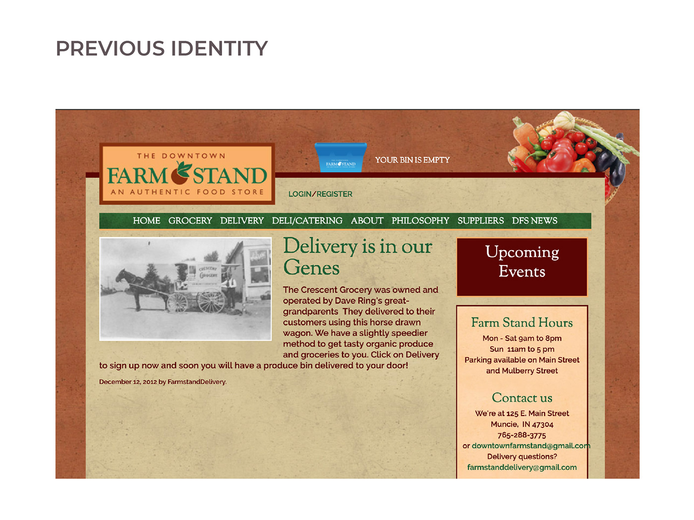
About Downtown Farm Stand
Founded in 2007, Downtown Farmstand is a locally owned and operated grocery store carrying organic, local, fair trade products. Additionally, they house a deli and offer delivery and catering services. The downtown Farmstand harbors a philosophy of valuing healthy food and earth friendly practices while supporting local farmers and building up the community.
Solution
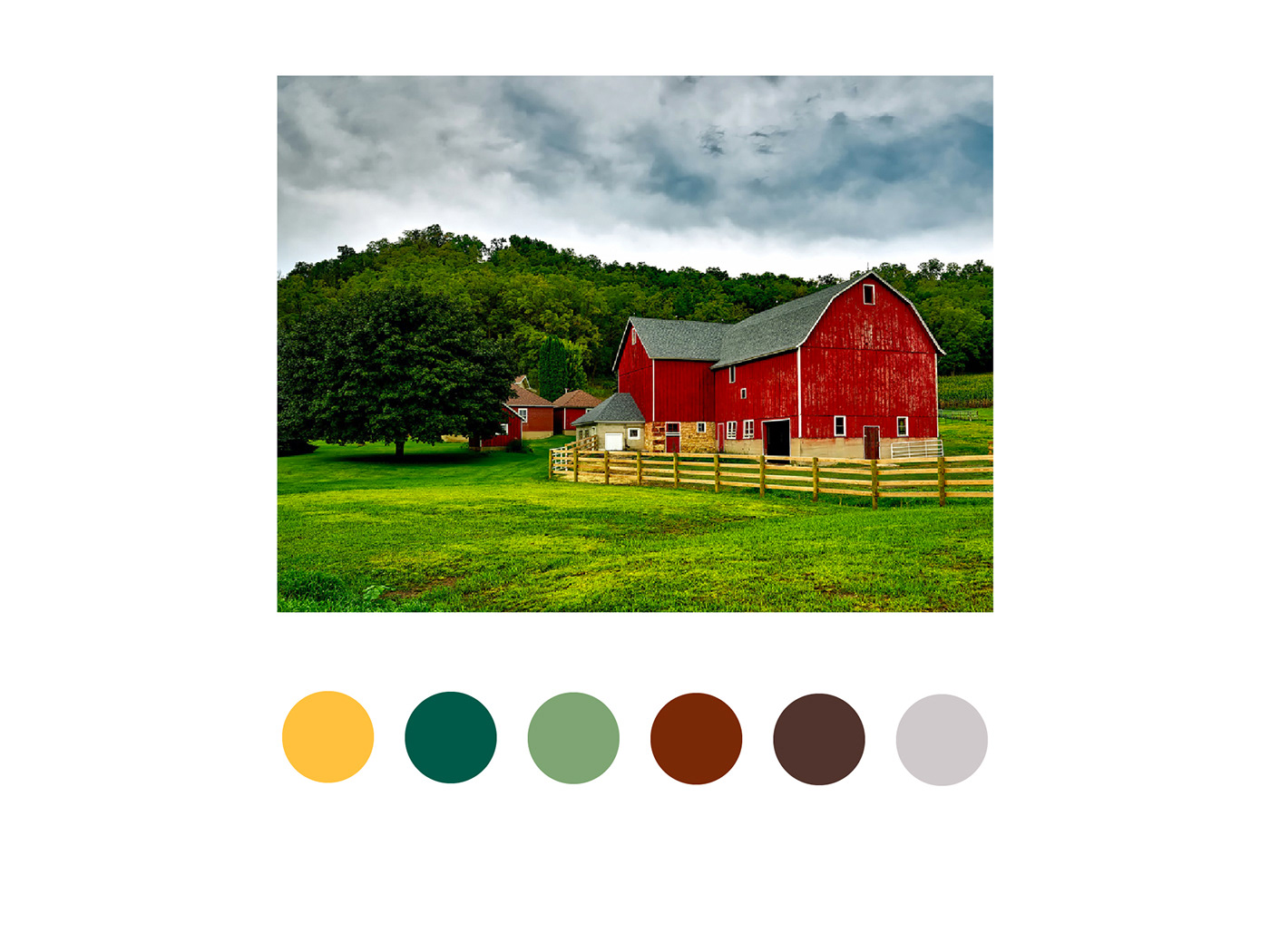
The typography and its treatment reflects the organic, handmade qualities found in the food, ingredients, and products offered by downtown farm stand. The color palette is drawn from earth tones to show connection to the environment and the warmth and harmony the Downtown Farm Stand brings to a variety of people. Texture and various supporting elements are meant to reinforce the nature of the brand while adding visual interest.
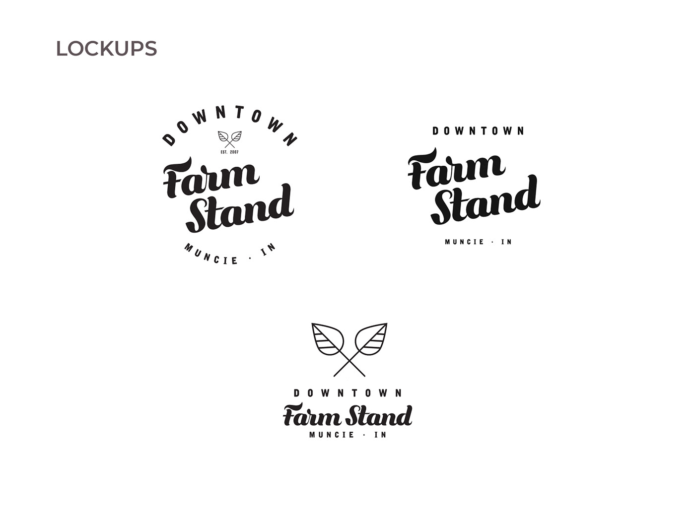
The circular lock-up communicates accessibility, inclusiveness and expresses a down-to-earth feeling, meanwhile the square lock-up provides versatility when branding across platforms.
The upward slant in the circular lock-up is meant to represent the growth that the Downtown Farm Stand provides to community members and local farmers alike as it helps the local economy grow and individuals flourish.