
Steinweiss Script
A New Font Designed in the Spirit of the Calligraphy of Alex Steinweiss
Download the PDF User’s Guide
A New Font Designed in the Spirit of the Calligraphy of Alex Steinweiss
Download the PDF User’s Guide
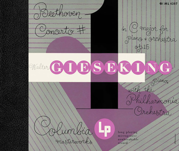
Taschen Publishing had asked me to do some lettering the book they were publishing on the work of Alex Steinweiss. Steinweiss is considered to be the inventor of the album cover as we have come to know it—as a kind of mini-poster with graphics relating to the musical content of the album. He produced hundreds of covers for 78 RPM albums between the late 1930s and the late 1940s. Here's an example of one of his album covers:
My assignment was to do some lettering for the cover and title page that was in the spirit of Mr. Steinweiss' very graphic calligraphy, known as "The Steinweiss Scrawl". It was a bit of a challenge to try to capture his spontaneity in my piece of digital art for Taschen's cover:

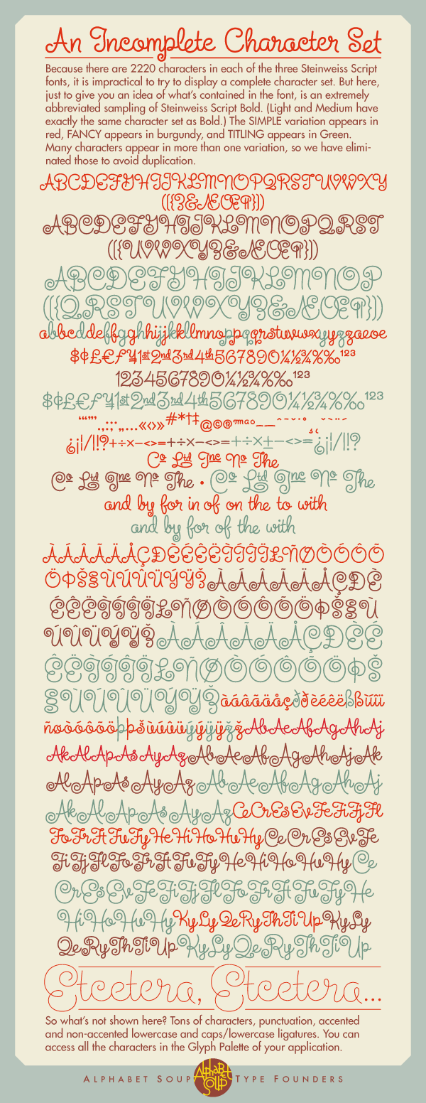
Shortly after completing the Steinweiss project for Taschen, I decided to pursue on my own the design of a font in the spirit of his calligraphy. The challenge was enormous—to create a typeface that retained the sense of hand-letting and fluidity within the context of a digital font. Part of my solution was to create the typeface with a ton of alternates, lowercase ligatures, and caps/lowerase ligatures. Creating this as an OpenType font would be the only way to wrangle these thousands of pieces together into a coherent typeface design. I was fortunate enough to be able to contact the Steinweiss family through Taschen, and get the official Steinweiss approval for this font design.

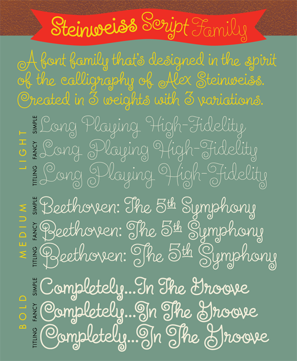
Here's how the fonts are organized: "Steinweiss Script" is a family of fonts in three weights: "Steinweiss Script Light", "Steinweiss Script Medium", and "Steinweiss Script Bold". Additionally, within each weight there are three variations: Simple, Fancy, and Titling. These relate to the size/ratio of the caps to the lowercase, the complexity of those caps, and the size of the ascenders/descenders on the lowercase characters:
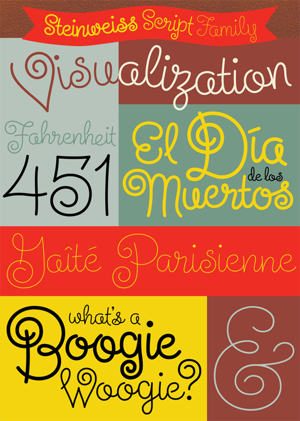
Setting this script on a curved path couldn’t be easier—you just need to do a little custom kerning, and the different weights and variations allow for a great amount of flexibility:
Purchase Steinweiss Script
Steinweiss Script Design and Art: Michael Doret–after Alex Steinweiss
Steinweiss Script OpenType Programming: Patrick Griffin/Canada Type
Steinweiss Script OpenType Programming: Patrick Griffin/Canada Type

Award-Winning Typeface Designs for every taste from Alphabet Soup Type Founders


