A family culture
Client: Walker Brothers
Location: Nashville, TN - United States
Industry: Beverage
About
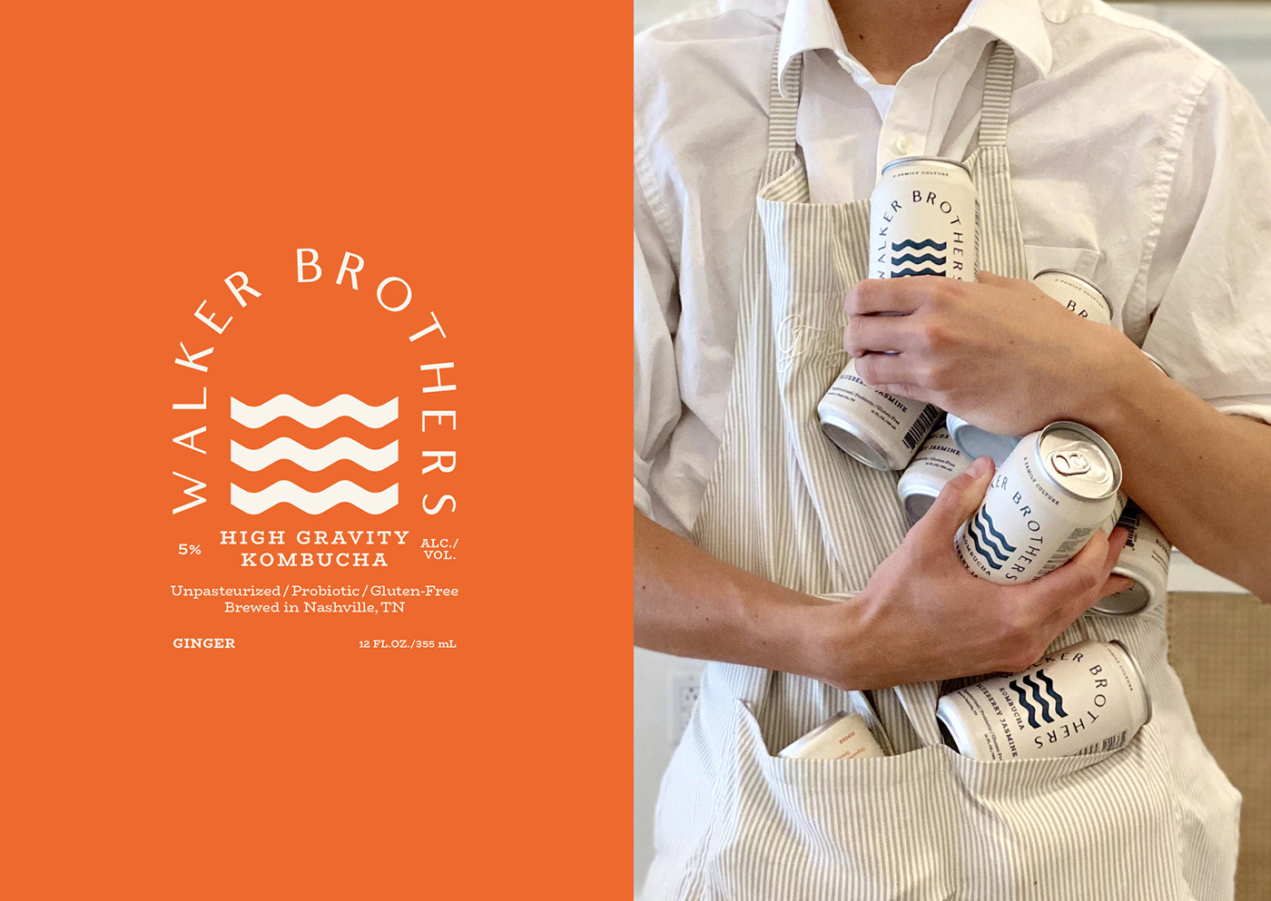
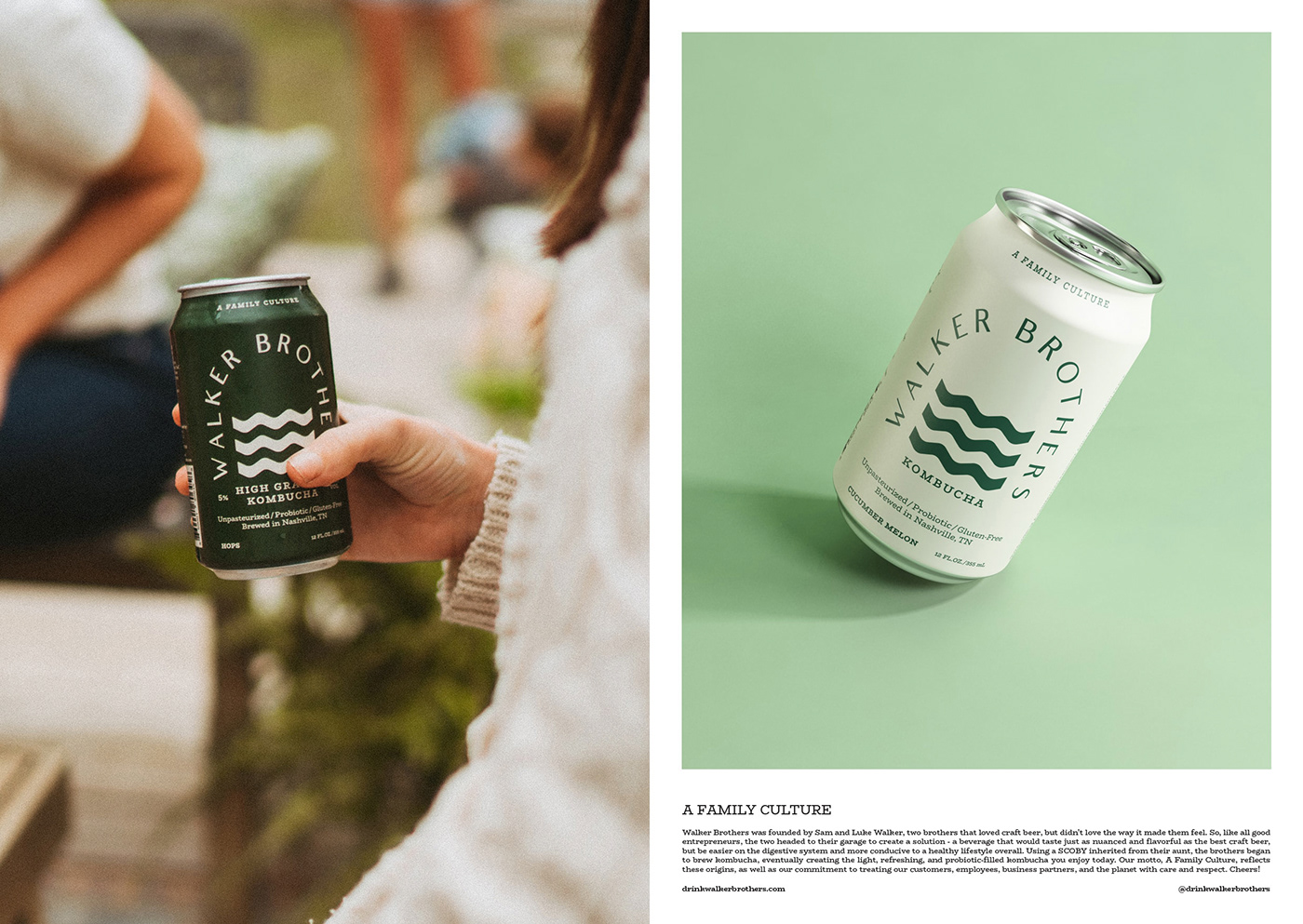
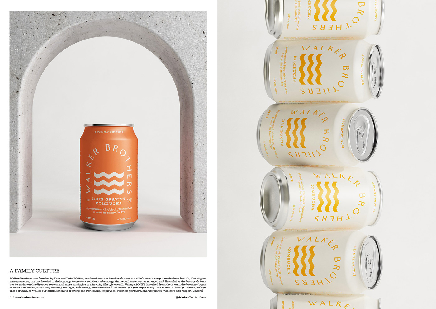
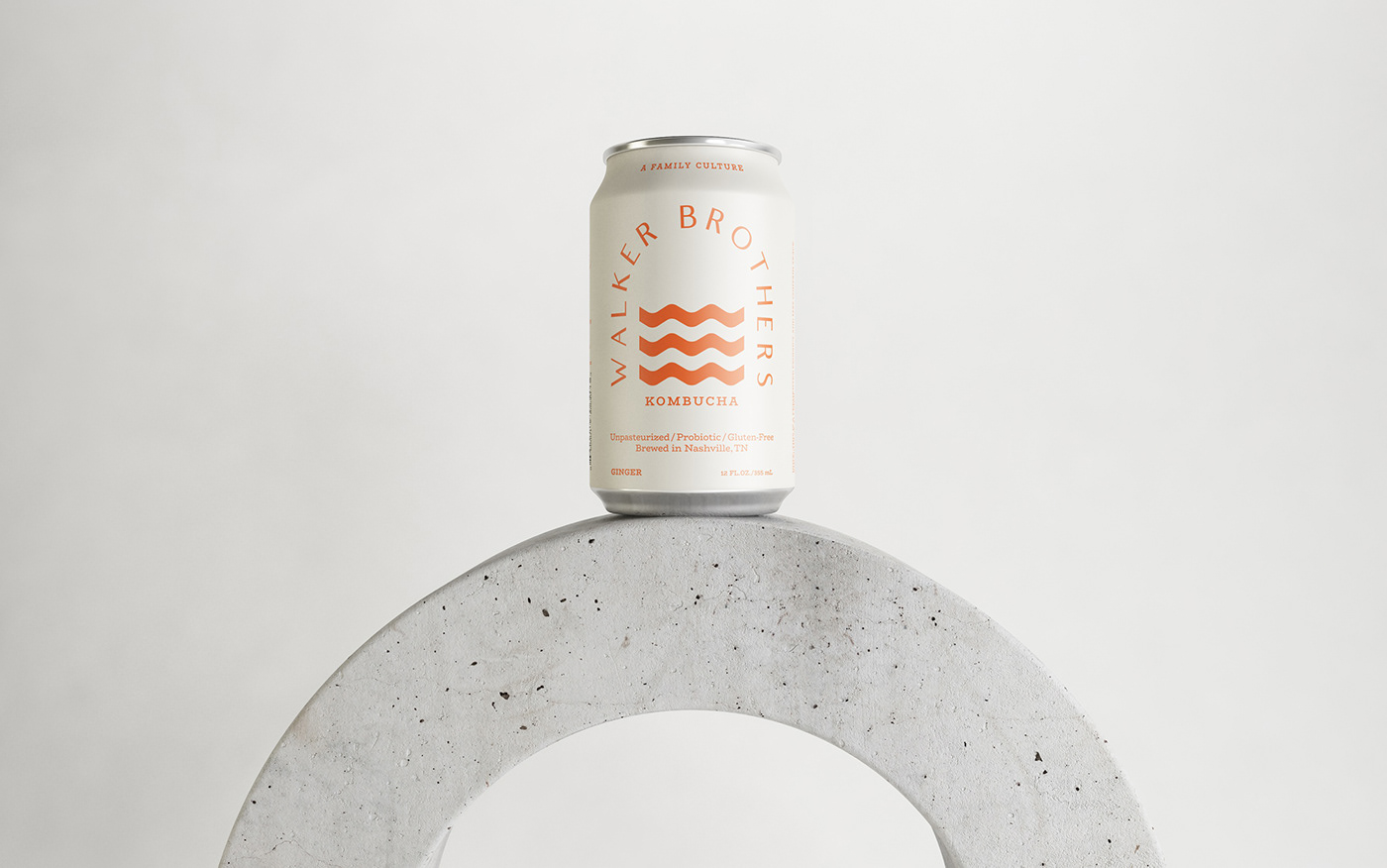
Walker Brothers approached us in 2018 to create their brand identity and packaging design. They brew traditional and high gravity (alcoholic) kombucha in Nashville, USA. For them, brewing kombucha is a family affair because they inherited the company's first SCOBY (the live culture used to make kombucha) from their aunt. This tradition inspired the slogan — 'A family culture'.
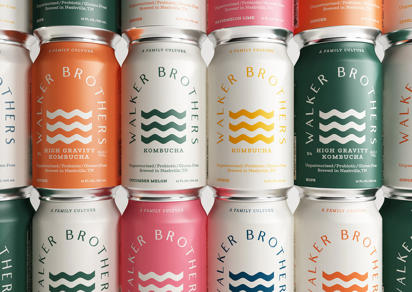
The main challenge was clear, create an identity capable of responding cohesively to both worlds, the alcoholic and non-alcoholic. To achieve this, we use the colour palette as our principal ally to distinguish each category. For the non-alcoholic, we chose a light background accompanied by bright colours, and for the high gravity, we invert the scheme to obtain a stronger look representing the alcoholic side of the brand. The complete palette aims to strike a balance between freshness and maturity, appealing with energy and positivism to multiple audiences.
The concept on which we have relied for creating the logo was 'the bridge' because having a drink with a friend creates a connection, a bridge that helps to build a healthy community. For a clear communication of that concept, we resort to minimalism, eliminating everything superfluous. We create a non-literal bridge with the wordmark's morphology, and we add wavy water (pictorial mark) below to reinforce the idea.
The result expresses what they were looking for, something aesthetically striking and beautiful in its simplicity.
Our Work
Brand Design
Concept Development
Packaging Design
Visual Identity