Jazz Club Firenze re-branding
The Florentine Jazz Club appears in all the most important guides of the world. In over 40 years, thousands of musicians of all ages and nationalities have risen on the Jazz Club stage. It is an indispensable pub for those who love music.
However, the old logotype and visual identity do no longer transmit the Jazz Club’s values.
I created a manual which presents the new logotype design, as well as it covers all the possible applications and visual uses of the new corporate identity, for a correct use in all its expressions. The entire project has been designed in the same graphic line and with the same intention: the brand must be identifiable by its personality in any medium.
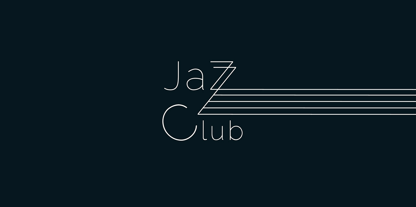
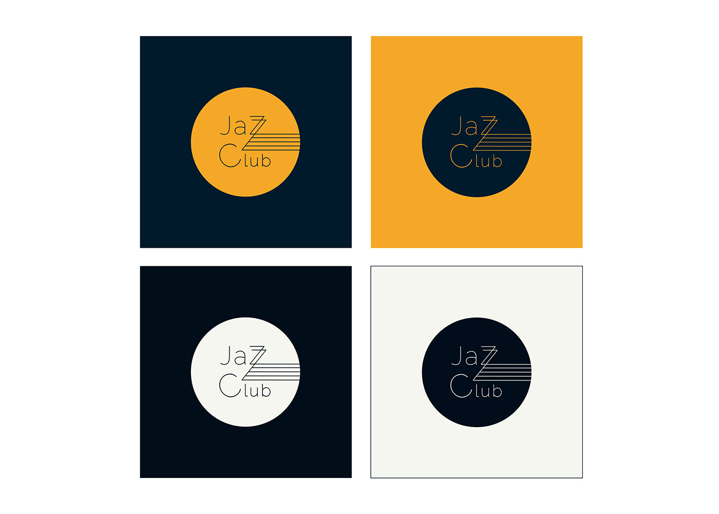
THE LOGOTYPE
As the Jazz Club has been in Florence since 1979, one of the challenges when redesigning the logo was to change it in a way that would remind the Florentines to the logo they already knew.
That is why, even if the typography, the colors and the visuals are more modern and elegant, the circle shape is kept.
The new logo is intended to transmit the same values that Jazz music does: elegance, rhythm, playfulness and spontaneity.
Therefore, the thin typography represents elegance; the five lines represent a music stave; therepeated “Z”s represent rhythm; and the rotated “C” represents playfulness and spontaneity.

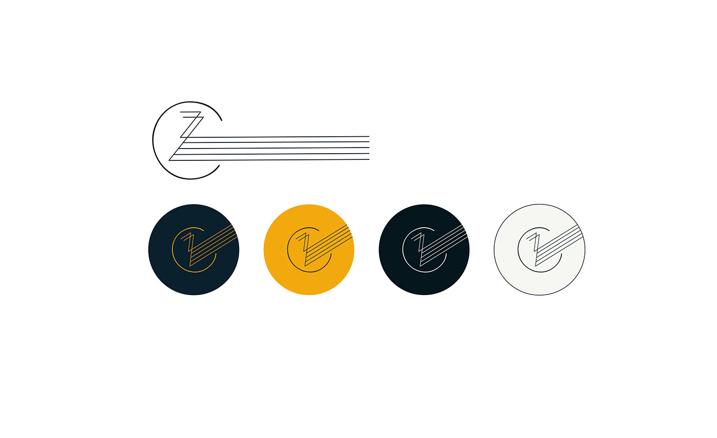
THE ISOTYPE
The isotype is the symbol of the brand. Jazz Club’s isotype unites the three more unique components of the logotype: the doble “Z”s, the stave and the rotated “C”.
This isotype is symbolic and unique, and it has the power of making the brand easy to remember.

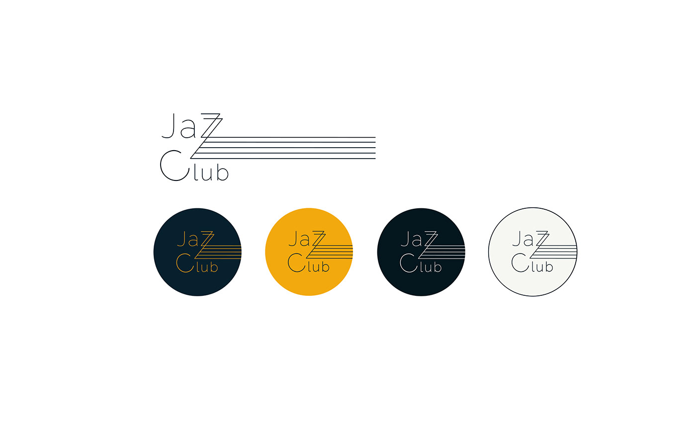
COLOR PALETTE
Just as the logo is designed to transmit the values of jazz music, the colors were also selected for the same purpose.
Jazz is usually represented by the black and white colors. However, the idea was to choose some more personalized colors that would stand out and differentiate the Jazz Club from others. In adittion, black and white transmit seriousness, and the visual identity of the Jazz Club should also represent fun and playfulness.
Therefore, the main two colors are a customized elegant dark blue and a very Italian and lively ochre.
To complement these two main colors: another dark blue, almost black; and a dark white. Both remind to the ebony and ivory of a piano.
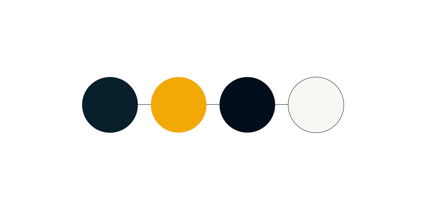
The color palette is thought to be playful. All of the colors match together, making possible the creation of different variations depending on the aim of the specific use of the logo.
TYPOGRAPHY
The typography is thought to be readable and elegant.
Difference between the main text and the head text will be based on the thickness of the lines and the corporate colors.

PATTERNS
These two patterns were created to add more fun and playfulness to the new corporate image of the Jazz Club.
The first one it is based on the five line of the logo, adding a quaver to increase the stave illustion.
The second one represents the keys of a piano.
Both can be used by combining the different corporate colors, in social media communication campaigns, in printed flyers and cards, in t-shirts, etc.

APPLICATION