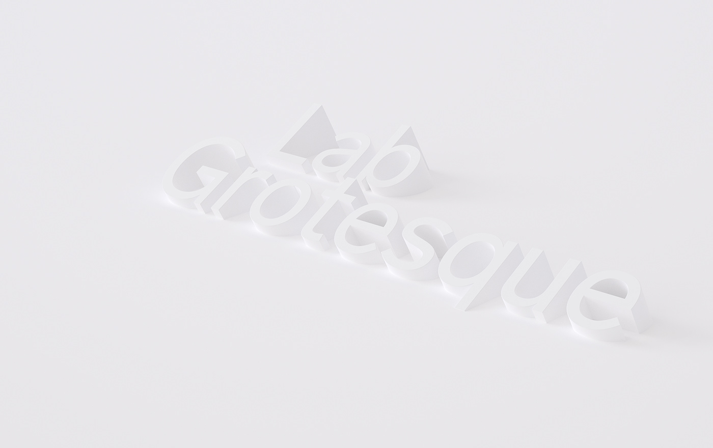
Lab Grotesque
Our type
In the landscape of grots, the subtlest of differences can bear great weight in a typeface’s tone. Looking past the repression of Helvetica, inspiration was found in the idiosyncrasies of earlier grotesks and gothics from the turn of the century. Conceptually, Lab Grotesque is built on the idea of round strokes straightening out towards the terminals. With that in mind, we made the choice of square or rounded dots possible through stylistic sets.
Lab Grotesque comes in six resolute weights, complete with italics available in Latin, Greek and Cyrillic for everyone. A Vietnamese version is also available on request. As an addition there is a mono spaced version.
Designed in collaboration with Letters from Sweden


Reimagined with Lab Grotesque


