


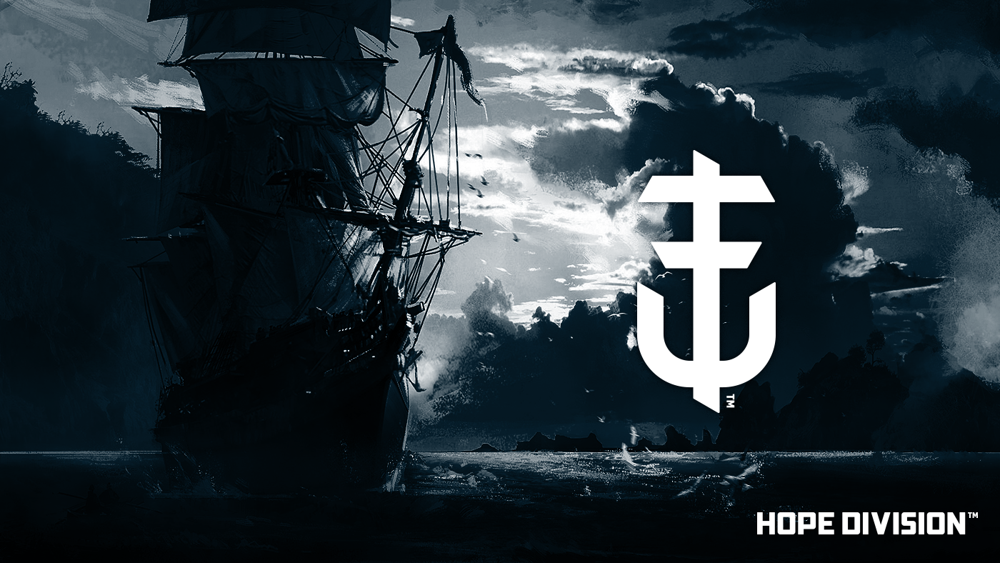
Hope Division
Originally 'Hope Division Creative'
I decided to redo the old outdated version and beef it up slightly.
The name originates from an album title of the hardcore band Stick to Your Guns. A big influence in my life.
The logo mark is a combination of the letters HD and a rotated anchor, it signifies hope, strength and comfort in a storm of a world.
Thanks for checking it out!


