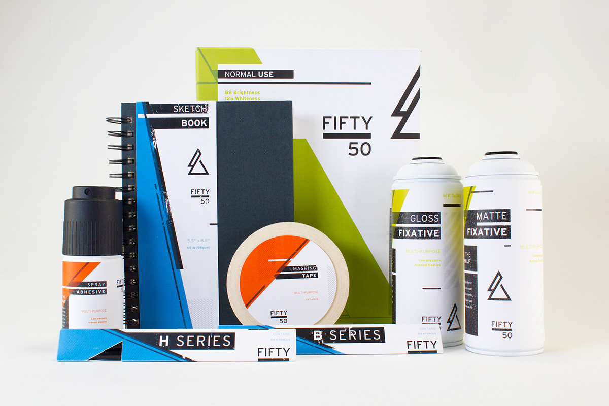
Fifty/50 is built upon the idea of the two halves of design: you and your tools. Fifty/50 is a precision art supply line from the parent company Letraset.

The logo is a simple mark, based on the form of two triangles - the strongest geometric form, as well as a reference to the great pyramid. The pyramid is referenced as an iconic feat of human creation, something Fifty/50 would like to encourage to it's consumers.
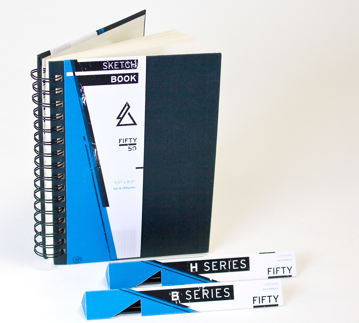
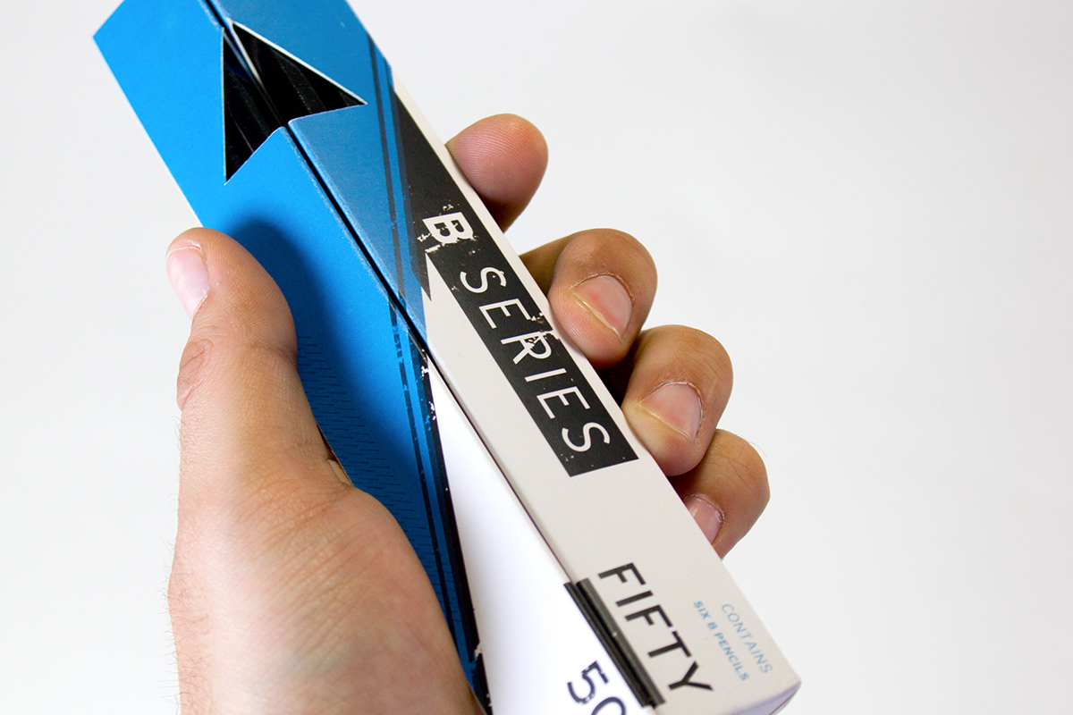
Fifty/50 is designed toward precision art supplies, rather than craft supplies. The overall design system reinforces the concept of precision by using clean lines and high contrasting colors. However, because this is still an art supply line, elements like ink overlays were used to give a handmade feel as well.
The color system is design for a quick reference for consumers. Products packaged in blue are for sketching and drafting tools. Orange products are for adhesives, and green is for the finishing products. The texture system is also based off of elements from the individual pieces as well. Aerosols feature a speckled black and white texture, while sketching tools have a hand drawn black and white texture.