


Pure Gravity
We were approached by a calisthenics instructor looking to pivot her person brand towards a more structured identity that she could grow indefinitely in order to help a larger number of people.
Through a series of brand strategy and business development exercises, we were able to clarify who Pure Gravity's ideal customer was while building systems that would satisfy those customers completely. This resulted in a mission statement to help guide the company along.
Pure Gravity teachers attainable calisthenics in an approachable way that creates healthy students, helping them feel confident and develop strength.
Pure Gravity teachers attainable calisthenics in an approachable way that creates healthy students, helping them feel confident and develop strength.
After thorough discussion about the final visual direction we would take the identity, we created and presented the following mark...


The logo was built with two functional icons.
The one of the left depicts a person with their arms raised high, as if they're mid-exercise. The up and down arrows on the right reference the tension and release that occurs in all calisthenic exercises.
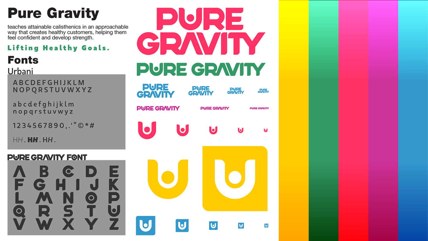
A custom font was developed to help Pure Gravity communicate simple and effective messages while still remaining identifiable among a crowd of similar influencers.


Thanks.


